4 Exploratory data analysis and unsupervised learning
Exploratory data analysis (EDA) is a process in which we summarise and visually explore a dataset. An important part of EDA is unsupervised learning, which is a collection of methods for finding interesting subgroups and patterns in our data. Unlike statistical hypothesis testing, which is used to reject hypotheses, EDA can be used to generate hypotheses (which can then be confirmed or rejected by new studies). Another purpose of EDA is to find outliers and incorrect observations, which can lead to a cleaner and more useful dataset. In EDA we ask questions about our data and then try to answer them using summary statistics and graphics. Some questions will prove to be important, and some will not. The key to finding important questions is to ask a lot of questions. This chapter will provide you with a wide range of tools for question-asking.
After working with the material in this chapter, you will be able to use R to:
- Create reports using R Markdown,
- Customise the look of your plots,
- Visualise the distribution of a variable,
- Create interactive plots,
- Detect and label outliers,
- Investigate patterns in missing data,
- Visualise trends,
- Plot time series data,
- Visualise multiple variables at once using scatterplot matrices, correlograms, and bubble plots,
- Visualise multivariate data using principal component analysis, and
- Use unsupervised learning techniques for clustering.
4.1 Reports with R Markdown
R Markdown files can be used to create nicely formatted documents using R that are easy to export to other formats, like HTML, Word or PDF. They allow you to mix R code with results and text. They can be used to create reproducible reports that are easy to update with new data, because they include the code for making tables and figures. Additionally, they can be used as notebooks for keeping track of your work and your thoughts as you carry out an analysis. You can even use them for writing books; in fact, this entire book was written using R Markdown.
It is often a good idea to use R Markdown for exploratory analyses, as it allows you to write down your thoughts and comments as the analysis progresses, as well as to save the results of the exploratory journey. For that reason, we’ll start this chapter by looking at some examples of what you can do using R Markdown. According to your preference, you can use either R Markdown or ordinary R scripts for the analyses in the remainder of the chapter. The R code used is the same and the results are identical; but, if you use R Markdown, you can also save the output of the analysis in a nicely formatted document.
4.1.1 A first example
When you create a new R Markdown document in RStudio by clicking File > New File > R Markdown in the menu, a document similar to the one below is created:
---
title: "Untitled"
author: "Måns Thulin"
date: "10/20/2020"
output: html_document
---

```{r setup, include=FALSE}
knitr::opts_chunk$set(echo = TRUE)
```

## R Markdown

This is an R Markdown document. Markdown is a simple formatting syntax
for authoring HTML, PDF, and MS Word documents. For more details on
using R Markdown see
<http://rmarkdown.rstudio.com>.

When you click the **Knit** button a document will be generated that
includes both content as well as the output of any embedded R code
chunks within the document. You can embed an R code chunk like this:

```{r cars}
summary(cars)
```

## Including Plots

You can also embed plots, for example:

```{r pressure, echo=FALSE}
plot(pressure)
```

Note that the `echo = FALSE` parameter was added to the code chunk to
prevent printing of the R code that generated the plot.
Press the Knit button at the top of the Script panel to create an HTML document using this Markdown file. It will be saved in the same folder as your Markdown file. Once the HTML document has been created, it will open so that you can see the results. You may have to install additional packages for this to work, in which case RStudio will prompt you.
Now, let’s have a look at what the different parts of the Markdown document do. The first part is called the document header or YAML header. It contains information about the document, including its title, the name of its author, and the date on which it was first created:
---
title: "Untitled"
author: "Måns Thulin"
date: "10/20/2020"
output: html_document
---
The part that says output: html_document specifies what type of document should be created when you press Knit. In this case, it’s set to html_document, meaning that an HTML document will be created. By changing this to output: word_document you can create a .docx Word document instead. By changing it to output: pdf_document, you can create a .pdf document using LaTeX (you’ll have to install LaTeX if you haven’t already – RStudio will notify you if that is the case).
The second part sets the default behaviour of code chunks included in the document, specifying that the output from running the chunks should be printed unless otherwise specified:
```{r setup, include=FALSE}
knitr::opts_chunk$set(echo = TRUE)
```
The third part contains the first proper section of the document. First, a header is created using ##. Then there is some text with formatting: < > is used to create a link and ** is used to get bold text. Finally, there is a code chunk, delimited by ```:
## R Markdown

This is an R Markdown document. Markdown is a simple formatting syntax
for authoring HTML, PDF, and MS Word documents. For more details on
using R Markdown see
<http://rmarkdown.rstudio.com>.

When you click the **Knit** button a document will be generated that
includes both content as well as the output of any embedded R code
chunks within the document. You can embed an R code chunk like this:

```{r cars}
summary(cars)
```
The fourth and final part contains another section, this time with a figure created using R. A setting is added to the code chunk used to create the figure, which prevents the underlying code from being printed in the document:
## Including Plots

You can also embed plots, for example:

```{r pressure, echo=FALSE}
plot(pressure)
```

Note that the `echo = FALSE` parameter was added to the code chunk to
prevent printing of the R code that generated the plot.
In the next few sections, we will look at how formatting and code chunks work in R Markdown.
4.1.2 Formatting text
To create plain text in a Markdown file, you simply have to write plain text. If you wish to add some formatting to your text, you can use the following:
_italics_or*italics*: to create text in italics.__bold__or**bold**: to create bold text.[linked text](http://www.modernstatisticswithr.com): to create linked text.`code`: to include inlinecodein your document.$a^2 + b^2 = c^2$: to create inline equations like \(a^2 + b^2 = c^2\) using LaTeX syntax.$$a^2 + b^2 = c^2$$: to create a centred equation on a new line.
To add headers and sub-headers, and to divide your document into section, start a new line with #’s as follows:
# Header text
## Sub-header text
### Sub-sub-header text
...and so on.
4.1.3 Lists, tables, and images
To create a bullet list, you can use * as follows. Note that you need a blank line between your list and the previous paragraph to begin a list.
* Item 1
* Item 2
   + Sub-item 1
   + Sub-item 2
* Item 3
yielding:
- Item 1
- Item 2
- Sub-item 1
- Sub-item 2
- Item 3
To create an ordered list, use:
1. First item
2. Second item
  i) Sub-item 1
  ii) Sub-item 2
3. Item 3
yielding:
- First item
- Second item
- Sub-item 1
- Sub-item 2
- Item 3
To create a table, use | and --------- as follows:
Column 1  | Column 2
--------- | ---------
Content  | More content
Even more  | And some here
Even more?  | Yes!
which yields the following output:
| Column 1 | Column 2 |
|---|---|
| Content | More content |
| Even more | And some here |
| Even more? | Yes! |
To include an image, use the same syntax as when creating linked text with a link to the image path (either local or on the web), but with a ! in front:

which yields:

Figure 4.1: R logo.
4.1.4 Code chunks
The simplest way to define a code chunk is to write:
```{r}
plot(pressure)
```
In RStudio, Ctrl+Alt+I is a keyboard shortcut for inserting this kind of code chunk.
We can add a name and a caption to the chunk, which lets us reference objects created by the chunk:
```{r pressureplot, fig.cap = "Plot of the pressure data."}
plot(pressure)
```

As we can see in Figure \@ref(fig:pressureplot), the relationship between
temperature and pressure resembles a banana.
This yields the following output:
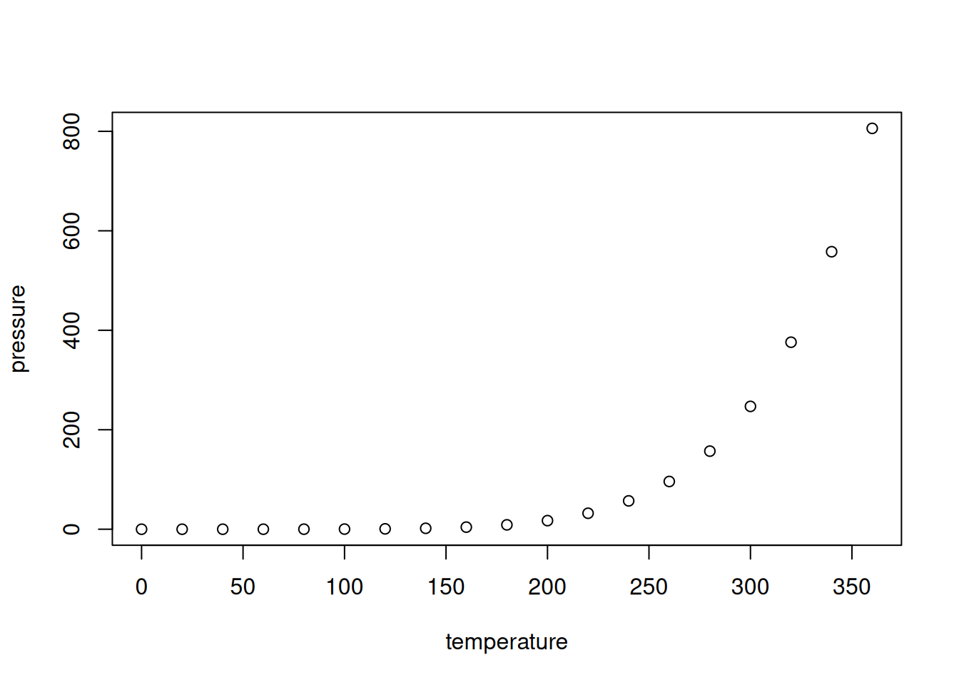
Figure 4.2: Plot of the pressure data.
As we can see in Figure 4.2, the relationship between temperature and pressure resembles a banana.
In addition, you can add settings to the chunk header to control its behaviour. For instance, you can include a code chunk without running it by adding echo = FALSE:
```{r, eval = FALSE}
plot(pressure)
```
You can add the following settings to your chunks:
echo = FALSEto run the code without printing it,eval = FALSEto print the code without running it,results = "hide"to hide printed output,fig.show = "hide"to hide plots,warning = FALSEto suppress warning messages from being printed in your document,message = FALSEto suppress other messages from being printed in your document,include = FALSEto run a chunk without showing the code or results in the document,error = TRUEto continue running your R Markdown document even if there is an error in the chunk (by default, the documentation creation stops if there is an error).
Data frames can be printed either as in the Console or as a nicely formatted table. For example,
```{r, echo = FALSE}
head(airquality)
```
yields:
##   Ozone Solar.R Wind Temp Month Day
## 1    41     190  7.4   67     5   1
## 2    36     118  8.0   72     5   2
## 3    12     149 12.6   74     5   3
## 4    18     313 11.5   62     5   4
## 5    NA      NA 14.3   56     5   5
## 6    28      NA 14.9   66     5   6
whereas
```{r, echo = FALSE}
knitr::kable(
  head(airquality),
  caption = "Some data I found."
)
```
yields a nicely formatted table.
Further help and documentation for R Markdown can be found through the RStudio menus, by clicking Help > Cheatsheets > R Markdown Cheat Sheet or Help > Cheatsheets > R Markdown Reference Guide.
4.2 Customising ggplot2 plots
We’ll be using ggplot2 a lot in this chapter; so, before we get started with exploratory analyses, we’ll take some time to learn how we can customise the look of ggplot2-plots.
Consider the following facetted plot from Section 2.7.4:
library(ggplot2)

ggplot(msleep, aes(brainwt, sleep_total)) +
      geom_point() +
      labs(x = "Brain weight (logarithmic scale)",
           y = "Total sleep time") +
      scale_x_log10() +
      facet_wrap(~ vore)
It looks nice, sure, but there may be things that you’d like to change. Maybe you’d like the plot’s background to be white instead of grey, or perhaps you’d like to use a different font. These, and many other things, can be modified using themes and palettes. Before we look at that, we’ll take a quick look at how to modify the labels and axes of the plot.
4.2.1 Modifying labels
As we’ve already seen, the labs function allows us to change the labels for the aesthethics, like the header of the legend showing the different colours in the figure:
4.2.2 Modifying axis scales
We’ve seen how functions with names beginning with scale_x, such as scale_x_log10 can be used to modify the scale of the x-axis (and scale_y-functions used to modify the y-axis). In addition to log transforms, we can for instance control where the tick marks are located by using the breaks argument. If we only want to modify the tick marks (without doing a log transform), we can use scale_x_continuous:
# Default:
ggplot(msleep, aes(brainwt, sleep_total, colour = vore)) +
      geom_point() +
      labs(x = "Brain weight",
           y = "Total sleep time",
           colour = "Feeding behaviour")

# Tick marks at all integers from 0 to 6:
ggplot(msleep, aes(brainwt, sleep_total, colour = vore)) +
      geom_point() +
      labs(x = "Brain weight",
           y = "Total sleep time",
           colour = "Feeding behaviour") +
      scale_x_continuous(breaks = 0:6)

# Tick mark at specific values:
ggplot(msleep, aes(brainwt, sleep_total, colour = vore)) +
      geom_point() +
      labs(x = "Brain weight",
           y = "Total sleep time",
           colour = "Feeding behaviour") +
      scale_x_continuous(breaks = c(0, 2.5, 4.25))
The y-axis can be modified analogously using scale_y_continuous.
4.2.3 Using themes
ggplot2 comes with a number of basic themes. All are fairly similar but differ in things like background colour, grids, and borders. You can add them to your plot using theme_themeName, where themeName is the name of the theme24. Here are some examples:
p <- ggplot(msleep, aes(brainwt, sleep_total, colour = vore)) +
      geom_point() +
      labs(x = "Brain weight (logarithmic scale)",
           y = "Total sleep time",
           colour = "Feeding behaviour") +
      scale_x_log10() +
      facet_wrap(~ vore)

# Create plot with different themes:
p + theme_grey() # The default theme
p + theme_bw()
p + theme_linedraw()
p + theme_light()
p + theme_dark()
p + theme_minimal()
p + theme_classic()
There are several packages available that contain additional themes. Let’s try a few:
4.2.4 Colour palettes
Unlike, e.g., background colours, the colour palette, i.e., the list of colours used for plotting, is not part of the theme that you’re using. Next, we’ll have a look at how to change the colour palette used for your plot.
Let’s start by creating a ggplot object:
p <- ggplot(msleep, aes(brainwt, sleep_total, colour = vore)) +
      geom_point() +
      labs(x = "Brain weight (logarithmic scale)",
           y = "Total sleep time",
           colour = "Feeding behaviour") +
      scale_x_log10()
You can change the colour palette using scale_colour_brewer. Three types of colour palettes are available:
- Sequential palettes: these range from a colour to white. These are useful for representing ordinal (i.e., ordered) categorical variables and numerical variables.
- Diverging palettes: these range from one colour to another, with white in between. Diverging palettes are useful when there is a meaningful middle or 0 value (e.g., when your variables represent temperatures or profit/loss), which can be mapped to white.
- Qualitative palettes: these contain multiple distinct colours. They are useful for nominal (i.e., with no natural ordering) categorical variables.
See ?scale_colour_brewer or http://www.colorbrewer2.org for a list of the available palettes. Here are some examples:
# Sequential palette:
p + scale_colour_brewer(palette = "OrRd")
# Diverging palette:
p + scale_colour_brewer(palette = "RdBu")
# Qualitative palette:
p + scale_colour_brewer(palette = "Set1")
In this case, because vore is a nominal categorical variable, a qualitative palette is arguably the best choice.
In addition to these ready-made palettes, you can create your own custom palettes. Here’s an example with colours that have been recommended as being easy to distinguish for people who are colour-blind:
# Create a vector with colours:
colour_blind_palette <- c("#000000", "#E69F00", "#56B4E9", "#009E73",
                          "#0072B2", "#D55E00", "#CC79A7")

# Use the palette with the plot:
p + scale_colour_manual(values = colour_blind_palette)
Use scale_colour_manual to change the palette used for colour and scale_fill_manual to change the palette used for fill in your plots.
Finally, if you want to use your custom palette in many different plots, and you don’t want to have to add scale_colour_manual to every single plot, you can change the default colours for all ggplot2 plots in your R session as follows:
options(ggplot2.discrete.colour = colour_blind_palette,
        ggplot2.discrete.fill = colour_blind_palette)
Some examples of themes are shown in Figure 4.3.
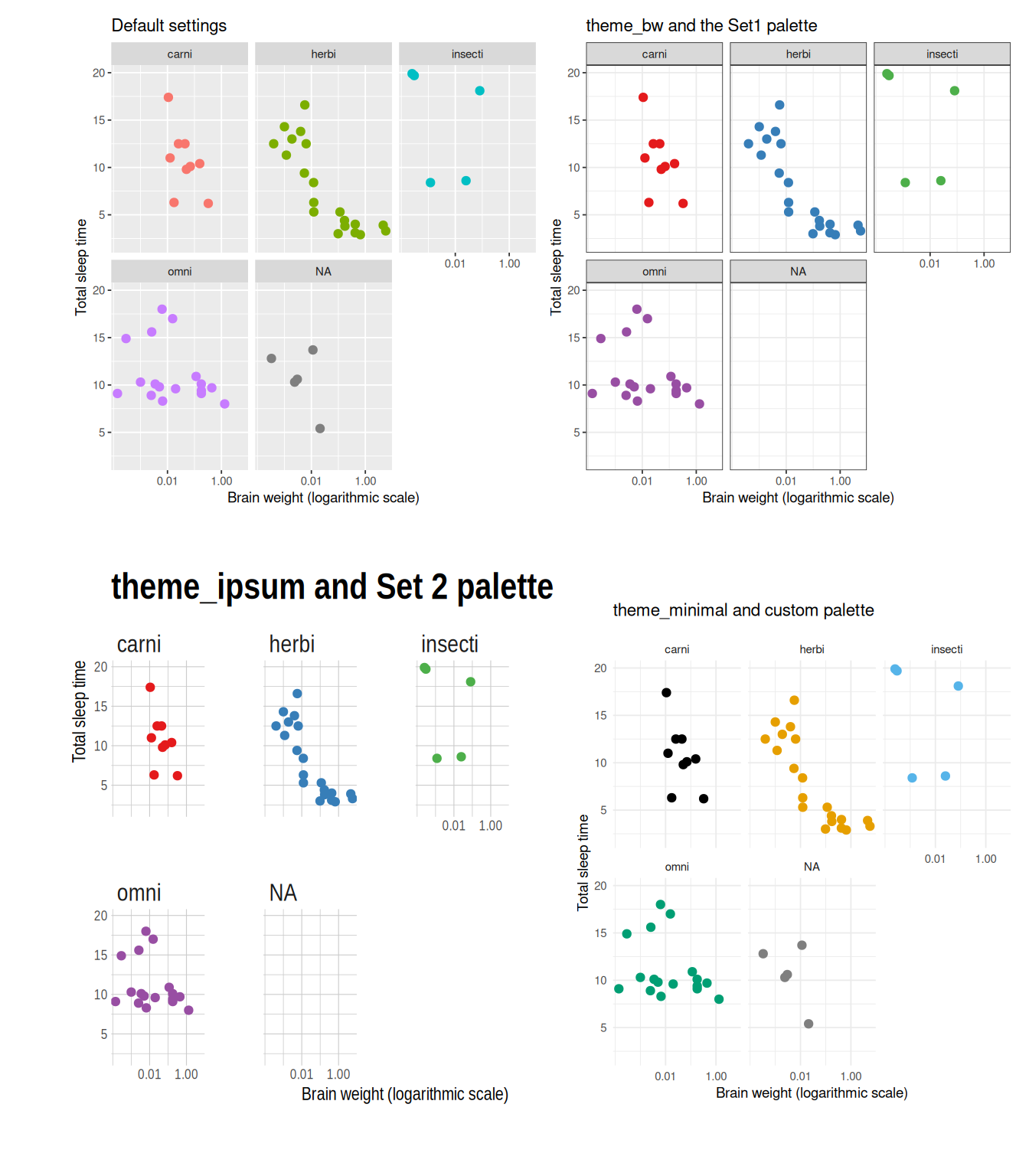
Figure 4.3: Examples of ggplot themes and colour palettes.
4.2.5 Theme settings
The point of using a theme is that you get a combination of colours, fonts, and other choices that are supposed to go well together, meaning that you don’t have to spend too much time picking combinations. But if you like, you can override the default options and customise any and all parts of a theme.
The theme controls all visual aspects of the plot not related to the aesthetics. You can change the theme settings using the theme function. For instance, you can use theme to remove the legend or change its position:
# No legend:
p + theme(legend.position = "none")

# Legend below figure:
p + theme(legend.position = "bottom")

# Legend inside plot:
p + theme(legend.position = c(0.9, 0.7))
In the last example, the vector c(0.9, 0.7) gives the relative coordinates of the legend, with c(0 0) representing the bottom left corner of the plot and c(1, 1) the upper right corner. Try to change the coordinates to different values between 0 and 1 and see what happens.
The base size of a theme controls the scale of the entire figure. This makes it useful when you want to rescale all elements of your plot at the same time:
theme has a lot of other settings, including for the colours of the background, the grid, and the text in the plot. Here are a few examples that you can use as a starting point for experimenting with the settings:
p + theme(panel.grid.major = element_line(colour = "black"),
          panel.grid.minor = element_line(colour = "purple",
                                          linetype = "dotted"),
          panel.background = element_rect(colour = "red", size = 2),
          plot.background = element_rect(fill = "yellow"),
          axis.text = element_text(family = "mono", colour = "blue"),
          axis.title = element_text(family = "serif", size = 14))
To find a complete list of settings, see ?theme, ?element_line (lines), ?element_rect (borders and backgrounds), ?element_text (text), and element_blank (for suppressing plotting of elements). As before, you can use colors() to get a list of built-in colours, or use colour hex codes.
\[\sim\]
Exercise 4.1 Use the documentation for theme and the element_... functions to change the plot object p created above as follows:
Change the background colour of the entire plot to
lightblue.Change the font of the legend to
serif.Remove the grid.
Change the colour of the axis ticks to
orangeand make them thicker.
4.3 Exploring distributions
It is often useful to visualise the distribution of a numerical variable. Comparing the distributions of different groups can lead to important insights. Visualising distributions is also essential when checking assumptions used for various statistical tests (sometimes called initial data analysis). In this section, we will illustrate how this can be done using the diamonds data from the ggplot2 package. You can read more about it by running ?diamonds.
4.3.1 Density plots and frequency polygons
We already know how to visualise the distribution of the data by dividing it into bins and plotting a histogram:
A similar plot is created using frequency polygons, which uses lines instead of bars to display the counts in the bins:
An advantage with frequency polygons is that they can be used to compare groups, e.g., diamonds with different cuts, without facetting:
It is clear from this figure that there are more diamonds with ideal cuts than diamonds with fair cuts in the data. The polygons have roughly the same shape, except perhaps for the polygon for diamonds with fair cuts.
In some cases, we are more interested in the shape of the distribution than in the actual counts in the different bins. Density plots are similar to frequency polygons but show an estimate of the density function of the underlying random variable. These estimates are smooth curves that are scaled so that the area below them is 1 (i.e., scaled to be proper density functions):
From this figure, shown in Figure 4.4, it becomes clear that low-carat diamonds tend to have better cuts, which wasn’t obvious from the frequency polygons. However, the plot does not provide any information about how common different cuts are. Use density plots if you’re more interested in the shape of a variable’s distribution, and frequency polygons if you’re more interested in counts.
There are several settings that can help improve the look of your density plot, which you’ll explore in the next exercise.
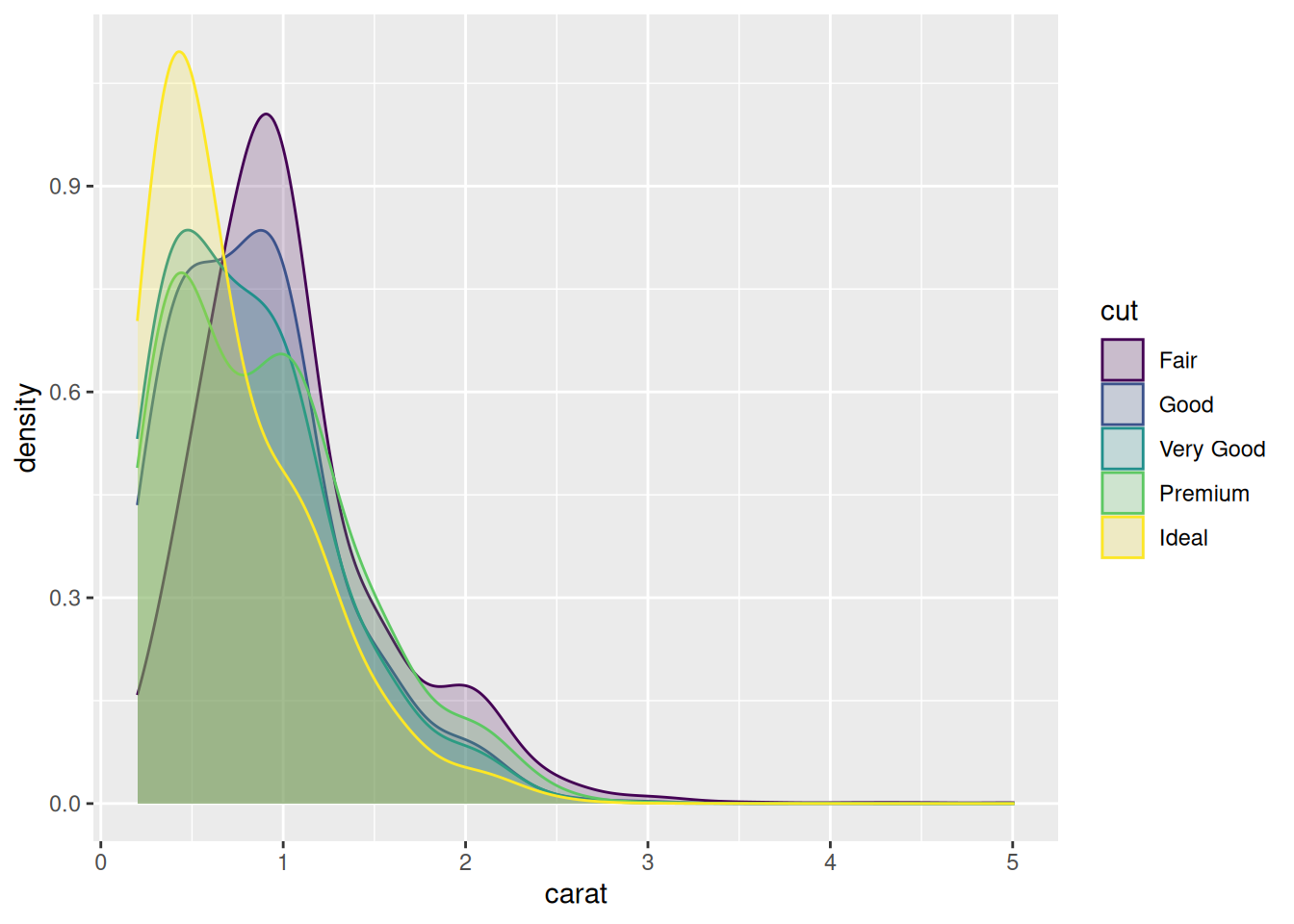
Figure 4.4: Density plot for diamond carats.
\[\sim\]
Exercise 4.2 Using the density plot we just created above (Figure 4.4) and the documentation for geom_density, do the following:
Increase the smoothness of the density curves.
Fill the area under the density curves with the same colour as the curves themselves.
Make the colours that fill the areas under the curves transparent.
The figure still isn’t that easy to interpret. Install and load the
ggridgespackage, an extension ofggplot2that allows you to make so-called ridge plots (density plots that are separated along the y-axis, similar to facetting). Read the documentation forgeom_density_ridgesand use it to make a ridge plot of diamond prices for different cuts.
(Click here to go to the solution.)
Exercise 4.3 Return to the histogram created by ggplot(diamonds, aes(carat)) + geom_histogram() above. As there are very few diamonds with carat greater than 3, cut the x-axis at 3. Then decrease the bin width to 0.01. Do any interesting patterns emerge?
4.3.2 Asking questions
Exercise 4.3 causes us to ask why diamonds with carat values that are multiples of 0.25 are more common than others. Perhaps the price is involved? Unfortunately, a plot of carat versus price is not that informative:
Maybe we could compute the average price in each bin of the histogram? In that case, we need to extract the bin breaks from the histogram somehow. We could then create a new categorical variable using the breaks with cut (as we did in Exercise 2.27). It turns out that extracting the bins is much easier using base graphics than ggplot2, so let’s do that:
# Extract information from a histogram with bin width 0.01,
# which corresponds to 481 breaks:
carat_br <- hist(diamonds$carat, breaks = 481, right = FALSE,
                 plot = FALSE)
# Of interest to us are:
# carat_br$breaks, which contains the breaks for the bins
# carat_br$mid, which contains the midpoints of the bins
#               (useful for plotting!)

# Create categories for each bin:
diamonds$carat_cat <- cut(diamonds$carat, 481, right = FALSE)
We now have a variable, carat_cat, that shows to which bin each observation belongs. Next, we’d like to compute the mean for each bin. This is a grouped summary – mean by category. After we’ve computed the bin means, we could then plot them against the bin midpoints. Let’s try it:
That didn’t work as intended. We get an error message when attempting to plot the results:
The error message implies that the number of bins and the number of mean values that have been computed differ. But we’ve just computed the mean for each bin, haven’t we? So what’s going on?
By default, aggregate ignores groups for which there are no values when computing grouped summaries. In this case, there are a lot of empty bins – there is for instance no observation in the [4.99,5) bin. In fact, only 272 out of the 481 bins are non-empty.
We can solve this in different ways. One way is to remove the empty bins. We can do this using the match function, which returns the positions of matching values in two vectors. If we use it with the bins from the grouped summary and the vector containing all bins, we can find the indices of the non-empty bins. This requires the use of the levels function, which you’ll learn more about in Section 5.4:
means <- aggregate(price ~ carat_cat, data = diamonds, FUN = mean)

id <- match(means$carat_cat, levels(diamonds$carat_cat))
Finally, we’ll also add some vertical lines to our plot, to call attention to multiples of 0.25.
It appears that there are small jumps in the prices at some of the 0.25-marks. This explains why there are more diamonds just above these marks than just below.
The above example illustrates three crucial things regarding exploratory data analysis:
Plots (in our case, the histogram) often lead to new questions.
Often, we must transform, summarise, or otherwise manipulate our data to answer a question. Sometimes this is straightforward, and sometimes it means diving deep into R code.
Sometimes the thing that we’re trying to do doesn’t work straight away. There is almost always a solution though (and oftentimes more than one!). The more you work with R, the more problem-solving tricks you will learn.
4.3.3 Violin plots
Density curves can also be used as alternatives to boxplots. Consider these boxplots showing price differences between diamonds of different cuts:
Instead of using a boxplot, we can use a violin plot. Each group is represented by a “violin”, given by a rotated and duplicated density plot:
Compared to boxplots, violin plots capture the entire distribution of the data rather than just a few numerical summaries. If you like numerical summaries (and you should) you can add the median and the quartiles (corresponding to the borders of the box in the boxplot) using the draw_quantiles argument:
\[\sim\]
Exercise 4.4 Using the first boxplot created above, i.e., ggplot(diamonds, aes(cut, price)) + geom_violin(), do the following:
Add some colour to the plot by giving different colours to each violin.
Because the categories are shown along the x-axis, we don’t really need the legend. Remove it.
Both boxplots and violin plots are useful. Maybe we can have the best of both worlds? Add the corresponding boxplot inside each violin. Hint: the
widthandalphaarguments ingeom_boxplotare useful for creating a nice-looking figure here.Flip the coordinate system to create horizontal violins and boxes instead.
4.4 Combining multiple plots into a single graphic
When exploring data with many variables, you’ll often want to make the same kind of plot (e.g., a violin plot) for several variables. It will frequently make sense to place these side-by-side in the same plot window. The patchwork package extends ggplot2 by letting you do just that. Let’s install it:
To use it, save each plot as a plot object and then add them together:
plot1 <- ggplot(diamonds, aes(cut, carat, fill = cut)) +
            geom_violin() +
            theme(legend.position = "none")
plot2 <- ggplot(diamonds, aes(cut, price, fill = cut)) +
            geom_violin() +
            theme(legend.position = "none")

library(patchwork)
plot1 + plot2
You can also arrange the plots on multiple lines, with different numbers of plots on each line. This is particularly useful if you are combining different types of plots in a single plot window. In this case, you separate plots that are one the same line by | and mark the beginning of a new line with /:
# Create two more plot objects:
plot3 <- ggplot(diamonds, aes(cut, depth, fill = cut)) +
            geom_violin() +
            theme(legend.position = "none")
plot4 <- ggplot(diamonds, aes(carat, fill = cut)) +
            geom_density(alpha = 0.5) +
            theme(legend.position = c(0.9, 0.6))

# One row with three plots and one row with a single plot:
(plot1 | plot2 | plot3) / plot4

# One column with three plots and one column with a single plot:
(plot1 / plot2 / plot3) | plot4
(You may need to enlarge your plot window for this to look good!)
4.5 Outliers and missing data
4.5.1 Detecting outliers
Both boxplots and scatterplots are helpful in detecting deviating observations – often called outliers. Outliers can be caused by measurement errors or errors in the data input but can also be interesting rare cases that can provide valuable insights about the process that generated the data. Either way, it is often of interest to detect outliers, for instance because that may influence the choice of what statistical tests to use.
Let’s draw a scatterplot of diamond carats versus prices:
There are some outliers which we may want to study further. For instance, there is a surprisingly cheap 5-carat diamond, and some cheap 3-carat diamonds. Note that it is not just the prices nor just the carats of these diamonds that make them outliers, but the unusual combinations of prices and carats. But how can we identify those points?
One option is to use the plotly package to make an interactive version of the plot, where we can hover interesting points to see more information about them. Start by installing it:
To use plotly with a ggplot graphic, we store the graphic in a variable and then use it as input to the ggplotly function. The resulting (interactive!) plot takes a little longer than usual to load. Try hovering the points:
By default, plotly only shows the carat and price of each diamond. But we can add more information to the box by adding a text aesthetic:
myPlot <- ggplot(diamonds, aes(carat, price, text = paste("Row:",
rownames(diamonds)))) +
geom_point()
ggplotly(myPlot)We can now find the row numbers of the outliers visually, which is very useful when exploring data.
\[\sim\]
Exercise 4.5 The variables x and y in the diamonds data describe the length and width of the diamonds (in millimetres). Use an interactive scatterplot to identify outliers in these variables. Check prices, carat, and other information and think about if any of the outliers can be due to data errors.
4.5.2 Labelling outliers
Interactive plots are great when exploring a dataset but are not always possible to use in other contexts, e.g., for printed reports and some presentations. In these other cases, we can instead annotate the plot with notes about outliers. One way to do this is to use a geom called geom_text.
For instance, we may want to add the row numbers of outliers to a plot. To do so, we use geom_text along with a condition that specifies for which points we should add annotations. As in Section 2.11.3, if we, e.g., wish to add row numbers for diamonds with carats greater than four, our condition would be carat > 4. The ifelse function, which we’ll look closer at in Section 6.3, is perfect to use here. The syntax will be ifelse(condition, what text to write if the condition is satisfied, what text to write else). To add row names for observations that fulfill the condition but not for other observations, we use ifelse(condition, rownames(diamonds), ""). If, instead, we wanted to print the price of the diamonds, we’d use ifelse(condition, price, "").
Here are some different examples of conditions used to plot text:
# Using the row number (the 5 carat diamond is on row 27,416)
ggplot(diamonds, aes(carat, price)) +
geom_point() +
geom_text(aes(label = ifelse(rownames(diamonds) == 27416,
rownames(diamonds), "")),
hjust = 1.1)
# (hjust=1.1 shifts the text to the left of the point)
# Plot text next to all diamonds with carat>4
ggplot(diamonds, aes(carat, price)) +
geom_point() +
geom_text(aes(label = ifelse(carat > 4, rownames(diamonds), "")),
hjust = 1.1)
# Plot text next to 3 carat diamonds with a price below 7500
ggplot(diamonds, aes(carat, price)) +
geom_point() +
geom_text(aes(label = ifelse(carat == 3 & price < 7500,
rownames(diamonds), "")),
hjust = 1.1)\[\sim\]
Exercise 4.6 Create a static (i.e., non-interactive) scatterplot of x versus y from the diamonds data. Label the diamonds with suspiciously high \(y\)-values.
4.5.3 Missing data
Like many datasets, the mammal sleep data msleep contains a lot of missing values, represented by NA (Not Available) in R. This becomes evident when we have a look at the data:
We can check if a particular observation is missing using the is.na function:
We can count the number of missing values for each variable using:
Here, colSums computes the sum of is.na(msleep) for each column of msleep (remember that in summation, TRUE counts as 1 and FALSE as 0), yielding the number of missing values for each variable. In total, there are 136 missing values in the dataset:
You’ll notice that ggplot2 prints a warning in the Console when you create a plot with missing data:
Sometimes, data are missing simply because the information is not yet available (for instance, the brain weight of the mountain beaver could be missing because no one has ever weighed the brain of a mountain beaver). In other cases, data can be missing because something about them is different (for instance, values for a male patient in a medical trial can be missing because the patient died, or because some values only were collected for female patients). Therefore, it is of interest to see if there are any differences in non-missing variables between subjects that have missing data and subjects that don’t.
In msleep, all animals have recorded values for sleep_total and bodywt. To check if the animals that have missing brainwt values differ from the others, we can plot them in a different colour in a scatterplot:
(If is.na(brainwt) is TRUE, then the brain weight is missing in the dataset.) In this case, there are no apparent differences between the animals with missing data and those without.
\[\sim\]
Exercise 4.7 Create a version of the diamonds dataset where the x value is missing for all diamonds with \(x>9\). Make a scatterplot of carat versus price, in which points where the x value is missing are plotted in a different colour. How would you interpret this plot?
4.5.4 Exploring data
The nycflights13 package contains data about flights to and from three airports in New York, USA, in 2013. As a summary exercise, we will study a subset of these, namely all flights departing from New York on 1 January of that year:
install.packages("nycflights13")
library(nycflights13)
flights2 <- flights[flights$month == 1 & flights$day == 1,]
\[\sim\]
Exercise 4.8 Explore the flights2 dataset, focusing on delays and the amount of time spent in the air. Are there any differences between the different carriers? Are there missing data? Are there any outliers?
4.6 Trends in scatterplots
Let’s return to a familiar example: the relationship between animal brain size and sleep times:
ggplot(msleep, aes(brainwt, sleep_total)) +
      geom_point() +
      labs(x = "Brain weight (logarithmic scale)",
           y = "Total sleep time") +
      scale_x_log10()
There appears to be a decreasing trend in the plot. To aid the eye, we can add a smoothed line by adding a new geom, geom_smooth, to the figure:
ggplot(msleep, aes(brainwt, sleep_total)) +
      geom_point() +
      geom_smooth() +
      labs(x = "Brain weight (logarithmic scale)",
           y = "Total sleep time") +
      scale_x_log10()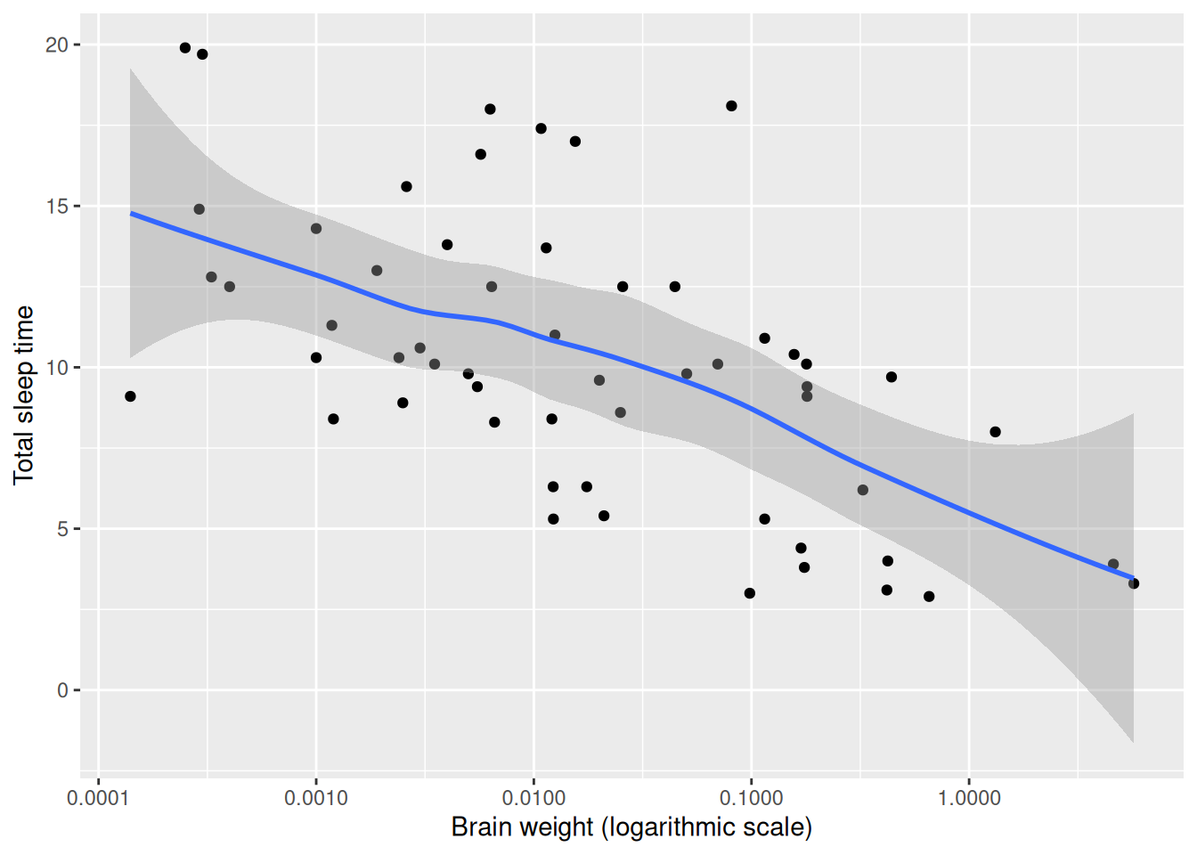
Figure 4.5: Scatterplot with a smooth trend curve.
This technique is useful for bivariate data as well as for time series, which we’ll delve into next.
By default, geom_smooth adds a line fitted using either LOESS25 or GAM26, as well as the corresponding 95% confidence interval describing the uncertainty in the estimate. There are several useful arguments that can be used with geom_smooth. You will explore some of these in the exercise below.
\[\sim\]
Exercise 4.9 Check the documentation for geom_smooth. Starting with the plot of brain weight vs. sleep time created above, do the following:
Decrease the degree of smoothing for the LOESS line that was fitted to the data. What is better in this case, more or less smoothing?
Fit a straight line to the data instead of a non-linear LOESS line.
Remove the confidence interval from the plot.
Change the colour of the fitted line to red.
4.7 Exploring time series
Before we have a look at time series, you should install four useful packages: forecast, nlme, fma and fpp2. The first contains useful functions for plotting time series data, and the latter three contain datasets that we’ll use.
The a10 dataset contains information about the monthly anti-diabetic drug sales in Australia from July 1991 to June 2008. By checking its structure, we see that it is saved as a time series object27:
ggplot2 requires that data is saved as a data frame in order for it to be plotted. In order to plot the time series, we could first convert it to a data frame and then plot each point using geom_points:
It is however usually preferable to plot time series using lines instead of points. This is done using a different geom: geom_line:
Having to convert the time series object to a data frame is a little awkward. Luckily, there is a way around this. ggplot2 offers a function called autoplot that automatically draws an appropriate plot for certain types of data. forecast extends this function to time series objects:
We can still add other geoms, axis labels, and other things just as before. autoplot has simply replaced the ggplot(data, aes()) + geom part that would be the first two rows of the ggplot2 figure and has implicitly converted the data to a data frame.
\[\sim\]
Exercise 4.10 Using the autoplot(a10) figure, do the following:
Add a smoothed line describing the trend in the data. Make sure that it is smooth enough not to capture the seasonal variation in the data.
Change the label of the x-axis to “Year” and the label of the y-axis to “Sales ($ million)”.
Check the documentation for the
ggtitlefunction. What does it do? Use it with the figure.Change the colour of the time series line to red.
(Click here to go to the solution.)
4.7.1 Annotations and reference lines
We sometimes wish to add text or symbols to plots, for instance to highlight interesting observations. Consider the following time series plot of daily morning gold prices, based on the gold data from the forecast package:
There is a sharp spike a few weeks before day 800, which is due to an incorrect value in the data series. We’d like to add a note about that to the plot. First, we wish to find out on which day the spike appears. This can be done by checking the data manually or using some code:
To add a circle around that point, we add a call to annotate to the plot:
autoplot(gold) +
      annotate(geom = "point", x = spike_date, y = gold[spike_date],
               size = 5, shape = 21,
               colour = "red",
               fill = "transparent")
annotate can be used to annotate the plot with both geometrical objects and text (and can therefore be used as an alternative to geom_text).
\[\sim\]
Exercise 4.11 Using the figure created above and the documentation for annotate, do the following:
Add the text “Incorrect value” next to the circle.
Create a second plot where the incorrect value has been removed.
Read the documentation for the geom
geom_hline. Use it to add a red reference line to the plot, at \(y=400\).
4.7.2 Longitudinal data
Multiple time series with identical time points, known as longitudinal data or panel data, are common in many fields. One example of this is given by the elecdaily time series from the fpp2 package, which contains information about electricity demand in Victoria, Australia during 2014. As with a single time series, we can plot these data using autoplot:
In this case, it is probably a good idea to facet the data, i.e., to plot each series in a different figure:
\[\sim\]
Exercise 4.12 Make the following changes to the autoplot(elecdaily, facets = TRUE):
Remove the
WorkDayvariable from the plot (it describes whether or not a given date is a workday, and while it is useful for modelling purposes, we do not wish to include it in our figure).Add smoothed trend lines to the time series plots.
4.7.3 Path plots
Another option for plotting multiple time series is path plots. A path plot is a scatterplot where the points are connected with lines in the order they appear in the data (which, for time series data, should correspond to time). The lines and points can be coloured to represent time.
To make a path plot of Temperature versus Demand for the elecdaily data, we first convert the time series object to a data frame and create a scatterplot:
Next, we connect the points by lines using the geom_path geom:
The resulting figure is quite messy. Using colour to indicate the passing of time helps a little. For this, we need to add the day of the year to the data frame. To get the values right, we use nrow, which gives us the number of rows in the data frame.
elecdaily2 <- as.data.frame(elecdaily)
elecdaily2$day <- 1:nrow(elecdaily2)

ggplot(elecdaily2, aes(Temperature, Demand, colour = day)) +
      geom_point() +
      geom_path()
It becomes clear from the plot that temperatures were the highest at the beginning of the year and lower in the winter months (July-August).
\[\sim\]
Exercise 4.13 Make the following changes to the plot you created above:
Decrease the size of the points.
Add text annotations showing the dates of the highest and lowest temperatures, next to the corresponding points in the figure.
4.7.4 Spaghetti plots
In cases where we’ve observed multiple subjects over time, we often wish to visualise their individual time series together using so-called spaghetti plots. With ggplot2 this is done using the geom_line geom. To illustrate this, we use the Oxboys data from the nlme package, showing the heights of 26 boys over time.
The first two aes arguments specify the x- and y-axes, and the third specifies that there should be one line per subject (i.e., per boy) rather than a single line interpolating all points. The latter would be a rather useless figure that looks like this:
Returning to the original plot, if we wish to be able to identify which time series corresponds to which boy, we can add a colour aesthetic:
Note that the boys are ordered by height, rather than subject number, in the legend.
Now, imagine that we wish to add a trend line describing the general growth trend for all boys. The growth appears approximately linear, so it seems sensible to use geom_smooth(method = "lm") to add the trend:
ggplot(Oxboys, aes(age, height, group = Subject, colour = Subject)) +
      geom_point() +
geom_line() +
geom_smooth(method = "lm", colour = "red", se = FALSE)Unfortunately, because we have specified in the aesthetics that the data should be grouped by Subject, geom_smooth produces one trend line for each boy. The “problem” is that when we specify an aesthetic in the ggplot call, it is used for all geoms.
\[\sim\]
Exercise 4.14 Figure out how to produce a spaghetti plot of the Oxboys data with a single red trend line based on the data from all 26 boys.
4.7.5 Seasonal plots and decompositions
The forecast package includes a number of useful functions when working with time series. One of them is ggseasonplot, which allows us to easily create a spaghetti plot of different periods of a time series with seasonality, i.e., with patterns that repeat seasonally over time. It works similar to the autoplot function, in that it replaces the ggplot(data, aes) + geom part of the code.
This function is very useful when visually inspecting seasonal patterns.
The year.labels and year.labels.left arguments remove the legend in favour of putting the years at the end and beginning of the lines:
As always, we can add more things to our plot if we like:
ggseasonplot(a10, year.labels = TRUE, year.labels.left = TRUE) +
      labs(y = "Sales ($ million)") +
      ggtitle("Seasonal plot of anti-diabetic drug sales")
When working with seasonal time series, it is common to decompose the series into a seasonal component, a trend component, and a remainder. In R, this is typically done using the stl function, which uses repeated LOESS smoothing to decompose the series. There is an autoplot function for stl objects:
This plot can too be manipulated in the same way as other ggplot objects. You can access the different parts of the decomposition as follows:
stl(a10, s.window = 365)$time.series[,"seasonal"]
stl(a10, s.window = 365)$time.series[,"trend"]
stl(a10, s.window = 365)$time.series[,"remainder"]
\[\sim\]
Exercise 4.15 Investigate the writing dataset from the fma package graphically. Make a time series plot with a smoothed trend line, a seasonal plot and an stl-decomposition plot. Add appropriate plot titles and labels to the axes. Can you see any interesting patterns?
4.7.6 Detecting changepoints
The changepoint package contains a number of methods for detecting changepoints in time series, i.e., time points at which either the mean or the variance of the series changes. Finding changepoints can be important for detecting changes in the process underlying the time series. The ggfortify package extends ggplot2 by adding autoplot functions for a variety of tools, including those in changepoint. Let’s install the packages:
We can now look at some examples with the anti-diabetic drug sales data:
library(forecast)
library(fpp2)
library(changepoint)
library(ggfortify)

# Plot the time series:
autoplot(a10)

# Remove the seasonal part and plot the series again:
a10_ns <- a10 - stl(a10, s.window = 365)$time.series[,"seasonal"]
autoplot(a10_ns)

# Plot points where there are changes in the mean:
autoplot(cpt.mean(a10_ns))

# Choosing a different method for finding changepoints
# changes the result:
autoplot(cpt.mean(a10_ns, method = "BinSeg"))

# Plot points where there are changes in the variance:
autoplot(cpt.var(a10_ns))

# Plot points where there are changes in either the mean or
# the variance:
autoplot(cpt.meanvar(a10_ns))
As you can see, the different methods from changepoint all yield different results. The results for changes in the mean are a bit dubious – which isn’t all that strange as we are using a method that looks for jumps in the mean on a time series where the increase actually is more or less continuous. The changepoint for the variance looks more reliable – there is a clear change toward the end of the series where the sales become more volatile. We won’t go into details about the different methods here but mention that the documentation at ?cpt.mean, ?cpt.var, and ?cpt.meanvar contains descriptions of and references for the available methods.
\[\sim\]
Exercise 4.16 Are there any changepoints for variance in the Demand time series in elecdaily? Can you explain why the behaviour of the series changes?
4.7.7 Interactive time series plots
The plotly packages can be used to create interactive time series plots. As before, you create a ggplot2 object as usual, assigning it to a variable and then call the ggplotly function. Here is an example with the elecdaily data:
When you hover the mouse pointer over a point, a box appears, displaying information about that data point. Unfortunately, the date formatting isn’t great in this example – dates are shown as weeks with decimal points. We’ll see how to fix this in Section 5.6.
4.8 Using polar coordinates
Most plots are made using Cartesian coordinate systems, in which the axes are orthogonal to each other and values are placed in an even spacing along each axis. In some cases, non-linear axes (e.g., log-transformed) are used instead, as we have already seen.
Another option is to use a polar coordinate system, in which positions are specified using an angle and a (radial) distance from the origin. Here is an example of a polar scatterplot, where sleep_rem is represented by the angle and sleep_total by the radial distance:
ggplot(msleep, aes(sleep_rem, sleep_total, colour = vore)) +
      geom_point() +
      labs(x = "REM sleep (circular axis)",
           y = "Total sleep time (radial axis)") +
      coord_polar()
4.8.1 Visualising periodic data
Polar coordinates are particularly useful when the data is periodic. Consider for instance the following dataset, describing monthly weather averages for Cape Town, South Africa:
Cape_Town_weather <- data.frame(
Month = 1:12,
Temp_C = c(22, 23, 21, 18, 16, 13, 13, 13, 14, 16, 18, 20),
Rain_mm = c(20, 20, 30, 50, 70, 90, 100, 70, 50, 40, 20, 20),
Sun_h = c(11, 10, 9, 7, 6, 6, 5, 6, 7, 9, 10, 11))
We can visualise the monthly average temperature using lines in a Cartesian coordinate system:
What this plot doesn’t show is that the 12th month and the 1st month actually are consecutive months. If we instead use polar coordinates, this becomes clearer:
To improve the presentation, we can change the scale of the x-axis (i.e., the circular axis) so that January and December aren’t plotted at the same angle:
\[\sim\]
Exercise 4.17 In the plot that we just created, the last and first month of the year aren’t connected. You can fix manually this by adding a cleverly designed faux data point to Cape_Town_weather. How?
4.8.2 Pie charts
Consider the stacked bar chart that we plotted in Section 2.8:
What would happen if we plotted this figure in a polar coordinate system instead? If we map the height of the bars (the y-axis of the Cartesian coordinate system) to both the angle and the radial distance, we end up with a pie chart:
There are many arguments against using pie charts for visualisations. Most boil down to the fact that the same information is easier to interpret when conveyed as a bar chart. This is at least partially due to the fact that most people are more used to reading plots in Cartesian coordinates than in polar coordinates.
If we make a similar transformation of a grouped bar chart, we get a different type of pie chart, in which the height of the bars is mapped to both the angle and the radial distance28:
# Cartesian bar chart:
ggplot(msleep, aes(vore, fill = vore)) +
      geom_bar() +
      theme(legend.position = "none")

# Polar bar chart:
ggplot(msleep, aes(vore, fill = vore)) +
      geom_bar() +
      coord_polar() +
      theme(legend.position = "none")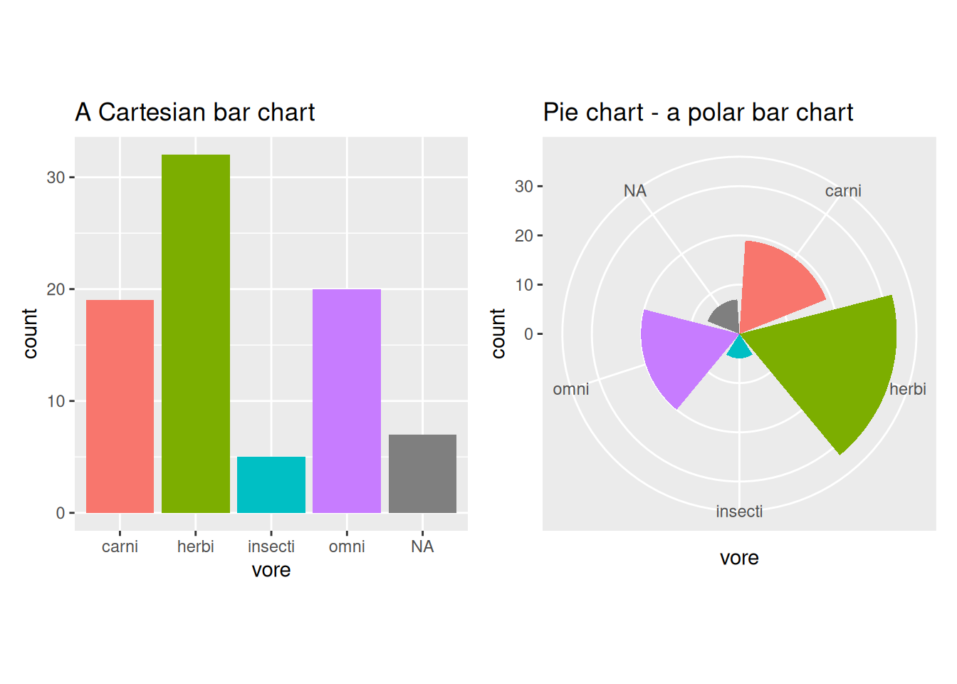
Figure 4.6: Bar charts vs. pie charts.
4.9 Visualising multiple variables
4.9.1 Scatterplot matrices
When we have a large enough number of numeric variables in our data, plotting scatterplots of all pairs of variables becomes tedious. Luckily there are some R functions that speed up this process.
The GGally package is an extension to ggplot2 which contains several functions for plotting multivariate data. They work similarly to the autoplot functions that we have used in previous sections. One of these is ggpairs, which creates a scatterplot matrix, a grid with scatterplots of all pairs of variables in data. In addition, it also plots density estimates (along the diagonal) and shows the (Pearson) correlation for each pair. Let’s start by installing GGally:
To create a scatterplot matrix for the airquality dataset, simply write:
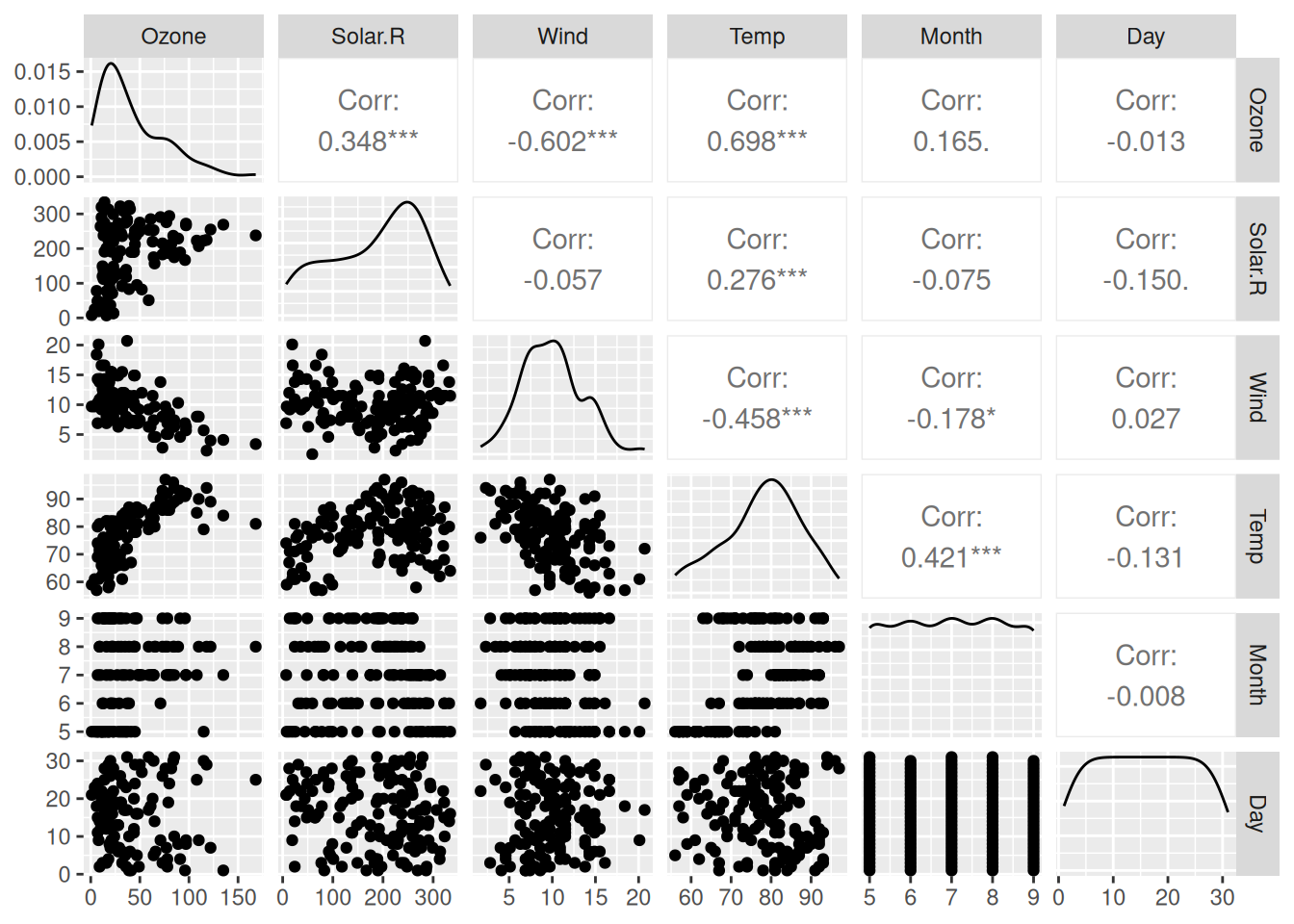
Figure 4.7: Scatterplot matrix for the airquality data.
(Enlarging your Plot window can make the figure look better.)
If we want to create a scatterplot matrix but only want to include some of the variables in a dataset, we can do so by providing a vector with variable names. Here is an example for the animal sleep data msleep.
Without pipes:
With pipes:
library(dplyr)
msleep |>
  select(sleep_total, sleep_rem, sleep_cycle, awake, brainwt, bodywt) |>
  ggpairs()
Optionally, if we wish to create a scatterplot involving all numeric variables, we can replace the vector with variable names with some R code that extracts the columns containing numeric variables:
Without pipes:
With pipes:
You’ll learn more about the sapply function in Section 6.5.
The resulting plot is identical to the previous one, because the list of names contained all numeric variables. The grab-all-numeric-variables approach is often convenient, because we don’t have to write all the variable names. On the other hand, it’s not very helpful in case we only want to include some of the numeric variables.
If we include a categorical variable in the list of variables (such as the feeding behaviour vore), the matrix will include a bar plot of the categorical variable as well as boxplots and facetted histograms to show differences between different categories in the continuous variables:
ggpairs(msleep[, c("vore", "sleep_total", "sleep_rem", "sleep_cycle",
                   "awake", "brainwt", "bodywt")])
Alternatively, we can use a categorical variable to colour points and density estimates using aes(colour = ...). The syntax for this follows the same pattern as that for a standard ggplot call - ggpairs(data, aes). The only exception is that if the categorical variable is not included in the data argument, we must specify which data frame it belongs to:
ggpairs(msleep[, c("sleep_total", "sleep_rem", "sleep_cycle", "awake",
                   "brainwt", "bodywt")],
        aes(colour = msleep$vore, alpha = 0.5))
As a side note, if all variables in your data frame are numeric, and if you only are looking for a quick-and-dirty scatterplot matrix without density estimates and correlations, you can also use the base R plot:
\[\sim\]
Exercise 4.18 Create a scatterplot matrix for all numeric variables in diamonds. Differentiate different cuts by colour. Add a suitable title to the plot. (diamonds is a fairly large dataset, and it may take a minute or so for R to create the plot.)
4.9.2 3D scatterplots
The plotly package lets us make three-dimensional scatterplots with the plot_ly function, which can be a useful alternative to scatterplot matrices in some cases. Here is an example using the airquality data:
Note that you can drag and rotate the plot, to see it from different angles.
4.9.3 Correlograms
Scatterplot matrices are not a good choice when we have too many variables, partially because the plot window needs to be very large to fit all variables and partially because it becomes difficult to get a good overview of the data. In such cases, a correlogram, where the strength of the correlation between each pair of variables is plotted instead of scatterplots, can be used instead. It is effectively a visualisation of the correlation matrix of the data, where the strengths and signs of the correlations are represented by different colours.
The GGally package contains the function ggcorr, which can be used to create a correlogram:
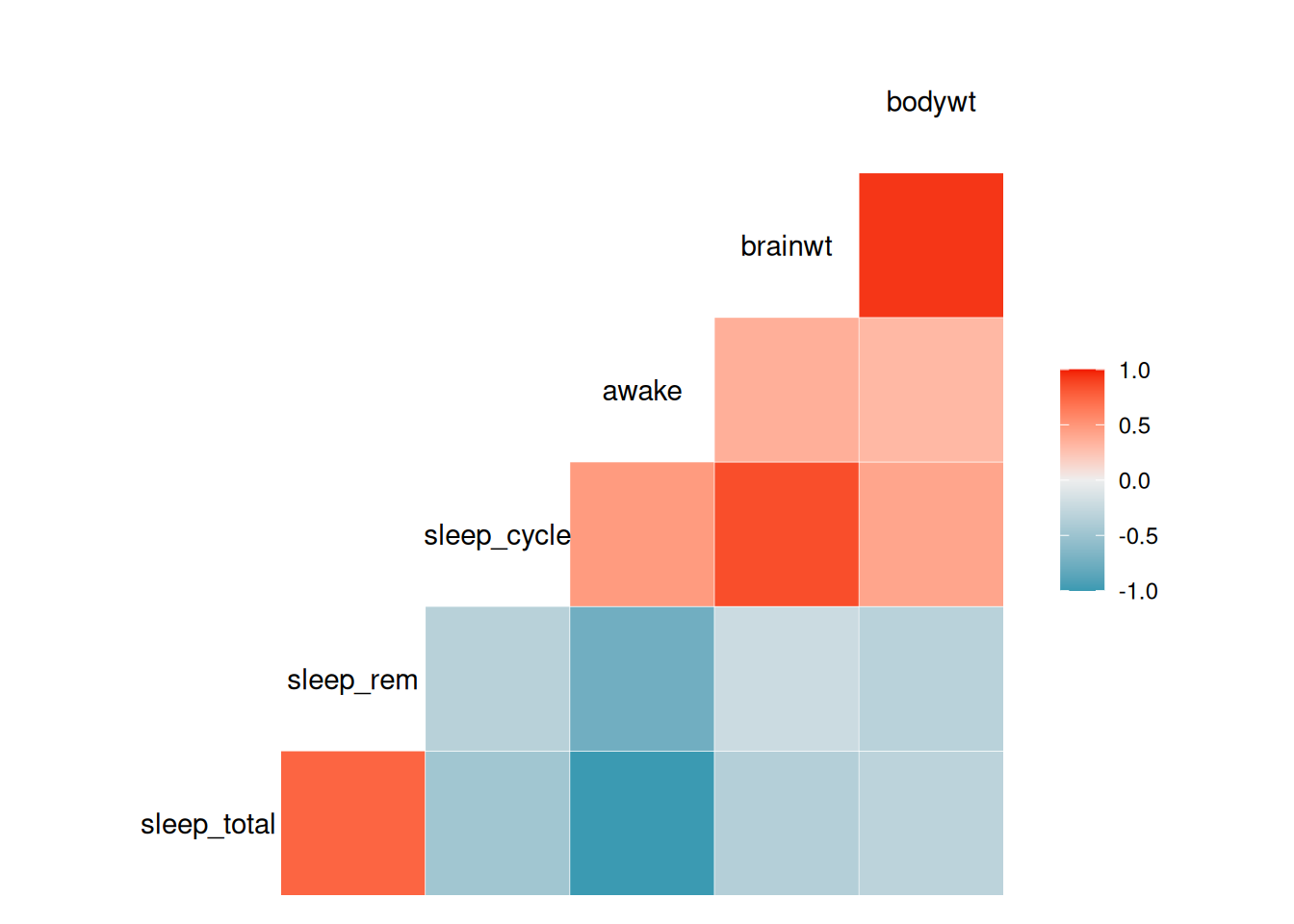
Figure 4.8: Correlogram for variables in the mammal sleep data.
\[\sim\]
Exercise 4.19 Using the diamonds dataset and the documentation for ggcorr, do the following:
Create a correlogram for all
numericvariables in the dataset.The Pearson correlation that
ggcorruses by default isn’t always the best choice. A commonly used alternative is the Spearman correlation. Change the type of correlation used to create the plot to the Spearman correlation.Change the colour scale from a categorical scale with five categories.
Change the colours on the scale to go from yellow (low correlation) to black (high correlation).
4.9.4 Adding more variables to scatterplots
We have already seen how scatterplots can be used to visualise two continuous and one categorical variable by plotting the two continuous variables against each other and using the categorical variable to set the colours of the points. There are, however, more ways we can incorporate information about additional variables into a scatterplot.
So far, we have set three aesthetics in our scatterplots: x, y, and colour. Two other important aesthetics are shape and size, which, as you’d expect, allow us to control the shape and size of the points. As a first example using the msleep data, we use feeding behaviour (vore) to set the shapes used for the points:
The plot looks a little nicer if we increase the size of the points:
Another option is to let size represent a continuous variable, in what is known as a bubble plot:
ggplot(msleep, aes(brainwt, sleep_total, colour = vore,
                   size = bodywt)) +
      geom_point() +
      scale_x_log10()
The size of each “bubble” now represents the weight of the animal. Because some animals are much heavier (i.e., have higher bodywt values) than most others, almost all points are quite small. There are a couple of things we can do to remedy this. First, we can transform bodywt, e.g., using the square root transformation sqrt(bodywt), to decrease the differences between large and small animals. This can be done by adding scale_size(trans = "sqrt") to the plot. Second, we can also use scale_size to control the range of point sizes (e.g., from size 1 to size 20). This will cause some points to overlap, so we add alpha = 0.5 to the geom, to make the points transparent:
ggplot(msleep, aes(brainwt, sleep_total, colour = vore,
                   size = bodywt)) +
      geom_point(alpha = 0.5) +
      scale_x_log10() +
      scale_size(range = c(1, 20), trans = "sqrt")
This produces a fairly nice-looking plot, but it’d look even better if we changed the axes labels and legend texts. We can change the legend text for the size scale by adding the argument name to labs. Including a \n in the text lets us create a line break – you’ll learn more tricks like that in Section 5.5.
ggplot(msleep, aes(brainwt, sleep_total, colour = vore,
                   size = bodywt)) +
      geom_point(alpha = 0.5) +
      labs(x = "Brain weight (logarithmic scale)",
           y = "Total sleep time",
           size = "Square root of\nbody weight",
           colour = "Feeding behaviour") +
      scale_x_log10() +
      scale_size(range = c(1, 20), trans = "sqrt")
\[\sim\]
Exercise 4.20 Using the bubble plot created above, do the following:
Replace
colour = vorein theaesbyfill = voreand addcolour = "black", shape = 21togeom_point. What happens?Use
ggplotlyto create an interactive version of the bubble plot above, where variable information and the animal name are displayed when you hover a point.
4.9.5 Overplotting
Let’s make a scatterplot of table versus depth based on the diamonds dataset:
This plot is cluttered. There are too many points, which makes it difficult to see if, for instance, high table values are more common than low table values. In this section, we’ll look at some ways to deal with this problem, known as overplotting.
The first thing we can try is to decrease the point size:
This helps a little, but now the outliers become a bit difficult to spot. We can try changing the opacity using alpha instead:
This is also better than the original plot, but neither plot is great. Instead of plotting each individual point, maybe we can try plotting the counts or densities in different regions of the plot instead? Effectively, this would be a two-dimensional version of a histogram. There are several ways of doing this in ggplot2.
First, we bin the points and count the numbers in each bin, using geom_bin2d:
By default, geom_bin2d uses 30 bins. Increasing that number can sometimes give us a better idea about the distribution of the data:
If you prefer, you can get a similar plot with hexagonal bins by using geom_hex instead:
As an alternative to bin counts, we could create a two-dimensional density estimate and create a contour plot showing the levels of the density:
ggplot(diamonds, aes(table, depth)) +
      stat_density_2d(aes(fill = ..level..), geom = "polygon",
                      colour = "white")
The fill = ..level.. bit above probably looks a little strange to you. It means that an internal function (the level of the contours) is used to choose the fill colours. It also means that we’ve reached a point where we’re reaching deep into the depths of ggplot2!
We can use a similar approach to show a summary statistic for a third variable in a plot. For instance, we may want to plot the average price as a function of table and depth. This is called a tile plot:
ggplot(diamonds, aes(table, depth, z = price)) +
     geom_tile(binwidth = 1, stat = "summary_2d", fun = mean) +
     ggtitle("Mean prices for diamonds with different depths and
             tables")
\[\sim\]
Exercise 4.21 The following tasks involve the diamonds dataset:
Create a tile plot of
tableversusdepth, showing the highest price for a diamond in each bin.Create a bin plot of
caratversusprice. What type of diamonds have the highest bin counts?
4.9.6 Categorical data
When visualising a pair of categorical variables, plots similar to those in the previous section prove to be useful. One way of doing this is to use the geom_count geom. We illustrate this with an example using diamonds, showing how common different combinations of colours and cuts are:
However, it is often better to use colour rather than point size to visualise counts, which we can do using a tile plot. First, we have to compute the counts though, using aggregate. We now wish to have two grouping variables, color and cut, which we can put on the right-hand side of the formula as follows:
diamonds2 is now a data frame containing the different combinations of color and cut along with counts of how many diamonds belong to each combination (labelled carat, because we put carat in our formula). Let’s change the name of the last column from carat to Count:
Next, we can plot the counts using geom_tile:
It is also possible to combine point size and colours:
\[\sim\]
Exercise 4.22 Using the diamonds dataset, do the following:
Use a plot to find out what the most common combination of cut and clarity is.
Use a plot to find out which combination of cut and clarity has the highest average price.
4.9.7 Putting it all together
In the next two exercises, you will repeat what you have learned so far by investigating the gapminder and planes datasets. First, load the corresponding libraries and have a look at the documentation for each dataset:
\[\sim\]
Exercise 4.23 Do the following using the gapminder dataset:
Create a scatterplot matrix showing life expectancy, population, and GDP per capita for all countries, using the data from the year 2007. Use colours to differentiate countries from different continents. Note: you’ll probably need to add the argument
upper = list(continuous = "na")when creating the scatterplot matrix. By default, correlations are shown above the diagonal, but the fact that there only are two countries from Oceania will cause a problem there – at least three points are needed for a correlation test.Create an interactive bubble plot, showing information about each country when you hover the points. Use data from the year 2007. Put log(GDP per capita) on the x-axis and life expectancy on the y-axis. Let population determine point size. Plot each country in a different colour and facet by continent. Tip: the
gapminderpackage provides a pretty colour scheme for different countries, calledcountry_colors. You can use that scheme by addingscale_colour_manual(values = country_colors)to your plot.
(Click here to go to the solution.)
Exercise 4.24 Use graphics to answer the following questions regarding the planes dataset:
What is the most common combination of manufacturer and plane type in the dataset?
Which combination of manufacturer and plane type has the highest average number of seats?
Do the numbers of seats on planes change over time? Which plane had the highest number of seats?
Does the type of engine used change over time?
4.10 Sankey diagrams
A Sankey diagram is a type of flow diagram used to show flows from one state to another. We’ll consider an example with data from a medical trial. Patients were recruited from four hospitals and assigned to one of two treatments: either surgery or physiotherapy. At the end of the study, they had either recovered or not. The data is in the surgphys.csv file, which can be downloaded from the book’s web page.
Set file_path to the path of surgphys.csv to load the data:
We’ll use the ggsankey package for creating the diagram, so let’s install that:
First, we need to reformat the data by pointing out the order of the different “states”. In this case, patients are first recruited at a hospital, then assigned a treatment, and then an outcome is observed. The make_long function from ggsankey formats the data to reflect this:
Next, we create a ggplot using the variables we just created, and add the geom_sankey geom:
ggplot(surgphys_sankey, aes(x = x,
                            next_x = next_x,
                            node = node,
                            next_node = next_node,
                            fill = factor(node),
                            label = node)) +
    geom_sankey()
To make this a little prettier, we can change some settings for geom_sankey, add labels with geom_sankey_label, and change the theme settings and colour palette:
ggplot(surgphys_sankey, aes(x = x,
                          next_x = next_x,
                          node = node,
                          next_node = next_node,
                          fill = factor(node),
                          label = node)) +
    geom_sankey(flow.alpha = 0.5,
                node.color = "black",
                show.legend = FALSE) +
    geom_sankey_label(size = 3,
                      colour = "black",
                      fill = "white",
                      hjust = -0.3) +
    theme_minimal() +
    theme(axis.title = element_blank(),
          axis.text.y = element_blank(),
          axis.ticks = element_blank(),
          panel.grid = element_blank()) +
    scale_fill_manual(values = c("darkorange", "skyblue",
                                 "forestgreen", "#00AFBB",
                                 "#E7B800", "#FC4E07",
                                 "deeppink", "purple"))
If we want to show the number of patients in each state, we can add counts to the data, and then add them to the node labels as follows (see Section 5.12 for an explanation of what right_join does):
library(dplyr)
surgphys_sankey |> group_by(node)|>
                   count() |>
                   right_join(surgphys_sankey, by = "node") -> surgphys_sankey

ggplot(surgphys_sankey, aes(x = x,
                          next_x = next_x,
                          node = node,
                          next_node = next_node,
                          fill = factor(node),
                          label = paste0(node," (n=", n, ")"))) +
    geom_sankey(flow.alpha = 0.5,
                node.color = "black",
                show.legend = FALSE) +
    geom_sankey_label(size = 3,
                      colour = "black",
                      fill = "white",
                      hjust = -0.15) +
    theme_minimal() +
    theme(axis.title = element_blank(),
          axis.text.y = element_blank(),
          axis.ticks = element_blank(),
          panel.grid = element_blank()) +
    scale_fill_manual(values = c("darkorange", "skyblue",
                                 "forestgreen", "#00AFBB",
                                 "#E7B800", "#FC4E07",
                                 "deeppink", "purple"))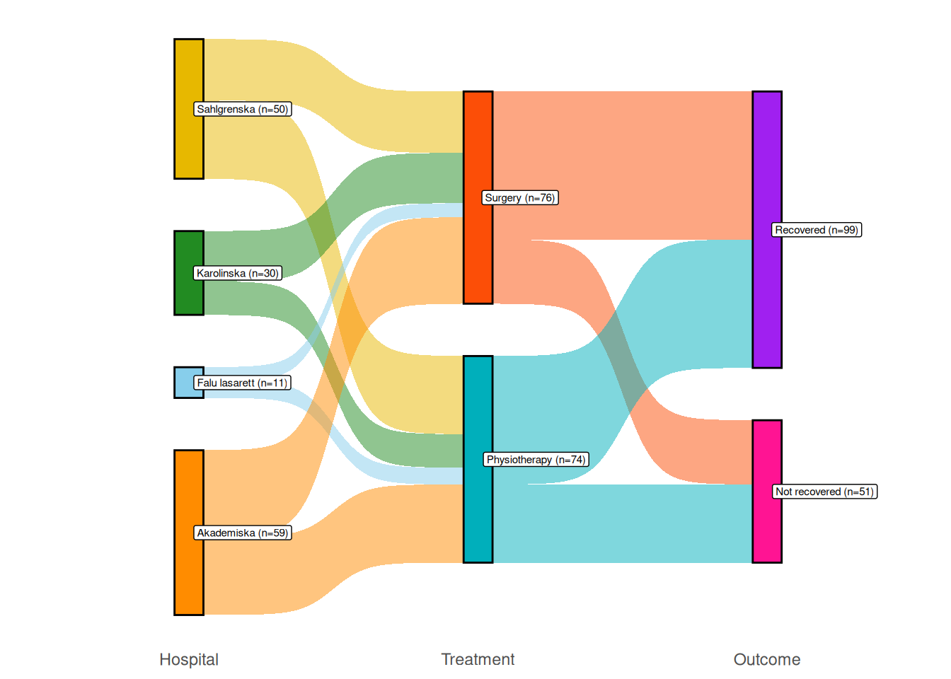
Figure 4.9: Sankey diagram comparing surgery and physiotherapy.
4.11 Principal component analysis
If there are many variables in your data, it can often be difficult to detect differences between groups or create a perspicuous visualisation. A useful tool in this context is principal component analysis (PCA), which can reduce high-dimensional data to a lower number of variables that can be visualised in one or two scatterplots. The idea is to compute new variables, called principal components, that are linear combinations of the original variables29. These are constructed with two goals in mind: the principal components should capture as much of the variance in the data as possible, and each principal component should be uncorrelated to the other components. You can then plot the principal components to get a low-dimensional representation of your data, which hopefully captures most of its variation.
By design, the number of principal components computed are as many as the original number of variables, with the first having the largest variance, the second having the second largest variance, and so on. We hope that it will suffice to use just the first few of these to represent most of the variation in the data, but this is not guaranteed. Principal component analysis is more likely to yield a useful result if several variables are correlated.
4.11.1 Running a principal component analysis
To illustrate the principles of PCA, we will use a dataset from Charytanowicz et al. (2010), containing measurements on wheat kernels for three varieties of wheat. A description of the variables is available at:
http://archive.ics.uci.edu/ml/datasets/seeds
We are interested to find out if these measurements can be used to distinguish between the varieties. The data is stored in a .txt file, which we import using read.table (which works just like read.csv, but is tailored to text files) and convert the Variety column to a categorical factor variable (which you’ll learn more about in Section 5.4):
# The data is downloaded from the UCI Machine Learning Repository:
# http://archive.ics.uci.edu/ml/datasets/seeds
seeds <- read.table("https://tinyurl.com/seedsdata",
        col.names = c("Area", "Perimeter", "Compactness",
         "Kernel_length", "Kernel_width", "Asymmetry",
         "Groove_length", "Variety"))
seeds$Variety <- factor(seeds$Variety)
If we make a scatterplot matrix of all variables, it becomes evident that there are differences between the varieties, but that no single pair of variables is enough to separate them:
Moreover, for presentation purposes, the amount of information in the scatterplot matrix is a bit overwhelming. It would be nice to be able to present the data in a single scatterplot, without losing too much information. We’ll therefore compute the principal components using the prcomp function. It is usually recommended that PCA is performed using standardised data, i.e., using data that has been scaled to have mean 0 and standard deviation 1. The reason for this is that it puts all variables on the same scale. If we don’t standardise our data, then variables with a high variance will completely dominate the principal components. This isn’t desirable, as variance is affected by the scale of the measurements, meaning that the choice of measurement scale would influence the results (as an example, the variance of kernel length will be a million times greater if lengths are measured in millimetres instead of in metres).
We don’t have to standardise the data ourselves, but can let prcomp do that for us using the arguments center = TRUE (to get mean 0) and scale. = TRUE (to get standard deviation 1):
To see the loadings of the components, i.e., how much each variable contributes to the components, simply type the name of the object prcomp created:
The first principal component is more or less a weighted average of all variables but has stronger weights on Area, Perimeter, Kernel_length, Kernel_width, and Groove_length, all of which are measures of size. We can therefore interpret it as a size variable. The second component has higher loadings for Compactness and Asymmetry, meaning that it mainly measures those shape features. In Exercise 4.26 you’ll see how the loadings can be visualised in a biplot.
4.11.2 Choosing the number of components
To see how much of the variance each component represents, use summary:
The first principal component accounts for 71.87% of the variance, and the first three combined account for 98.67%.
To visualise this, we can draw a scree plot, which shows the variance of each principal component – the total variance of the data is the sum of the variances of the principal components:
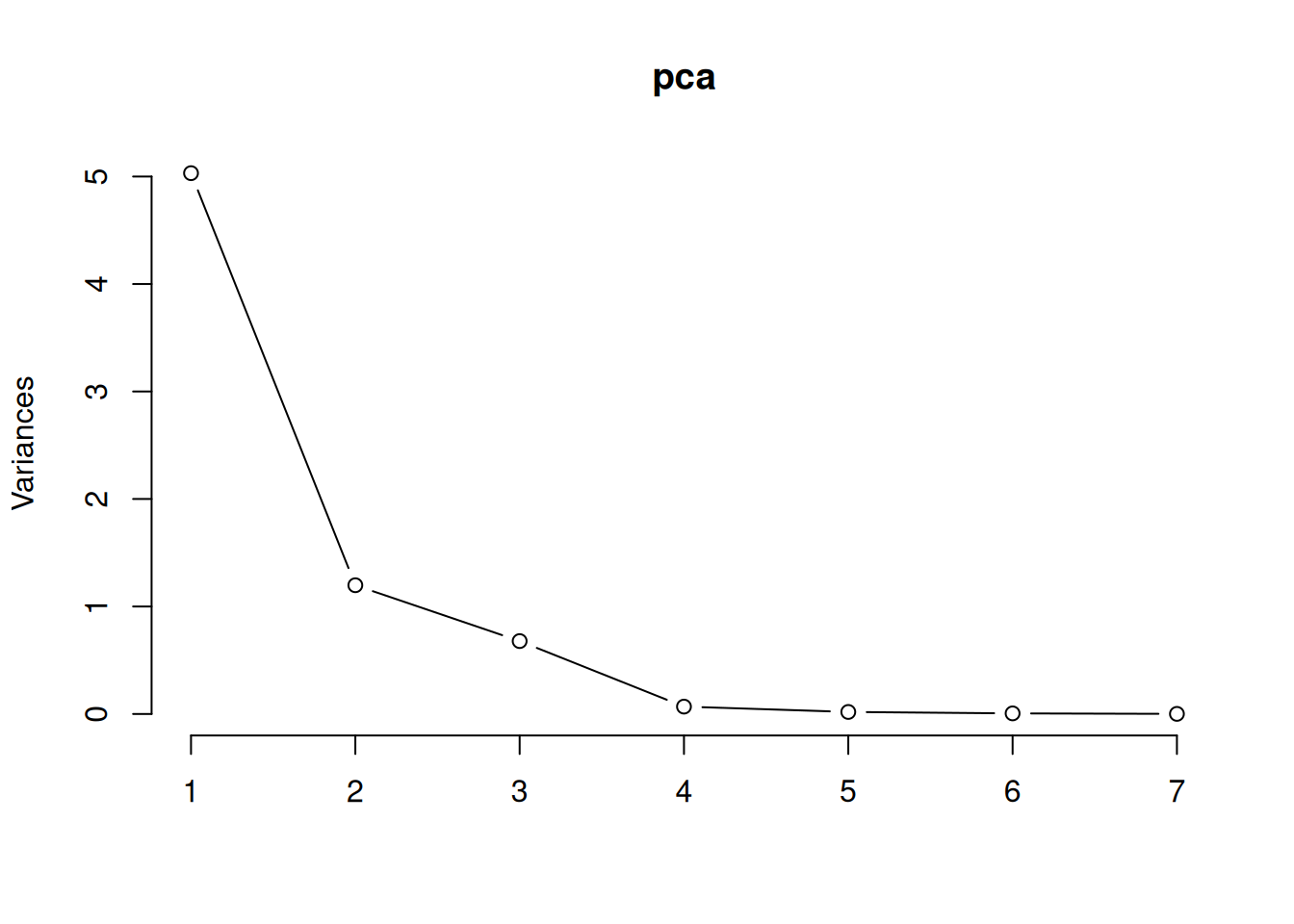
Figure 4.10: Screeplot for principal component analysis.
We can use this to choose how many principal components to use when visualising or summarising our data. In that case, we look for an “elbow”, i.e., a bend in the curve after which increasing the number of components doesn’t increase the amount of variance explained much. In this case, we see an “elbow” somewhere between two and four components.
4.11.3 Plotting the results
We can access the values of the principal components using pca$x. Let’s check that the first two components really are uncorrelated:
In this case, almost all of the variance is summarised by the first two or three principal components. It appears that we have successfully reduced the data from seven variables to between two and three, which should make visualisation much easier. The ggfortify package contains an autoplot function for PCA objects that creates a scatterplot of the first two principal components:
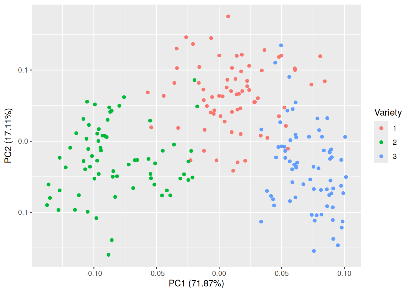
Figure 4.11: Plot of the first two principal components for the seeds data.
That is much better! The groups are almost completely separated, which shows that the variables can be used to discriminate between the three varieties. The first principal component accounts for 71.87% of the total variance in the data, and the second for 17.11%.
If you like, you can plot other pairs of principal components than just components 1 and 2. In this case, component 3 may be of interest, as its variance is almost as high as that of component 2. You can specify which components to plot with the x and y arguments:
Here, the separation is nowhere near as clear as in the previous figure. In this particular example, plotting the first two principal components is the better choice.
Judging from these plots, it appears that the kernel measurements can be used to discriminate between the three varieties of wheat. In Chapters 7 and 11 you’ll learn how to use R to build models that can be used to do just that, e.g., by predicting which variety of wheat a kernel comes from given its measurements. If we wanted to build a statistical model that could be used for this purpose, we could use the original measurements. But we could also try using the first two principal components as the only input to the model. Principal component analysis is very useful as a pre-processing tool used to create simpler models based on fewer variables (or ostensibly simpler, because the new variables are typically more difficult to interpret than the original ones).
\[\sim\]
Exercise 4.25 Use principal components on the carat, x, y, z, depth, and table variables in the diamonds data, and answer the following questions:
How much of the total variance does the first principal component account for? How many components are needed to account for at least 90% of the total variance?
Judging by the loadings, what do the first two principal components measure?
What is the correlation between the first principal component and
price?Can the first two principal components be used to distinguish between diamonds with different cuts?
(Click here to go to the solution.)
Exercise 4.26 Return to the scatterplot of the first two principal components for the seeds data created above. Adding the arguments loadings = TRUE and loadings.label = TRUE to the autoplot call creates a biplot, which shows the loadings for the principal components on top of the scatterplot. Create a biplot and compare the result to those obtained by looking at the loadings numerically. Do the conclusions from the two approaches agree?
4.12 Cluster analysis
Cluster analysis is concerned with grouping observations into groups, clusters, that in some sense are similar. Numerous methods are available for this task, approaching the problem from different angles. Many of these are available in the cluster package, which ships with R. In this section, we’ll look at a smorgasbord of clustering techniques.
4.12.1 Hierarchical clustering
As a first example where clustering can be of interest, we’ll consider the votes.repub data from cluster. It describes the proportion of votes for the Republican candidate in US presidential elections from 1856 to 1976 in 50 different states:
We are interested in finding subgroups – clusters – of states with similar voting patterns.
To find clusters of similar observations (states, in this case), we could start by assigning each observation to its own cluster. We’d then start with 50 clusters, one for each observation. Next, we could merge the two clusters that are the most similar, yielding 49 clusters, one of which consisted of two observations and 48 consisting of a single observation. We could repeat this process, merging the two most similar clusters in each iteration until only a single cluster was left. This would give us a hierarchy of clusters, which could be plotted in a tree-like structure, where observations from the same cluster would be shown one the same branch. Like this:
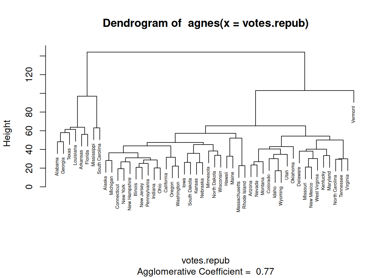
Figure 4.12: Dendrogram for hierarchical clustering.
This type of plot is known as a dendrogram.
We’ve just used agnes, a function from cluster that can be used to carry out hierarchical clustering in the manner described above. There are a couple of things that need to be clarified, though.
First, how do we measure how similar two \(p\)-dimensional observations \(x\) and \(y\) are? agnes provides two measures of distance between points:
metric = "euclidean"(the default), uses the Euclidean \(L_2\) distance \(||x-y||=\sqrt{\sum_{i=1}^p(x_i-y_i)^2}\),metric = "manhattan", uses the Manhattan \(L_1\) distance \(||x-y||={\sum_{i=1}^p|x_i-y_i|}\).
Note that neither of these work if you have categorical variables in your data. If all your variables are binary, i.e., categorical with two values, you can use mona instead of agnes for hierarchical clustering.
Second, how do we measure how similar two clusters of observations are? agnes offers a number of options here. Among them are:
method = "average"(the default), unweighted average linkage, uses the average distance between points from the two clusters,method = "single", single linkage, uses the smallest distance between points from the two clusters,method = "complete", complete linkage, uses the largest distance between points from the two clusters,method = "ward", Ward’s method, uses the within-cluster variance to compare different possible clusterings, with the clustering with the lowest within-cluster variance chosen.
Regardless of which of these you use, it is often a good idea to standardise the numeric variables in your dataset so that they all have the same variance. If you don’t, your distance measure is likely to be dominated by variables with larger variance, while variables with low variances will have little or no impact on the clustering. To standardise your data, you can use scale:
# Perform clustering on standardised data:
clusters_agnes <- agnes(scale(votes.repub))
# Plot dendrogram:
plot(clusters_agnes, which = 2)
At this point, we’re starting to use several functions one after another, and so this looks like a perfect job for a pipeline. To carry out the same analysis using the |> pipe, we write:
We can now try changing the metric and clustering method used as described above. Let’s use the Manhattan distance and complete linkage:
We can change the look of the dendrogram by adding hang = -1, which causes all observations to be placed at the same level:
votes.repub |> scale() |>
               agnes(metric = "manhattan", method = "complete") |>
               plot(which = 2, hang = -1)
As an alternative to agnes, we can consider diana. agnes is an agglomerative method, which starts with a lot of clusters and then merge them step-by-step. diana, in contrast, is a divisive method, which starts with one large cluster and then step-by-step splits it into several smaller clusters.
You can change the distance measure used by setting metric in the diana call. Euclidean distance is the default.
To wrap this section up, we’ll look at two packages that are useful for plotting the results of hierarchical clustering: dendextend and factoextra. We installed factoextra in the previous sectio, but still need to install dendextend:
To compare the dendrograms produced by different methods (or the same method with different settings), in a tanglegram, where the dendrograms are plotted against each other, we can use tanglegram from dendextend:
library(dendextend)
# Create clusters using agnes:
votes.repub |> scale() |>
               agnes() -> clusters_agnes
# Create clusters using diana:
votes.repub |> scale() |>
               diana() -> clusters_diana

# Compare the results:
tanglegram(as.dendrogram(clusters_agnes),
           as.dendrogram(clusters_diana))
Some clusters are quite similar here, whereas others are very different.
Often, we are interested in finding a comparatively small number of clusters, \(k\). In hierarchical clustering, we can reduce the number of clusters by “cutting” the dendrogram tree. To do so using the factoextra package, we first use hcut to cut the tree into \(k\) parts, and then fviz_dend to plot the dendrogram, with each cluster plotted in a different colour. If, for instance, we want \(k=5\) clusters30 and want to use agnes with average linkage and Euclidean distance for the clustering, we’d do the following:
library(factoextra)
votes.repub |> scale() |>
               hcut(k = 5, hc_func = "agnes",
                    hc_method = "average",
                    hc_metric = "euclidean") |>
               fviz_dend()
There is no inherent meaning to the colours – they are simply a way to visually distinguish between clusters.
Hierarchical clustering is especially suitable for data with named observations. For other types of data, other methods may be better. We will consider some alternatives next.
\[\sim\]
Exercise 4.27 Continue the last example above by changing the clustering method to complete linkage with the Manhattan distance.
Do any of the five coloured clusters remain the same?
How can you produce a tanglegram with five coloured clusters, to better compare the results from the two clusterings?
(Click here to go to the solution.)
Exercise 4.28 The USArrests data contains statistics on violent crime rates in 50 US states. Perform a hierarchical cluster analysis of the data. With which states is Maryland clustered?
4.12.2 Heatmaps and clustering variables
When looking at a dendrogram, you may ask why and how different observations are similar. Similarities between observations can be visualised using a heatmap, which displays the levels of different variables using colour hues or intensities. The heatmap function creates a heatmap from a matrix object. Let’s try it with the votes.repub voting data. Because votes.repub is a data.frame object, we have to convert it to a matrix with as.matrix first (see Section 2.10.2):
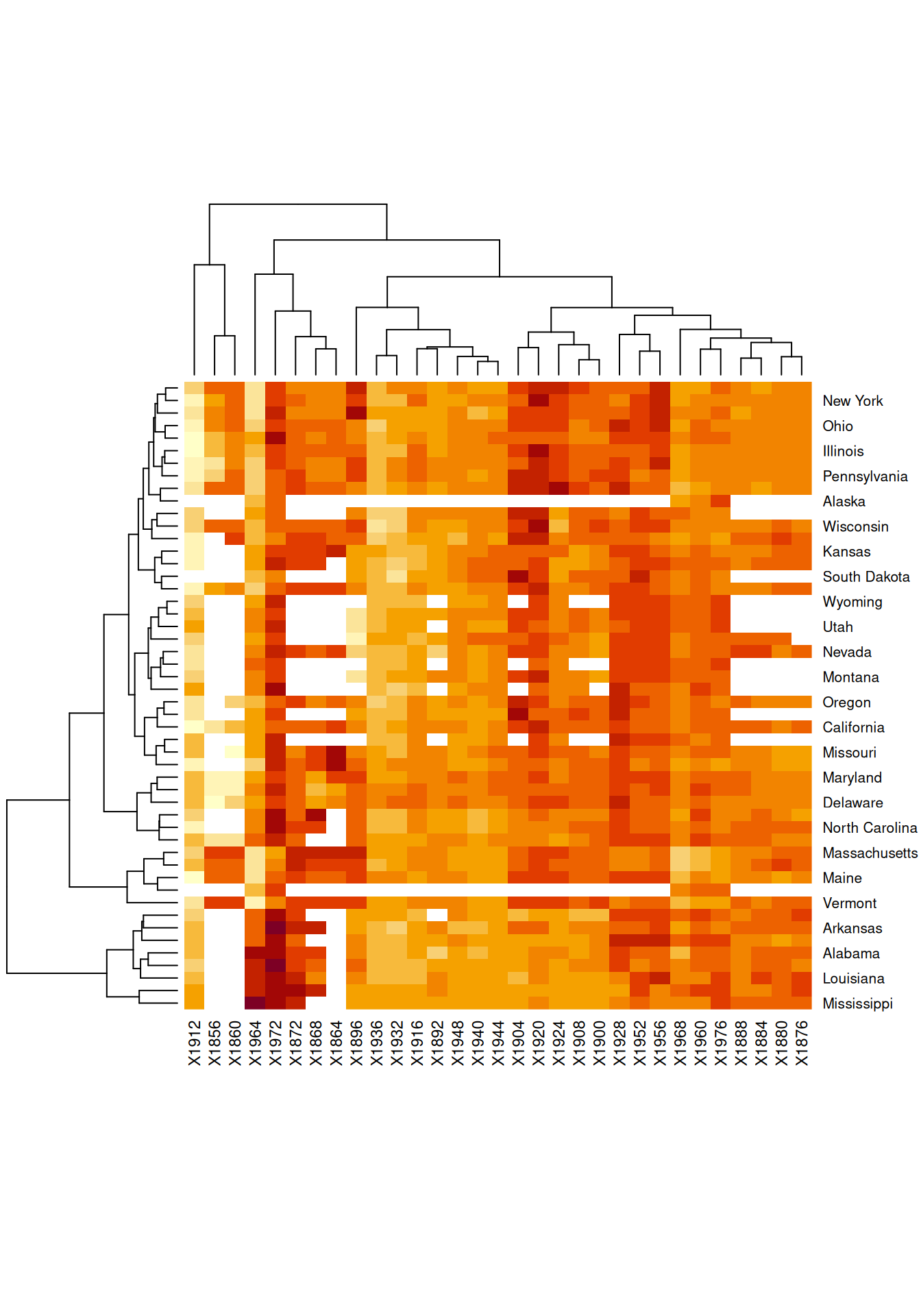
Figure 4.13: Heatmap showing similarities between observations.
You may want to increase the height of your Plot window so that the names of all states are displayed properly. Using the default colours, low values are represented by a light yellow and high values by a dark red. White represents missing values.
You’ll notice that dendrograms are plotted along the margins. heatmap performs hierarchical clustering (by default, agglomerative with complete linkage) of the observations as well as of the variables. In the latter case, variables are grouped together based on similarities between observations, creating clusters of variables. In essence, this is just a hierarchical clustering of the transposed data matrix, but it does offer a different view of the data, which at times can be very revealing. The rows and columns are sorted according to the two hierarchical clusterings.
As per usual, it is a good idea to standardise the data before clustering, which can be done using the scale argument in heatmap. There are two options for scaling, either in the row direction (preferable if you wish to cluster variables) or the column direction (preferable if you wish to cluster observations):
# Standardisation suitable for clustering variables:
votes.repub |> as.matrix() |> heatmap(scale = "row")

# Standardisation suitable for clustering observations:
votes.repub |> as.matrix() |> heatmap(scale = "col")
Looking at the first of these plots, we can see which elections (i.e., which variables) had similar outcomes in terms of Republican votes. For instance, we can see that the elections in 1960, 1976, 1888, 1884, 1880, and 1876 all had similar outcomes, with the large number of orange rows indicating that the Republicans neither did great nor did poorly.
If you like, you can change the colour palette used. As in Section 4.2.4, you can choose between palettes from http://www.colorbrewer2.org. heatmap is not a ggplot2 function, so this is done in a slightly different way than what you’re used to from other examples. Here are two examples, with the white-blue-purple sequential palette "BuPu" and the red-white-blue diverging palette "RdBu":
library(RColorBrewer)
col_palette <- colorRampPalette(brewer.pal(8, "BuPu"))(25)
votes.repub |> as.matrix() |>
    heatmap(scale = "row", col = col_palette)

col_palette <- colorRampPalette(brewer.pal(8, "RdBu"))(25)
votes.repub |> as.matrix() |>
    heatmap(scale = "row", col = col_palette)
\[\sim\]
Exercise 4.29 Draw a heatmap for the USArrests data. Have a look at Maryland and the states with which it is clustered. Do they have high or low crime rates?
4.12.3 Centroid-based clustering
Let’s return to the seeds data that we explored in Section 4.11:
# Download the data:
seeds <- read.table("https://tinyurl.com/seedsdata",
         col.names = c("Area", "Perimeter", "Compactness",
          "Kernel_length", "Kernel_width", "Asymmetry",
          "Groove_length", "Variety"))
seeds$Variety <- factor(seeds$Variety)
We know that there are three varieties of seeds in this dataset, but what if we didn’t? Or what if we’d lost the labels and didn’t know what seeds are of what type? There are no row names for this data, and plotting a dendrogram may therefore not be that useful. Instead, we can use \(k\)-means clustering, where the points are clustered into \(k\) clusters based on their distances to the cluster means, or centroids.
When performing \(k\)-means clustering (using the algorithm of Hartigan & Wong (1979) that is the default in the function that we’ll use), the data is split into \(k\) clusters based on their distance to the mean of all points. Points are then moved between clusters, one at a time, based on how close they are (as measured by Euclidean distance) to the mean of each cluster. The algorithm finishes when no point can be moved between clusters without increasing the average distance between points and the means of their clusters.
To run a \(k\)-means clustering in R, we can use kmeans. Let’s start by using \(k=3\) clusters:
# First, we standardise the data, and then we do a k-means
# clustering.
# We ignore variable 8, Variety, which is the group label.
seeds[, -8] |> scale() |>
               kmeans(centers = 3) -> seeds_cluster

seeds_cluster
To visualise the results, we’ll plot the first two principal components. We’ll use colour to show the clusters. Moreover, we’ll plot the different varieties in different shapes to see if the clusters found correspond to different varieties:
# Compute principal components:
pca <- prcomp(seeds[,-8])
library(ggfortify)
autoplot(pca, data = seeds, colour = seeds_cluster$cluster,
         shape = "Variety", size = 2, alpha = 0.75)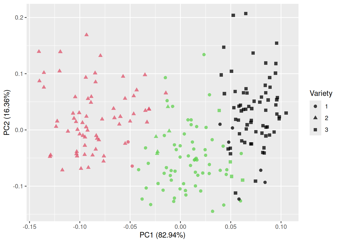
Figure 4.14: Clustering using k-means.
In this case, the clusters more or less overlap with the varieties! Of course, in a lot of cases, we don’t know the number of clusters beforehand. What happens if we change \(k\)?
First, we try \(k=2\):
seeds[, -8] |> scale() |>
                kmeans(centers = 2) -> seeds_cluster
autoplot(pca, data = seeds, colour = seeds_cluster$cluster,
         shape = "Variety", size = 2, alpha = 0.75)
Next, \(k=4\):
seeds[, -8] |> scale() |>
                kmeans(centers = 4) -> seeds_cluster
autoplot(pca, data = seeds, colour = seeds_cluster$cluster,
         shape = "Variety", size = 2, alpha = 0.75)
And finally, a larger number of clusters, say \(k=12\):
seeds[, -8] |> scale() |>
                kmeans(centers = 12) -> seeds_cluster
autoplot(pca, data = seeds, colour = seeds_cluster$cluster,
         shape = "Variety", size = 2, alpha = 0.75)
If it weren’t for the fact that the different varieties were shown as different shapes, we’d have no way to say, based on this plot alone, which choice of \(k\) is preferable here. Before we go into methods for choosing \(k\) though, we’ll mention pam. pam is an alternative to \(k\)-means that works in the same way but uses median-like points, medoids instead of cluster means. This makes it more robust to outliers. Let’s try it with \(k=3\) clusters:
seeds[, -8] |> scale() |>
                pam(k = 3) -> seeds_cluster
autoplot(pca, data = seeds, colour = seeds_cluster$clustering,
         shape = "Variety", size = 2, alpha = 0.75)
For both kmeans and pam, there are visual tools that can help us choose the value of \(k\) in the factoextra package. Let’s install it:
The fviz_nbclust function in factoextra can be used to obtain plots that can guide the choice of \(k\). It takes three arguments as input: the data, the clustering function (e.g., kmeans or pam) and the method used for evaluating different choices of \(k\). There are three options for the latter: "wss", "silhouette" and "gap_stat".
method = "wss" yields a plot that relies on the within-cluster sum of squares, WSS, which is a measure of the within-cluster variation. The smaller this is, the more compact are the clusters. The WSS is plotted for several choices of \(k\), and we look for an “elbow”, just as we did when using a scree plot for PCA. That is, we look for the value of \(k\) such that increasing \(k\) further doesn’t improve the WSS much. Let’s have a look at an example, using pam for clustering:
library(factoextra)
fviz_nbclust(scale(seeds[, -8]), pam, method = "wss")

# Or, using a pipeline instead:
seeds[, -8] |> scale() |>
               fviz_nbclust(pam, method = "wss")
\(k=3\) seems like a good choice here.
method = "silhouette" produces a silhouette plot. The silhouette value measures how similar a point is compared to other points in its cluster. The closer to 1 this value is, the better. In a silhouette plot, the average silhouette value for points in the data are plotted against \(k\):
Judging by this plot, \(k=2\) appears to be the best choice.
Finally, method = "gap_stat" yields a plot of the gap statistic (Tibshirani et al., 2001), which is based on comparing the WSS to its expected value under a null distribution obtained using the bootstrap (Section 7.4). Higher values of the gap statistic are preferable:
In this case, \(k=3\) gives the best value.
In addition to plots for choosing \(k\), factoextra provides the function fviz_cluster for creating PCA-based plots, with an option to add convex hulls or ellipses around the clusters:
# First, find the clusters:
seeds[, -8] |> scale() |>
               kmeans(centers = 3) -> seeds_cluster

# Plot clusters and their convex hulls:
library(factoextra)
fviz_cluster(seeds_cluster, data = seeds[, -8])

# Without row numbers:
fviz_cluster(seeds_cluster, data = seeds[, -8], geom = "point")

# With ellipses based on the multivariate normal distribution:
fviz_cluster(seeds_cluster, data = seeds[, -8],
             geom = "point", ellipse.type = "norm")
Note that in this plot, the shapes correspond to the clusters and not the varieties of seeds.
\[\sim\]
Exercise 4.30 The chorSub data from cluster contains measurements of 10 chemicals in 61 geological samples from the Kola Peninsula. Cluster this data using either kmeans or pam (does either seem to be a better choice here?). What is a good choice of \(k\) here? Visualise the results.
4.12.4 Fuzzy clustering
An alternative to \(k\)-means clustering is fuzzy clustering, in which each point is “spread out” over the \(k\) clusters instead of being placed in a single cluster. The more similar it is to other observations in a cluster, the higher is its membership in that cluster. Points can have a high degree of membership to several clusters, which is useful in applications where points should be allowed to belong to more than one cluster. An important example is genetics, where genes can encode proteins with more than one function. If each point corresponds to a gene, it then makes sense to allow the points to belong to several clusters, potentially associated with different functions. The opposite of fuzzy clustering is hard clustering, in which each point only belongs to one cluster.
fanny from cluster can be used to perform fuzzy clustering:
library(cluster)
seeds[, -8] |> scale() |>
               fanny(k = 3) -> seeds_cluster

# Check membership of each cluster for the different points:
seeds_cluster$membership

# Plot the closest hard clustering:
library(factoextra)
fviz_cluster(seeds_cluster, geom = "point")
As for kmeans and pam, we can use fviz_nbclust to determine how many clusters to use:
seeds[, -8] |> scale() |>
               fviz_nbclust(fanny, method = "wss")
seeds[, -8] |> scale() |>
               fviz_nbclust(fanny, method = "silhouette")
# Producing the gap statistic plot takes a while here, so
# you may want to skip it in this case:
seeds[, -8] |> scale() |>
               fviz_nbclust(fanny, method = "gap")
\[\sim\]
Exercise 4.31 Do a fuzzy clustering of the USArrests data. Is Maryland strongly associated with a single cluster, or with several clusters? What about New Jersey?
4.12.5 Model-based clustering
As a last option, we’ll consider model-based clustering, in which each cluster is assumed to come from a multivariate normal distribution. This will yield ellipsoidal clusters. Mclust from the mclust package fits such a model, called a Gaussian finite mixture model, using the EM-algorithm (Scrucca et al., 2016). First, let’s install the package:
Now, let’s cluster the seeds data. The number of clusters is chosen as part of the clustering procedure. We’ll use a function from the factoextra for plotting the clusters with ellipsoids.
library(mclust)
seeds_cluster <- Mclust(scale(seeds[, -8]))
summary(seeds_cluster)

# Plot results with ellipsoids:
library(factoextra)
fviz_cluster(seeds_cluster, geom = "point", ellipse.type = "norm")
Gaussian finite mixture models are based on the assumption that the data is numerical. For categorical data, we can use latent class analysis, which we’ll discuss in Section 10.1.3, instead.
\[\sim\]
Exercise 4.32 Return to the chorSub data from Exercise 4.30. Cluster it using a Gaussian finite mixture model. How many clusters do you find?
4.12.6 Comparing clusters
Having found some interesting clusters, we are often interested in exploring differences between the clusters. To do so, we must first extract the cluster labels from our clustering (which are contained in the variables clustering for methods with Western female names, cluster for kmeans, and classification for Mclust). We can then add those labels to our data frame and use them when plotting.
For instance, using the seeds data, we can compare the area of seeds from different clusters:
# Cluster the seeds using k-means with k=3:
library(cluster)
seeds[, -8] |> scale() |>
               kmeans(centers = 3) -> seeds_cluster

# Add the results to the data frame:
seeds$clusters <- factor(seeds_cluster$cluster)
# Instead of $cluster, we'd use $clustering for agnes, pam, and fanny
# objects, and $classification for an Mclust object.

# Compare the areas of the 3 clusters using boxplots:
library(ggplot2)
ggplot(seeds, aes(x = Area, group = clusters, fill = clusters)) +
      geom_boxplot()

# Or using density estimates:
ggplot(seeds, aes(x = Area, group = clusters, fill = clusters)) +
      geom_density(alpha = 0.7)
We can also create a scatterplot matrix to look at all variables simultaneously:
It may be tempting to run some statistical tests (e.g., a t-test) to see if there are differences between the clusters. Note, however, that in statistical hypothesis testing, it is typically assumed that the hypotheses that are being tested have been generated independently from the data. Double-dipping, where the data first is used to generate a hypothesis (“judging from this boxplot, there seems to be a difference in means between these two groups!” or “I found these clusters, and now I’ll run a test to see if they are different”) and then test that hypothesis, is generally frowned upon, as that substantially inflates the risk of a type I error. Recently, however, there have been some advances in valid techniques for testing differences in means between clusters found using hierarchical clustering; see Gao et al. (2020).
See
?theme_greyfor a list of available themes.↩︎LOESS, LOcally Estimated Scatterplot Smoothing, is a nonparametric regression method that fits a polynomial to local areas of the data.↩︎
GAM, Generalised Additive Model, is a generalised linear model where the response variable is a linear function of smooth functions of the predictors.↩︎
Time series objects are a special class of vectors, with data sampled at equispaced points in time. Each observation can have a year/date/time associated with it.↩︎
Florence Nightingale, who famously pioneered the use of the pie chart, drew her pie charts this way.↩︎
A linear combination is a weighted sum of the form \(a_1x_1+a_2x_2+\cdots+a_px_p\). If you like, you can think of principal components as weighted averages of variables, computed for each row in your data.↩︎
Just to be clear, 5 is just an arbitrary number here. We could of course want 4, 14, or any other number of clusters.↩︎