8 Regression models
Regression models, in which explanatory variables are used to model the behaviour of a response variable, are without a doubt the most commonly used class of models in the statistical toolbox. In this chapter, we will have a look at different types of regression models tailored to many different sorts of data and applications.
After reading this chapter, you will be able to use R to:
- Fit and evaluate linear models, including linear regression and ANOVA,
- Fit and evaluate generalised linear models, including logistic regression and Poisson regression,
- Use multiple imputation to handle missing data,
- Fit and evaluate mixed models, and
- Create matched samples.
8.1 Linear models
Being flexible enough to handle different types of data, yet simple enough to be useful and interpretable, linear models are among the most important tools in the statistics toolbox. In this section, we’ll discuss how to fit and evaluate linear models in R.
Linear regression is used to model the relationship between two or more variables, where one variable is called the response variable (or outcome, or dependent variable), and the other variables are called the explanatory variables (or predictors, independent variables, features, or covariates). The goal of linear regression is to find the best linear relationship between the response variable and the explanatory variables, which can then be used to make predictions or infer the strength and direction of the relationship between the variables.
In a simple linear regression, where there is a single explanatory variable, the relationship between the response variable and the explanatory variable is modelled as a straight line. The equation for this line is represented as
\[y=\beta_0+\beta_1x,\] where
- \(y\) is the response variable,
- \(x\) is the explanatory variable,
- \(\beta_1\) is the slope of the line, describing how much \(y\) changes when \(x\) changes one unit, and
- \(\beta_0\) is the intercept; the value \(y\) attains when \(x=0\).
To find the best fit line, the least squares method is used, which involves finding the line that minimizes the sum of squared differences between the observed values and the fitted line. This yields fitted, or estimated, values of \(\beta_0\) and \(\beta_1\).
Multiple linear regression is an extension of simple linear regression, where there are multiple explanatory variables. The equation for the multiple linear regression model is represented as
\[y=\beta_0+\beta_1x_1+\beta_2x_2+\ldots+\beta_px_p,\] where
- \(y\) is the response variable,
- \(x_i\) are the \(p\) explanatory variables,
- \(\beta_i\) are the coefficients or the slopes of the lines, and
- \(\beta_0\) is the intercept; the value \(y\) attains when all \(x_i=0\).
Even if the relationship described by the linear regression formula is true, observations of \(y\) will deviate from the line due to random variation. To formally state the model, we need to include these random errors. Given \(n\) observations of \(p\) explanatory variables and the response variable \(y\), the linear model is:
\[y_i=\beta_0 +\beta_1 x_{i1}+\beta_2 x_{i2}+\cdots+\beta_p x_{ip} + \epsilon_i,\qquad i=1,\ldots,n\] where the \(\epsilon_i\) are independent random errors with mean 0, meaning that the model also can be written as:
\[E(y_i)=\beta_0 +\beta_1 x_{i1}+\beta_2 x_{i2}+\cdots+\beta_p x_{ip},\qquad i=1,\ldots,n\]
8.1.1 Fitting linear models
The mtcars data from Henderson and Velleman (1981) has become one of the classic datasets in R, and a part of the initiation rite for new R users is to use the mtcars data to fit a linear regression model. The data describes fuel consumption, number of cylinders, and other information about cars from the 1970s:
Let’s have a look at the relationship between gross horsepower (hp) and fuel consumption (mpg) in the mtcars data:
The relationship doesn’t appear to be perfectly linear; nevertheless, we can try fitting a linear regression model to the data. This can be done using lm. We fit a model with mpg as the response variable and hp as the explanatory variable as follows:
The first argument is a formula, saying that mpg is a function of hp, i.e.,
\[mpg=\beta_0 +\beta_1 \cdot hp.\]
A summary of the model is obtained using summary:
##
## Call:
## lm(formula = mpg ~ hp, data = mtcars)
##
## Residuals:
## Min 1Q Median 3Q Max
## -5.7121 -2.1122 -0.8854 1.5819 8.2360
##
## Coefficients:
## Estimate Std. Error t value Pr(>|t|)
## (Intercept) 30.09886 1.63392 18.421 < 0.0000000000000002 ***
## hp -0.06823 0.01012 -6.742 0.000000179 ***
## ---
## Signif. codes: 0 '***' 0.001 '**' 0.01 '*' 0.05 '.' 0.1 ' ' 1
##
## Residual standard error: 3.863 on 30 degrees of freedom
## Multiple R-squared: 0.6024, Adjusted R-squared: 0.5892
## F-statistic: 45.46 on 1 and 30 DF, p-value: 0.0000001788The summary contains a lot of information about the model:
Call: information about the formula and dataset used to fit the model.Residuals: information about the model residuals (which we’ll talk more about in Section 8.1.4).Coefficients: a table showing the fitted model coefficients (here, the fitted intercept \(\beta_0\approx 30.1\) and the fitted slope \(\beta_1\approx -0.07\)), their standard errors (more on these below), t-statistics (used for computing p-values, and of no interest in their own right), and p-values. The p-values are used to test the null hypothesis that the \(\beta_i\) are 0 against the two-sided alternative that they are non-zero. In this case, both p-values are small, so we reject the null hypotheses and conclude that we have statistical evidence that the coefficients are non-zero.- Information about the model fit, including the the
Multiple R-squared, or coefficient of determination, \(R^2\), which describes how much of the variance of \(y\) is described by \(x\) (in this case, \(60.24 \%\)).
The standard errors reported in the table are often thought of as quantifying the uncertainty in the coefficient estimates. This is correct, but the standard errors are often misinterpreted. It is much better to report confidence intervals for the model coefficients instead. These can be obtained using confint:
We can add the fitted line to the scatterplot by using geom_abline, which lets us add a straight line with a given intercept and slope – we take these to be the coefficients from the fitted model, given by coef:
# Check model coefficients:
coef(m)
# Add regression line to plot:
ggplot(mtcars, aes(hp, mpg)) +
geom_point() +
geom_abline(aes(intercept = coef(m)[1], slope = coef(m)[2]),
colour = "red")The resulting plot can be seen in Figure 8.1.
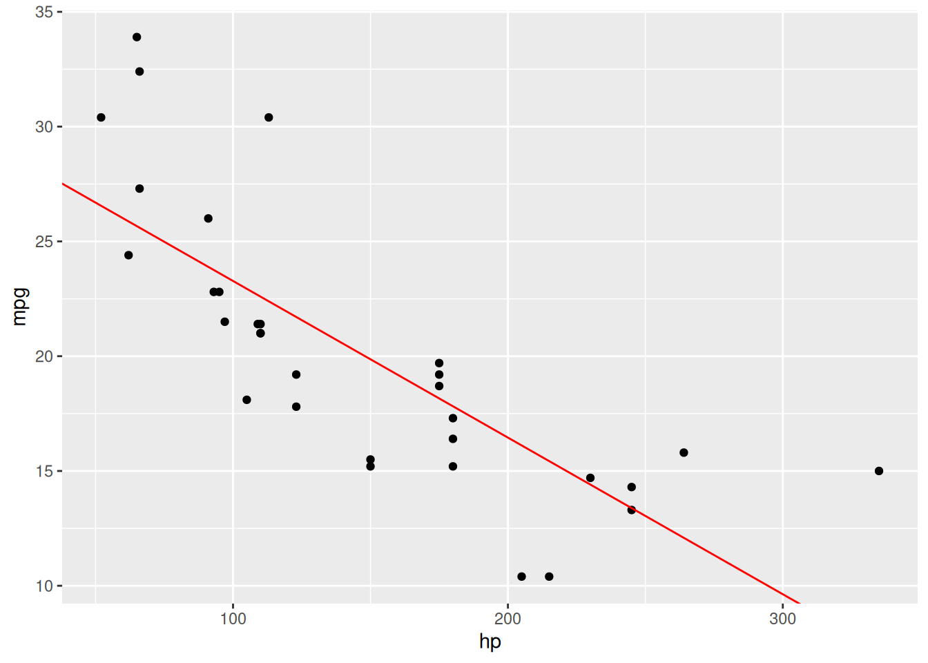
Figure 8.1: Linear regression model for the mtcars data.
If we wish to add more variables to the model, creating a multiple linear regressions model, we simply add them to the right-hand side of the formula in the function call:
In this case, the model becomes
\[mpg=\beta_0 +\beta_1 \cdot hp + \beta_2\cdot wt.\]
Next, we’ll look at what more R has to offer when it comes to regression. Before that though, it’s a good idea to do a quick exercise to make sure that you now know how to fit linear models.
\[\sim\]
Exercise 8.1 The sales-weather.csv data from Section 5.12 describes the weather in a region during the first quarter of 2020. Download the file from the book’s web page. Fit a linear regression model with TEMPERATURE as the response variable and SUN_HOURS as an explanatory variable. Plot the results. Is there a connection?
You’ll return to and expand this model in the next few exercises, so make sure to save your code.
(Click here to go to the solution.)
Exercise 8.2 Fit a linear model to the mtcars data using the formula mpg ~ .. What happens? What is ~ . a shorthand for?
8.1.2 Publication-ready summary tables
Just as for frequency tables and contingency tables, we can use the gtsummary package to obtain publication-ready summary tables for regression models. The tbl_regression function gives a nicely formatted summary table, showing the fitted \(\beta_i\) along with their confidence intervals and p-values:
For more on how to export gtsummary tables, see Section 3.2.2.
tbl_regression has options for including the intercept, changing the confidence level, and replacing the variable names by labels:
tbl_regression(m2,
intercept = TRUE,
conf.level = 0.99,
label = list(hp ~ "Gross horsepower", wt ~ "Weight (1000 lbs)"))See ?tbl_regression for even more options.
8.1.3 Dummy variables and interactions
Categorical variables can be included in regression models by using dummy variables. A dummy variable takes the values 0 and 1, indicating that an observation either belongs to a category (1) or not (0). For instance, consider a categorical variable \(z\) with two levels, \(A\) and \(B\). We introduce the dummy variable \(x_2\), defined as follows:
- \(x_2=0\) if \(z=A\),
- \(x_2=1\) if \(z=B\).
Now, consider a regression model with two explanatory variables: a numeric variable \(x_1\) and the dummy variable \(x_2\) described above. The model equation is
\[y=\beta_0+\beta_1x_1+\beta_2x_2.\] If \(z=A\), then \(x_2=0\) and the model reduces to
\[y=\beta_0+\beta_1x_1+\beta_2\cdot 0 = \beta_0+\beta_1x_1.\] This describes a line where the intercept is \(\beta_0\) and the slope is \(\beta_1\). However, if \(z=B\) we have \(x_2=1\) and the model becomes
\[y=\beta_0+\beta_1x_1+\beta_2\cdot 1 = (\beta_0+\beta_2)+\beta_1x_1.\]
This describes a line where the intercept is \(\beta_0+\beta_2\) and the slope is \(\beta_1\). That is, the intercept has changed. \(\beta_2\) describes how the intercept changes when \(z=B\), compared to when \(z=A\). Because the effect is relative to \(A\), \(A\) is said to be the reference category for this dummy variable.
If the original categorical variable has more than two categories, \(c\) categories, say, the number of dummy variables included in the regression model should be \(c-1\) (with the last category corresponding to all dummy variables being 0). If we have a categorical variable \(z\) with three levels, \(A\), \(B\), and \(C\), we would need to define two dummy variables:
- \(x_2=1\) if \(z=B\) and \(x_2=0\) otherwise.
- \(x_3=1\) if \(z=C\) and \(x_3=0\) otherwise.
Note that \(x_2\) and \(x_3\) both are \(0\) when \(z=A\). Again, this makes \(A\) the reference category for this dummy variable, and the coefficients corresponding to \(x_2\) and \(x_3\) will describe the effect of \(B\) and \(C\) relative to \(A\).
You can probably imagine that creating dummy variables can be a lot of work if we have categorical variables with many levels. Fortunately, R does this automatically for us if we include a factor variable in a regression model:
# Make cyl a categorical variable:
mtcars$cyl <- factor(mtcars$cyl)
m <- lm(mpg ~ hp + wt + cyl, data = mtcars)
summary(m)Note how only two categories, 6 cylinders and 8 cylinders, are shown in the summary table. The third category, 4 cylinders, corresponds to both of those dummy variables being 0. Therefore, the coefficient estimates for cyl6 and cyl8 are relative to the remaining reference category cyl4. For instance, compared to cyl4 cars, cyl6 cars have a higher fuel consumption, with their mpg being \(3.36\) lower.
We can control which category is used as the reference category by setting the order of the factor variable, as in Section 5.4. The first factor level is always used as the reference, so if for instance we want to use cyl6 as our reference category, we’d do the following:
# Make cyl a categorical variable with cyl6 as
# reference variable:
mtcars$cyl <- factor(mtcars$cyl, levels =
c(6, 4, 8))
m <- lm(mpg ~ hp + wt + cyl, data = mtcars)
summary(m)Dummy variables are frequently used for modelling differences between different groups. Including only the dummy variable corresponds to using different intercepts for different groups. If we also include an interaction with the dummy variable, we can get different slopes for different groups. As the name implies, interaction terms in regression models describe how different explanatory variables interact. To include an interaction between \(x_1\) and \(x_2\) in our model, we add \(x_1\cdot x_2\) as an explanatory variable.
This yields the model
\[y=\beta_0+\beta_1 x_{1}+\beta_2 x_{2}+\beta_{12} x_{1}x_{2},\]
where \(x_1\) is numeric and \(x_2\) is a dummy variable. Then the intercept and slope change depending on the value of \(x_2\) as follows:
\[y=\beta_0+\beta_1 x_{1},\qquad \mbox{if } x_2=0,\] \[y=(\beta_0+\beta_2)+(\beta_1+\beta_{12}) x_{1},\qquad \mbox{if } x_2=1.\] This yields a model where both the intercept and the slope differ between the two groups that \(x_2\) represents. \(\beta_2\) describes how the intercept for \(B\) differs from that for \(A\), and \(\beta_{12}\) describes how the slope for \(B\) differs from that for \(A\).
To include an interaction term in our regression model, we can use either of the following equivalent formulas:
In this model, cyl6 is the reference category. The variables cyl4 and cyl8 in the summary table describe how the number of cylinders affect the intercept. For 6 cylinders, the intercept is 20.7 mpg. For 4 cylinders, the intercept is 15.3 units higher than for 6 cylinders (remember that all effects are relative to the reference category!). For 8 cylinders, it is 2.6 units lower than for 6 cylinders.
The hp:cyl4 and hp:cyl8 variables describe how the slope for hp is affected by the number of cylinders. For 6 cylinders, the slope for hp is \(-0.007613\). For 4 cylinders, it is \(-0.007613-0.105163=-0.112776\), and for 8 cylinders it is \(-0.007613-0.006631=-0.014244\). Note that in this case we have a non-monotone effect of the number of cylinders – the slope is the lowest for 6 cylinders, and higher for 4 and 8 cylinders. This would not have been possible if we had included the number of cylinders as a numeric variable instead.
\[\sim\]
Exercise 8.3 R automatically creates dummy variables for us when we include categorical variables as explanatory variables in regression models. Sometimes, we may wish to create them manually, e.g., when creating a categorical variable from a numerical one. Return to the weather model from Exercise 8.1. Create a dummy variable for precipitation (zero precipitation (0) or non-zero precipitation (1)) and add it to your model. Also include an interaction term between the precipitation dummy and the number of sun hours. Are any of the coefficients significantly non-zero?
8.1.4 Model diagnostics
There are a few different ways in which we can plot the fitted model. First, we can of course make a scatterplot of the data and add a curve showing the fitted values corresponding to the different points. These can be obtained by running predict(m) with our fitted model m.
# Fit two models:
mtcars$cyl <- factor(mtcars$cyl)
m1 <- lm(mpg ~ hp + wt, data = mtcars) # Simple model
m2 <- lm(mpg ~ hp*wt + cyl, data = mtcars) # Complex model
# Create data frames with fitted values:
m1_pred <- data.frame(hp = mtcars$hp, mpg_pred = predict(m1))
m2_pred <- data.frame(hp = mtcars$hp, mpg_pred = predict(m2))
# Plot fitted values:
library(ggplot2)
ggplot(mtcars, aes(hp, mpg)) +
geom_point() +
geom_line(data = m1_pred, aes(x = hp, y = mpg_pred),
colour = "red") +
geom_line(data = m2_pred, aes(x = hp, y = mpg_pred),
colour = "blue")We could also plot the observed values against the fitted values:
n <- nrow(mtcars)
models <- data.frame(Observed = rep(mtcars$mpg, 2),
                     Fitted = c(predict(m1), predict(m2)),
                     Model = rep(c("Model 1", "Model 2"), c(n, n)))

ggplot(models, aes(Fitted, Observed)) +
      geom_point(colour = "blue") +
      facet_wrap(~ Model, nrow = 3) +
      geom_abline(intercept = 0, slope = 1) +
      xlab("Fitted values") + ylab("Observed values")
Linear models are fitted and analysed using a number of assumptions, most of which are assessed by looking at plots of the model residuals, \(y_i-\hat{y}_i\), where \(\hat{y}_i\) is the fitted value for observation \(i\). Some important assumptions are:
- The model is linear in the parameters: we check this by looking for non-linear patterns in the residuals, or in the plot of observed values against fitted values.
- The observations are independent: which can be difficult to assess visually. We’ll look at models that are designed to handle correlated observations in Sections 8.8 and 11.6.
- Homoscedasticity: which means that the random errors all have the same variance. We check this by looking for non-constant variance in the residuals. The opposite of homoscedasticity is heteroscedasticity.
- Normally distributed random errors: this assumption is important if we want to use the traditional parametric p-values, confidence intervals, and prediction intervals. If we use permutation p-values or bootstrap confidence intervals (as we will later in this chapter), we no longer need this assumption.
Additionally, residual plots can be used to find influential points that (possibly) have a large impact on the model coefficients (influence is measured using Cook’s distance and potential influence using leverage). We’ve already seen that we can use plot(m) to create some diagnostic plots. To get more and better-looking plots, we can use the autoplot function for lm objects from the ggfortify package:
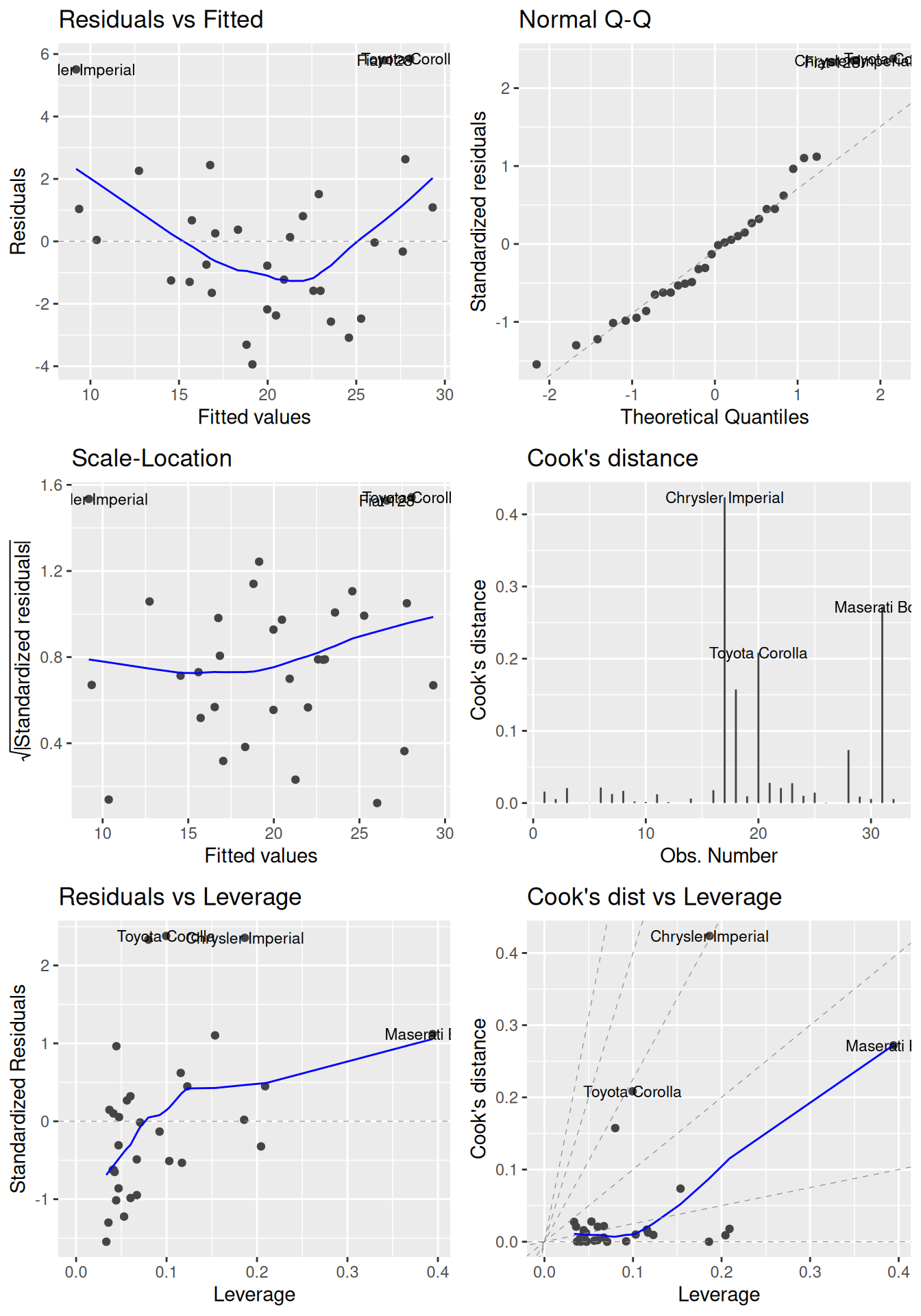
Figure 8.2: Diagnostic plots for linear regression.
In each of the plots in Figure 8.2, we look for the following:
- Residuals vs. fitted: look for patterns that can indicate non-linearity, e.g., that the residuals all are high in some areas and low in others. The blue line is there to aid the eye – it should ideally be relatively close to a straight line (in this case, it isn’t perfectly straight, which could indicate a mild non-linearity).
- Normal Q-Q: see if the points follow the line, which would indicate that the residuals (which we for this purpose can think of as estimates of the random errors) follow a normal distribution.
- Scale-Location: similar to the residuals vs. fitted plot, this plot shows whether the residuals are evenly spread for different values of the fitted values. Look for patterns in how much the residuals vary – if, e.g., they vary more for large fitted values, then that is a sign of heteroscedasticity. A horizontal blue line is a sign of homoscedasticity.
- Cook’s distance: look for points with high values. A commonly cited rule-of-thumb (Cook & Weisberg, 1982) says that values above 1 indicate points with a high influence.
- Residuals vs. leverage: look for points with a high residual and high leverage. Observations with a high residual but low leverage deviate from the fitted model but don’t affect it much. Observations with a high residual and a high leverage likely have a strong influence on the model fit, meaning that the fitted model could be quite different if these points were removed from the dataset.
- Cook’s distance vs. leverage: look for observations with a high Cook’s distance and a high leverage, which are likely to have a strong influence on the model fit.
A formal test for heteroscedasticity, the Breusch-Pagan test, is available in the car package as a complement to graphical inspection. A low p-value indicates statistical evidence for heteroscedasticity. To run the test, we use ncvTest (where “ncv” stands for non-constant variance):
A common problem in linear regression models is multicollinearity, i.e., explanatory variables that are strongly correlated. Multicollinearity can cause your \(\beta\) coefficients and p-values to change greatly if there are small changes in the data, rendering them unreliable. To check if you have multicollinearity in your data, you can create a scatterplot matrix of your explanatory variables, as in Section 4.9.1:
In this case, there are some highly correlated pairs, hp and disp among them. As a numerical measure of collinearity, we can use the generalised variance inflation factor (GVIF), given by the vif function in the car package:
A high GVIF indicates that a variable is highly correlated with other explanatory variables in the dataset. Recommendations for what a “high GVIF” is varies, from 2.5 to 10 or more.
You can mitigate problems related to multicollinearity by:
- Removing one or more of the correlated variables from the model (because they are strongly correlated, they measure almost the same thing anyway!),
- Centring your explanatory variables (particularly if you include polynomial terms) – more on this in the next section,
- Using a regularised regression model (which we’ll do in Section 11.4).
\[\sim\]
Exercise 8.4 Below are two simulated datasets. One exhibits a non-linear dependence between the variables, and the other exhibits heteroscedasticity. Fit a model with y as the response variable and x as the explanatory variable for each dataset, and make some residual plots. Which dataset suffers from which problem?
 exdata1 <- data.frame(
   x = c(2.99, 5.01, 8.84, 6.18, 8.57, 8.23, 8.48, 0.04, 6.80,
         7.62, 7.94, 6.30, 4.21, 3.61, 7.08, 3.50, 9.05, 1.06,
         0.65, 8.66, 0.08, 1.48, 2.96, 2.54, 4.45),
   y = c(5.25, -0.80, 4.38, -0.75, 9.93, 13.79, 19.75, 24.65,
         6.84, 11.95, 12.24, 7.97, -1.20, -1.76, 10.36, 1.17,
         15.41, 15.83, 18.78, 12.75, 24.17, 12.49, 4.58, 6.76,
         -2.92))
 exdata2 <- data.frame(
   x = c(5.70, 8.03, 8.86, 0.82, 1.23, 2.96, 0.13, 8.53, 8.18,
         6.88, 4.02, 9.11, 0.19, 6.91, 0.34, 4.19, 0.25, 9.72,
         9.83, 6.77, 4.40, 4.70, 6.03, 5.87, 7.49),
   y = c(21.66, 26.23, 19.82, 2.46, 2.83, 8.86, 0.25, 16.08,
          17.67, 24.86, 8.19, 28.45, 0.52, 19.88, 0.71, 12.19,
          0.64, 25.29, 26.72, 18.06, 10.70, 8.27, 15.49, 15.58,
          19.17))
(Click here to go to the solution.)
Exercise 8.5 We continue our investigation of the weather models from Exercises 8.1 and 8.3.
Plot the observed values against the fitted values for the two models that you’ve fitted. Does either model seem to have a better fit?
Create residual plots for the second model from Exercise 8.3. Are there any influential points? Any patterns? Any signs of heteroscedasticity?
8.1.5 Bootstrap and permutation tests
Non-normal regression errors can sometimes be an indication that you need to transform your data, that your model is missing an important explanatory variable, that there are interaction effects that aren’t accounted for, or that the relationship between the variables is non-linear. But sometimes, you get non-normal errors simply because the errors are non-normal.
The p-values reported by summary are computed under the assumption of normally distributed regression errors and can be sensitive to deviations from normality. I usually prefer to use bootstrap p-values (and confidence intervals) instead, as these don’t rely on the assumption of normality. In Section 8.2.3, we’ll go into detail about how these are computed. A convenient approach is to use boot_summary from the boot.pval package. It provides a data frame with estimates, bootstrap confidence intervals, and bootstrap p-values (computed using interval inversion; see Section 7.4.3) for the model coefficients. The arguments specify the number of bootstrap samples drawn, the interval type, and what resampling strategy to use (more on that later). We set the number of bootstrap samples to \(9,999\), but otherwise use the default settings:
To convert this to a publication ready-table, use summary_to_gt or summary_to_flextable:
# gt table:
boot_summary(m, R = 9999) |>
  summary_to_gt()

# To export to Word:
library(flextable)
boot_summary(m, R = 9999) |>
  summary_to_flextable() |>
  save_as_docx(path = "my_table.docx")
When bootstrapping regression models, we usually rely on residual resampling, where the model residuals are resampled. This is explained in detail in Section 8.2.3. There is also an alternative bootstrap scheme for regression models, often referred to as case resampling, in which the observations (or cases) \((y_i, x_{i1},\ldots,x_{ip})\) are resampled instead of the residuals. This approach can be applied when the explanatory variables can be treated as being random (but measured without error) rather than fixed. It can also be useful for models with heteroscedasticity, as it doesn’t rely on assumptions about constant variance (which, on the other hand, makes it less efficient if the errors actually are homoscedastic). In other words, it allows us to drop both the normality assumption and the homoscedasticity assumption from regression models. To use case resampling, we simply add method = "case" to boot_summary:
In this case, the resulting confidence intervals are similar to what we obtained with residual resampling.
An alternative to using the bootstrap is to compute p-values using permutation tests. This can be done using the lmp function from the lmPerm package. Note that, like the bootstrap, this doesn’t affect the model fitting in any way – the only difference is how the p-values are computed. Moreover, the syntax for lmp is identical to that of lm. The Ca and maxIter arguments are added to ensure that we compute sufficiently many permutations to get a reliable estimate of the permutation p-value:
# First, install lmPerm:
install.packages("lmPerm")

# Get summary table with permutation p-values:
library(lmPerm)
m <- lmp(mpg ~ hp + wt,
         data = mtcars,
         Ca = 1e-3,
         maxIter = 1e6)
summary(m)
\[\sim\]
Exercise 8.6 Refit your model from Exercise 8.3 using lmp. Are the two main effects still significant?
8.1.6 Transformations
If your data displays signs of non-linearity, heteroscedasticity, or non-normal residuals, you can sometimes use transformations of the response variable to mitigate those problems. It is for instance common to apply a log-transformation and fit the model
\[\ln(y_i)=\beta_0 +\beta_1 x_{i1}+\beta_2 x_{i2}+\cdots+\beta_p x_{ip} + \epsilon_i,\qquad i=1,\ldots,n.\]
Likewise, a square-root transformation is sometimes used:
\[\sqrt{y_i}=\beta_0 +\beta_1 x_{i1}+\beta_2 x_{i2}+\cdots+\beta_p x_{ip} + \epsilon_i,\qquad i=1,\ldots,n.\]
Both of these are non-linear models, because \(y\) is no longer a linear function of \(x_i\). We can still use lm to fit them though, with \(\ln(y)\) or \(\sqrt{y}\) as the response variable.
How then do we know which transformation to apply? A useful method for finding a reasonable transformation is the Box-Cox method (Box & Cox, 1964). This defines a transformation using a parameter \(\lambda\). The transformation is defined as \(\frac{y_i^\lambda-1}{\lambda}\) if \(\lambda\neq 0\) and \(\ln(y_i)\) if \(\lambda=0\). \(\lambda=1\) corresponds to no transformation at all, \(\lambda=1/2\) corresponds to a square-root transformation, \(\lambda=1/3\) corresponds to a cubic-root transformation, \(\lambda=2\) corresponds to a square transformation, and so on.
The boxcox function in MASS lets us find a good value for \(\lambda\). It is recommended to choose a “nice” \(\lambda\) (e.g., \(0, 1, 1/2\) or a similar value), that is close to the peak (inside the interval indicated by the outer dotted lines) of the curve plotted by boxcox:
In this case, because 0 is close to the peak, the curve indicates that \(\lambda=0\), which corresponds to a log-transformation, could be a good choice. Let’s give it a go:
mtcars$logmpg <- log(mtcars$mpg)
m_bc <- lm(logmpg ~ hp + wt, data = mtcars)
summary(m_bc)

library(ggfortify)
autoplot(m_bc, which = 1:6, ncol = 2, label.size = 3)
The model fit seems to have improved after the transformation. The downside is that we now are modelling the log-mpg rather than mpg, which make the model coefficients a little difficult to interpret: the beta coefficients now describe how the log-mpg changes when the explanatory variables are changed one unit. A positive \(\beta\) still indicates a positive effect, and a negative \(\beta\) a negative effect, but the size of the coefficients is trickier to interpret.
It is also possible to transform the explanatory variables. We’ll see some examples of that in Section 8.2.2.
\[\sim\]
Exercise 8.7 Run boxcox with your model from Exercise 8.3. Why do you get an error? How can you fix it? Does the Box-Cox method indicate that a transformation can be useful for your model?
8.1.7 Prediction
An important use of linear models is prediction. In R, this is done using predict. By providing a fitted model and a new dataset, we can get predictions.
Let’s use one of the models that we fitted to the mtcars data to make predictions for two cars that aren’t from the 1970s. Below, we create a data frame with data for a 2009 Volvo XC90 D3 AWD (with a fuel consumption of 29 mpg) and a 2019 Ferrari Roma (15.4 mpg):
new_cars <- data.frame(hp = c(161, 612), wt = c(4.473, 3.462),
                       row.names = c("Volvo XC90", "Ferrari Roma"))
To get the model predictions for these new cars, we run the following:
predict also lets us obtain prediction intervals for our prediction, under the assumption of normality. Prediction intervals provide interval estimates for the new observations. They incorporate both the uncertainty associated with our model estimates, and the fact that the new observation is likely to deviate slightly from its expected value. To get 90% prediction intervals, we add interval = "prediction" and level = 0.9:
If we were using a transformed \(y\)-variable, we’d probably have to transform the predictions back to the original scale for them to be useful:
8.1.8 ANOVA
Linear models are also used for analysis of variance (ANOVA) models to test whether there are differences among the means of different groups. We’ll use the mtcars data to give some examples of this. Let’s say that we want to investigate whether the mean fuel consumption (mpg) of cars differs depending on the number of cylinders (cyl), and that we want to include the type of transmission (am) as a blocking variable.
To get an ANOVA table for this problem, we must first convert the explanatory variables to factor variables, as the variables in mtcars all numeric (despite some of them being categorical). We can then use aov to fit the model, and then summary:
# Convert variables to factors:
mtcars$cyl <- factor(mtcars$cyl)
mtcars$am <- factor(mtcars$am)

# Fit model and print ANOVA table:
m <- aov(mpg ~ cyl + am, data = mtcars)
summary(m)(aov actually uses lm to fit the model, but by using aov we specify that we want an ANOVA table to be printed by summary.)
When there are different numbers of observations in the groups in an ANOVA, so that we have an unbalanced design, the sums of squares used to compute the test statistics can be computed in at least three different ways, commonly called types I, II, and III. See Herr (1986) for an overview and discussion of this.
summary prints a type I ANOVA table, which isn’t the best choice for unbalanced designs. We can, however, get type II or III tables by instead using Anova from the car package to print the table:
As a guideline, for unbalanced designs, you should use type II tables if there are no interactions, and type III tables if there are interactions. To look for interactions, we can use interaction.plot to create a two-way interaction plot:
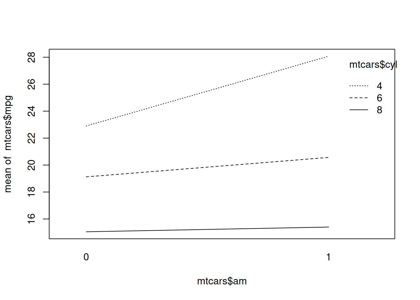
Figure 8.3: Two-way interaction plot.
In this case, as seen in Figure 8.3, there is no clear sign of an interaction between the two variables, as the lines are more or less parallel. A type II table is therefore probably the best choice here.
We can obtain diagnostic plots the same way we did for other linear models:
To find which groups have significantly different means, we can use a post hoc test like Tukey’s HSD, available through the TukeyHSD function:
We can visualise the results of Tukey’s HSD with plot, which shows 95% confidence intervals for the mean differences:
# When the difference isn't significant, the dashed line indicating
# "no differences" falls within the confidence interval for
# the difference:
plot(TukeyHSD(m, "am"))

# When the difference is significant, the dashed line does not
# fall within the confidence interval:
plot(TukeyHSD(m, "cyl"))
\[\sim\]
Exercise 8.8 Return to the residual plots that you created with autoplot. Figure out how you can plot points belonging to different cyl groups in different colours.
(Click here to go to the solution.)
Exercise 8.9 The aovp function in the lmPerm package can be utilised to perform permutation tests instead of the classical parametric ANOVA tests. Rerun the analysis in the example above, using aovp instead. Do the conclusions change? What happens if you run your code multiple times? Does using summary on a model fitted using aovp generate a type I, II, or III table by default? Can you change what type of table it produces?
(Click here to go to the solution.)
Exercise 8.10 In the case of a one-way ANOVA (i.e., ANOVA with a single explanatory variable), the Kruskal-Wallis test can be used as a nonparametric option. It is available in kruskal.test. Use the Kruskal-Wallis test to run a one-way ANOVA for the mtcars data, with mpg as the response variable and cyl as an explanatory variable.
8.2 Linear models: advanced topics
8.2.1 Robust estimation
The least squares method used by lm is not the only way to fit a regression model. Another option is to use a robust regression model based on M-estimators. Such models tend to be less sensitive to outliers and can be useful if you are concerned about the influence of deviating points. The rlm function in MASS is used for this. The syntax is identical to that of lm:
8.2.2 Interactions between numerical variables
In the fuel consumption model, it seems plausible that there could be an interaction between gross horsepower and weight, both of which are numeric. Just as when we had a categorical variable, we can include an interaction term by adding hp:wt to the formula:
Alternatively, to include the main effects of hp and wt along with the interaction effect, we can use hp*wt as a shorthand for hp + wt + hp:wt to write the model formula more concisely:
When our regression model includes interactions between numeric variables, it is often recommended to centre the explanatory variables, i.e., to shift them so that they all have mean 0.
There are a number of benefits to this: for instance that the intercept then can be interpreted as the expected value of the response variable when all explanatory variables are equal to their means, i.e., in an average case53. It can also reduce any multicollinearity – i.e., dependence between the explanatory variables – in the data, particularly when including interactions or polynomial terms in the model. Finally, it can reduce problems with numerical instability that may arise due to floating point arithmetics. Note, however, that there is no need to centre the response variable. On the contrary, doing so will usually only serve to make interpretation more difficult.
Centring the explanatory variables can be done using scale.
Without pipes:
# Create a new data frame, leaving the response variable mpg
# unchanged, while centring the explanatory variables:
mtcars_scaled <- data.frame(mpg = mtcars[,1],
                            cyl = mtcars[,2],
                            scale(mtcars[,-1], scale = FALSE))
With pipes:
# Create a new data frame, leaving the response variable mpg
# unchanged, while centring the explanatory variables:
library(dplyr)
mtcars |> mutate(across(c(where(is.numeric), -mpg),
                        ~ as.numeric(scale(., scale = FALSE)))) -> mtcars_scaled
We then refit the model using the centred data:
If we wish to add a polynomial term to the model, we can do so by wrapping the polynomial in I(). For instance, to add a quadratic effect in the form of the square weight of a vehicle to the model, we’d use:
8.2.3 Bootstrapping regression coefficients
In this section, we’ll have a closer look at how bootstrapping works in linear regression models. In most cases, we’ll simply use boot_summary for this, but if you want to know more about what that function does behind the scenes, then read on.
First, note that the only random part in the linear model
\[y_i=\beta_0 +\beta_1 x_{i1}+\beta_2 x_{i2}+\cdots+\beta_p x_{ip} + \epsilon_i,\qquad i=1,\ldots,n\] is the error term \(\epsilon_i\). In most cases, it is therefore this term (and this term only) that we wish to resample. The explanatory variables should remain constant throughout the resampling process; the inference is conditioned on the values of the explanatory variables.
To achieve this, we’ll resample from the model residuals and add those to the values predicted by the fitted function, which creates new bootstrap values of the response variable. We’ll then fit a linear model to these values, from which we obtain observations from the bootstrap distribution of the model coefficients.
It turns out that the bootstrap performs better if we resample not from the original residuals \(e_1,\ldots,e_n\), but from scaled and centred residuals \(r_i-\bar{r}\), where each \(r_i\) is a scaled version of residual \(e_i\), scaled by the leverage \(h_i\):
\[r_i=\frac{e_i}{\sqrt{1-h_i}},\]
see Chapter 6 of Davison & Hinkley (1997) for details. The leverages can be computed using lm.influence.
We implement this procedure in the code below (and will then have a look at convenience functions that help us achieve the same thing more easily). It makes use of formula, which can be used to extract the model formula from regression models:
library(boot)

coefficients <- function(formula, data, i, predictions, residuals) {
  # Create the bootstrap value of response variable by
  # adding a randomly drawn scaled residual to the value of
  # the fitted function for each observation:
  data[,all.vars(formula)[1]] <- predictions + residuals[i]

  # Fit a new model with the bootstrap value of the response
  # variable and the original explanatory variables:
  m <- lm(formula, data = data)
  return(coef(m))
}

# Fit the linear model:
m <- lm(mpg ~ hp + wt, data = mtcars)

# Compute scaled and centred residuals:
res <- residuals(m)/sqrt(1 - lm.influence(m)$hat)
res <- res - mean(res)

# Run the bootstrap, extracting the model formula and the
# fitted function from the model m:
boot_res <- boot(data = mtcars, statistic = coefficients,
                 R = 999, formula = formula(m),
                 predictions = predict(m),
                 residuals = res)

# Compute 95% confidence intervals:
boot.ci(boot_res, type = "perc", index = 1) # Intercept
boot.ci(boot_res, type = "perc", index = 2) # hp
boot.ci(boot_res, type = "perc", index = 3) # wt
The argument index in boot.ci should be the row number of the parameter in the table given by summary. The intercept is on the first row, and so its index is 1, hp is on the second row and its index is 2, and so on.
Clearly, the above code is a little unwieldy. Fortunately, the car package contains a function called Boot that can be used to bootstrap regression models in the exact same way:
library(car)

boot_res <- Boot(m, method = "residual", R = 9999)

# Compute 95% confidence intervals:
confint(boot_res, type = "perc")
Finally, the most convenient approach is to use boot_summary from the boot.pval package, as mentioned earlier:
\[\sim\]
Exercise 8.11 Refit your model from Exercise 8.3 using a robust regression estimator with rlm. Compute bootstrap confidence intervals for the coefficients of the robust regression model.
8.2.4 Prediction intervals using the bootstrap
It is often desirable to have prediction intervals, a type of confidence for predictions. Prediction intervals try to capture two sources of uncertainty:
- Model uncertainty, which we will capture by resampling the data and make predictions for the expected value of the observation,
- Random noise, i.e., that almost all observations deviate from their expected value. We will capture this by resampling residuals from the fitted bootstrap models.
Next, we will compute bootstrap prediction intervals. Based on the above, the value that we generate in each bootstrap replication will be the sum of a prediction and a resampled residual (see Davison & Hinkley (1997), section 6.3, for further details):
boot_pred <- function(data, new_data, model, i,
                      formula, predictions, residuals){
    # Resample residuals and fit new model:
    data[,all.vars(formula)[1]] <- predictions + residuals[i]
    m_boot <- lm(formula, data = data)

    # We use predict to get an estimate of the
    # expectation of new observations, and then
    # add resampled residuals to also include the
    # natural variation around the expectation:
    predict(m_boot, newdata = new_data) +
      sample(residuals, nrow(new_data))
}

library(boot)

m <- lm(mpg ~ hp + wt, data = mtcars)

# Compute scaled and centred residuals:
res <- residuals(m)/sqrt(1 - lm.influence(m)$hat)
res <- res - mean(res)

boot_res <- boot(data = m$model,
                 statistic = boot_pred,
                 R = 999,
                 model = m,
                 new_data = new_cars,
                 formula = formula(m),
                 predictions = predict(m),
                 residuals = res)

# 90% bootstrap prediction intervals:
boot.ci(boot_res, type = "perc", index = 1, conf = 0.9) # Volvo
boot.ci(boot_res, type = "perc", index = 2, conf = 0.9) # Ferrari
\[\sim\]
Exercise 8.12 Use your model from Exercise 8.3 to compute a bootstrap prediction interval for the temperature on a day with precipitation but no sun hours.
8.2.5 Prediction for multiple datasets
In certain cases, we wish to fit different models to different subsets of the data. Functionals like apply and map (Section 6.5) are handy when you want to fit several models at once. Below is an example of how we can use split (Section 5.2.1) and tools from the purrr package (Section 6.5.3) to fit the models simultaneously, as well as for computing the fitted values in a single line of code. These work best with the magrittr pipe %>%:
# Split the dataset into three groups depending on the
# number of cylinders:
library(magrittr)
mtcars_by_cyl <- mtcars %>% split(.$cyl)

# Fit a linear model to each subgroup:
library(purrr)
models <- mtcars_by_cyl |>  map(~ lm(mpg ~ hp + wt, data = .))

# Compute the fitted values for each model:
map2(models, mtcars_by_cyl, predict)
We’ll make use of this approach when we study linear mixed models in Section 8.8.
8.2.6 Alternative summaries with broom
The broom package contains some useful functions when working with linear models (and many other common models), which allow us to get various summaries of the model fit in useful formats. Let’s install it:
A model fitted with m is stored as a list with lots of elements:
How can we access the information about the model? For instance, we may want to get the summary table from summary, but as a data frame rather than as printed text. Here are two ways of doing this, using summary and the tidy function from broom:
tidy is the better option if you want to retrieve the table as part of a pipeline. For instance, if you want to adjust the p-values for multiplicity using Bonferroni correction (Section 3.7), you could do as follows:
If you prefer bootstrap p-values, you can use boot_summary from boot.pval similarly. That function also includes an argument for adjusting the p-values for multiplicity:
Another useful function in broom is glance, which lets us get some summary statistics about the model:
Finally, augment can be used to add predicted values, residuals, and Cook’s distances to the dataset used for fitting the model, which of course can be very useful for model diagnostics:
8.2.7 Variable selection
A common question when working with linear models is what variables to include in your model. Common practices for variable selection include stepwise regression methods, where variables are added to or removed from the model depending on p-values, \(R^2\) values, or information criteria like the Akaike information criterion (AIC) or the Bayesian information criterion (BIC).
Don’t ever do this if your main interest is p-values. Stepwise regression increases the risk of type I errors, renders the p-values of your final model invalid, and can lead to over-fitting; see, e.g., Smith (2018). Instead, you should let your research hypothesis guide your choice of variables or base your choice on a pilot study.
If your main interest is prediction, then that is a completely different story. For predictive models, it is usually recommended that variable selection and model fitting be done simultaneously. This can be done using regularised regression models, to which Section 11.4 is devoted.
8.2.8 Bayesian estimation of linear models
We can fit Bayesian linear models using the rstanarm package. To fit a model to the mtcars data using all explanatory variables, we can use stan_glm in place of lm as follows:
Next, we can plot the posterior distributions of the effects:
To get 95% credible intervals for the effects, we can use posterior_interval:
We can also plot them using plot:
Finally, we can use \(\hat{R}\) to check model convergence. It should be less than 1.1 if the fitting has converged:
Like for lm, residuals(m) provides the model residuals, which can be used for diagnostics. For instance, we can plot the residuals against the fitted values to look for signs of non-linearity, adding a curve to aid the eye:
model_diag <- data.frame(Fitted = predict(m),
Residual = residuals(m))
library(ggplot2)
ggplot(model_diag, aes(Fitted, Residual)) +
geom_point() +
geom_smooth(se = FALSE)For fitting ANOVA models, we can instead use stan_aov with the argument prior = R2(location = 0.5) to fit the model.
8.3 Modelling proportions: logistic regression
8.3.1 Generalised linear models
Generalised linear models (GLMs) are (yes) a generalisation of the linear model, that can be used when your response variable has a non-normal error distribution. Typical examples are when your response variable is binary (only takes two values, e.g., 0 or 1), or a count of something. Fitting GLMs is more or less entirely analogous to fitting linear models in R, but model diagnostics are very different. In this and the following section, we will look at some examples of how it can be done. We’ll start with logistic regression, which is used to model proportions.
8.3.2 Fitting logistic regression models
As the first example of binary data, we will consider the wine quality dataset wine from Cortez et al. (2009), which is available in the UCI Machine Learning Repository at http://archive.ics.uci.edu/ml/datasets/Wine+Quality. It contains measurements on white and red vinho verde wine samples from northern Portugal.
We start by loading the data. It is divided into two separate .csv files, one for white wines and one for red, which we have to merge.
Without pipes:
# Import data about white and red wines:
white <- read.csv("https://tinyurl.com/winedata1",
sep = ";")
red <- read.csv("https://tinyurl.com/winedata2",
sep = ";")
# Add a type variable:
white$type <- "white"
red$type <- "red"
# Merge the datasets:
wine <- rbind(white, red)
# Convert the type variable to a factor (this is
# needed when we fit the logistic regression model later):
wine$type <- factor(wine$type)
# Check the result:
summary(wine)With pipes:
library(dplyr)
# Import data about white and red wines.
# Add a type variable describing the colour.
white <- read.csv("https://tinyurl.com/winedata1",
sep = ";") |> mutate(type = "white")
red <- read.csv("https://tinyurl.com/winedata2",
sep = ";") |> mutate(type = "red")
# Merge the datasets and convert the type variable to
# a factor (this is needed when we fit the logistic
# regression model later):
white |> bind_rows(red) |>
mutate(type = factor(type)) -> wine
# Check the result:
summary(wine)We are interested in seeing if measurements like pH (pH) and alcohol content (alcohol) can be used to determine the colours of the wine. The colour is represented by the type variable, which is binary. In our model, it will be included as a dummy variable, where 0 corresponds to “red” and 1 corresponds to “white”. By default, R uses the class that is last in alphabetical order as \(y=1\). Here, that class is “white”, as can be seen by running levels(wine$type).
Our model is that the type of a randomly selected wine is binomial \(Bin(1, \pi_i)\)-distributed (Bernoulli distributed), where \(\pi_i\) depends on explanatory variables like pH and alcohol content. A common model for this situation is a logistic regression model. Given \(n\) observations of \(p\) explanatory variables, the model is:
\[\log\Big(\frac{\pi_i}{1-\pi_i}\Big)=\beta_0+\beta_1 x_{i1}+\beta_2 x_{i2}+\cdots+\beta_p x_{ip},\qquad i=1,\ldots,n\] Where in linear regression models we model the expected value of the response variable as a linear function of the explanatory variables, we now model the expected value of a function of the expected value of the response variable (that is, a function of \(\pi_i\)). In GLM terminology, this function is known as a link function.
Logistic regression models can be fitted using the glm function. To specify what our model is, we use the argument family = binomial:
The p-values presented in the summary table are based on a Wald test known to have poor performance unless the sample size is very large (Agresti, 2013). In this case, with a sample size of 6,497, it is probably safe to use; but, for smaller sample sizes, it is preferable to use a bootstrap test instead, which you will do in Exercise 8.15.
The coefficients of a logistic regression model aren’t as straightforward to interpret as those in a linear model. If we let \(\beta\) denote a coefficient corresponding to an explanatory variable \(x\), then:
- If \(\beta\) is positive, then \(\pi_i\) increases when \(x_i\) increases.
- If \(\beta\) is negative, then \(\pi_i\) decreases when \(x_i\) increases.
- \(e^\beta\) is the odds ratio, which shows how much the odds \(\frac{\pi_i}{1-\pi_1}\) change when \(x_i\) is increased 1 step.
We can extract the coefficients and odds ratios using coef:
Just as for linear models, publication-ready tables can be obtained using tbl_regression:
To get odds ratios instead of the \(\beta_i\) coefficients (called \(\log(OR)\) in the table), we use the argument exponentiate:
To find the fitted probability that an observation belongs to the second class (“white”) we can use predict(m, type = "response").
Without pipes:
# Get fitted probabilities:
probs <- predict(m, type = "response")
# Check what the average prediction is for
# the two groups:
mean(probs[wine$type == "red"])
mean(probs[wine$type == "white"])With pipes:
# Check what the average prediction is for each group:
# We use the augment function from the broom package to add
# the predictions to the original data frame.
library(broom)
m |> augment(type.predict = "response") |>
group_by(type) |>
summarise(AvgPrediction = mean(.fitted))It turns out that the model predicts that most wines are white – even the red ones! The reason may be that we have more white wines (4,898) than red wines (1,599) in the dataset. Adding more explanatory variables could perhaps solve this problem. We’ll give that a try in the next section.
\[\sim\]
Exercise 8.13 Download sharks.csv file from the book’s web page. It contains information about shark attacks in South Africa. Using data on attacks that occurred in 2000 or later, fit a logistic regression model to investigate whether the age and sex of the individual that was attacked affect the probability of the attack being fatal.
Note: save the code for your model, as you will return to it in the subsequent exercises.
(Click here to go to the solution.)
Exercise 8.14 In Section 8.2.6 we saw how some functions from the broom package could be used to get summaries of linear models. Try using them with the wine data model that we created above. Do the broom functions work for generalised linear models as well?
8.3.3 Bootstrap confidence intervals
In a logistic regression, the response variable \(y_i\) is a binomial (or Bernoulli) random variable with success probability \(\pi_i\). In this case, we don’t want to resample residuals to create confidence intervals, as it turns out that this can lead to predicted probabilities outside the range \((0,1)\). Instead, we can either use the case resampling strategy described in Section 8.1.5 or use a parametric bootstrap approach where we generate new binomial variables (Section 7.1.2) to construct bootstrap confidence intervals.
To use case resampling, we can use boot_summary from boot.pval:
library(boot.pval)
m <- glm(type ~ pH + alcohol, data = wine, family = binomial)
boot_summary(m, type = "perc", method = "case")In the parametric approach, for each observation, the fitted success probability from the logistic model will be used to sample new observations of the response variable. This method can work well if the model is well specified but tends to perform poorly for misspecified models; so, make sure to carefully perform model diagnostics (as described in the next section) before applying it. To use the parametric approach, we can do as follows:
library(boot)
coefficients <- function(formula, data, predictions, ...) {
# Check whether the response variable is a factor or
# numeric, and then resample:
if(is.factor(data[,all.vars(formula)[1]])) {
# If the response variable is a factor:
data[,all.vars(formula)[1]] <-
factor(levels(data[,all.vars(formula)[1]])[1 + rbinom(nrow(data),
1, predictions)]) } else {
# If the response variable is numeric:
data[,all.vars(formula)[1]] <-
unique(data[,all.vars(formula)[1]])[1 + rbinom(nrow(data),
1, predictions)]}
m <- glm(formula, data = data, family = binomial)
return(coef(m))
}
m <- glm(type ~ pH + alcohol, data = wine, family = binomial)
boot_res <- boot(data = wine, statistic = coefficients,
R = 999,
formula = formula(m),
predictions = predict(m, type = "response"))
# Compute confidence intervals:
boot.ci(boot_res, type = "perc", index = 1) # Intercept
boot.ci(boot_res, type = "perc", index = 2) # pH
boot.ci(boot_res, type = "perc", index = 3) # Alcohol\[\sim\]
Exercise 8.15 Use the model that you fitted to the sharks.csv data in Exercise 8.13 for the following:
When the
MASSpackage is loaded, you can useconfintto obtain (asymptotic) confidence intervals for the parameters of a GLM. Use it to compute confidence intervals for the parameters of your model for thesharks.csvdata.Compute parametric bootstrap confidence intervals and p-values for the parameters of your logistic regression model for the
sharks.csvdata. Do they differ from the intervals obtained usingconfint? Note that there are a lot of missing values for the response variable. Think about how that will affect your bootstrap confidence intervals and adjust your code accordingly.Use the confidence interval inversion method of Section 7.4.3 to compute bootstrap p-values for the effect of age.
8.3.4 Model diagnostics
It is notoriously difficult to assess model fit for GLMs, because the behaviour of the residuals is very different from residuals in ordinary linear models. In the case of logistic regression, the response variable is always 0 or 1, meaning that there will be two bands of residuals:
# Store deviance residuals:
m <- glm(type ~ pH + alcohol, data = wine, family = binomial)
res <- data.frame(Predicted = predict(m),
Residuals = residuals(m, type ="deviance"),
Index = 1:nrow(m$data),
CooksDistance = cooks.distance(m))
# Plot fitted values against the deviance residuals:
library(ggplot2)
ggplot(res, aes(Predicted, Residuals)) +
geom_point()
# Plot index against the deviance residuals:
ggplot(res, aes(Index, Residuals)) +
geom_point()Plots of raw residuals are of little use in logistic regression models. A better option is to use a binned residual plot, in which the observations are grouped into bins based on their fitted value. The average residual in each bin can then be computed, which will tell us which parts of the model have a poor fit. A function for this is available in the arm package:
install.packages("arm")
library(arm)
binnedplot(predict(m, type = "response"),
residuals(m, type = "response"))The grey lines show confidence bounds which are supposed to contain about 95% of the bins. If too many points fall outside these bounds, it’s a sign that we have a poor model fit. In this case, there are a few points outside the bounds. Most notably, the average residuals are fairly large for the observations with the lowest fitted values, i.e., among the observations with the lowest predicted probability of being white wines.
Let’s compare the above plot to that for a model with more explanatory variables:
m2 <- glm(type ~ pH + alcohol + fixed.acidity + residual.sugar,
data = wine, family = binomial)
binnedplot(predict(m2, type = "response"),
residuals(m2, type = "response"))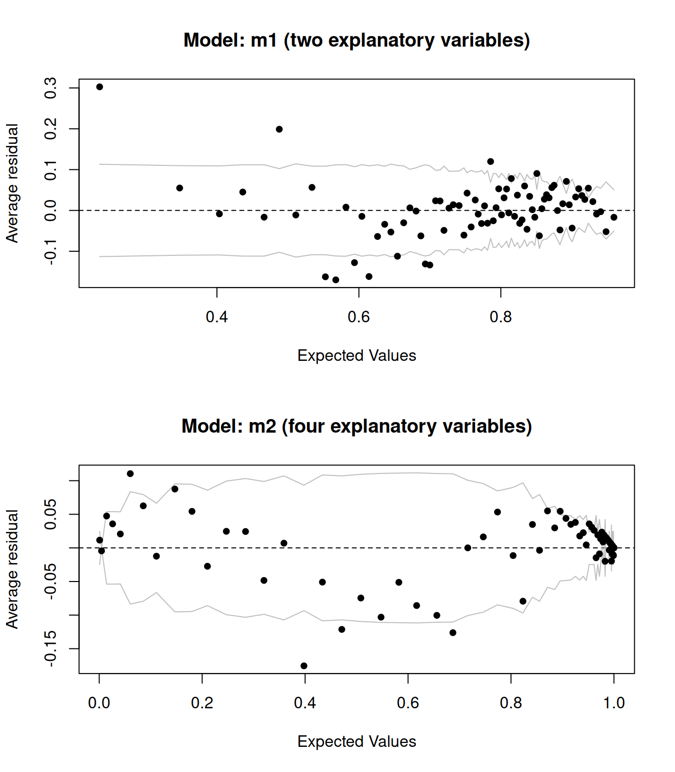
Figure 8.4: Binned residual plots for logistic regression models.
The results are shown in Figure 8.4. They look better – adding more explanatory variable appears to have improved the model fit.
It’s worth repeating that if your main interest is hypothesis testing, you shouldn’t fit multiple models and then pick the one that gives the best results. However, if you’re doing an exploratory analysis or are interested in predictive modelling, you can and should try different models. It can then be useful to do a formal hypothesis test of the null hypothesis that m and m2 fit the data equally well, against the alternative that m2 has a better fit. If both fit the data equally well, we’d prefer m, since it is a simpler model. We can use anova to perform a likelihood ratio deviance test (see Section 14.4 for details), which tests this:
The p-value is very low, and we conclude that m2 has a better model fit.
Another useful function is cooks.distance, which can be used to compute the Cook’s distance for each observation, which is useful for finding influential observations. In this case, I’ve chosen to print the row numbers for the observations with a Cook’s distance greater than 0.004 – this number has been arbitrarily chosen in order only to highlight the observations with the highest Cook’s distance.
res <- data.frame(Index = 1:length(cooks.distance(m)),
CooksDistance = cooks.distance(m))
# Plot index against the Cook's distance to find
# influential points:
ggplot(res, aes(Index, CooksDistance)) +
geom_point() +
geom_text(aes(label = ifelse(CooksDistance > 0.004,
rownames(res), "")),
hjust = 1.1)\[\sim\]
Exercise 8.16 Investigate the residuals for your sharks.csv model. Are there any problems with the model fit? Any influential points?
8.3.5 Prediction
Just as for linear models, we can use predict to make predictions for new observations using a GLM. To begin with, let’s randomly sample 10 rows from the wine data and fit a model using all data except those 10 observations:
# Randomly select 10 rows from the wine data:
rows <- sample(1:nrow(wine), 10)
m <- glm(type ~ pH + alcohol, data = wine[-rows,], family = binomial)We can now use predict to make predictions for the 10 observations:
Those predictions look a bit strange though – what are they? By default, predict returns predictions on the scale of the link function. That’s not really what we want in most cases; instead, we are interested in the predicted probabilities. To get those, we have to add the argument type = "response" to the call:
Logistic regression models are often used for prediction, in what is known as classification. Section 11.1.7 is concerned with how to evaluate the predictive performance of logistic regression and other classification models.
8.4 Regression models for multicategory response variables
Logistic regression can be extended to situations where our response variable is categorical with three or more levels. Such variables can be of two types:
- Nominal: the categories do not have a natural ordering (e.g., sex, regions).
- Ordinal: the categories have a natural ordering (e.g., education levels, risk levels, answers on a scale that ranges from strongly disagree to strongly agree).
We’ll consider logistic regression models for both types of variables, starting with ordinal ones.
8.4.1 Ordinal response variables
The method that we’ll use for ordinal response variables is called ordinal logistic regression.
Let’s say that our response variable \(Y\) has \(k\) levels: \(1, 2, 3, \ldots, k\). Let’s also say that we have \(p\) explanatory variables \(x_1,\ldots,x_p\) that we believe are connected to \(Y\).
A dataset with such data is found in the ordinalex.csv data file, which can be downloaded from the book’s web page.
The variable that we’ll use as the response in our model is Risk. For these data, we have \(k=4\) levels for \(Y\): 1 = no risk, 2 = low risk, 3 = moderate risk, 4 = high risk.
The ordinal logistic regression model is that:
\[P(Y\leq j)=f\Big(\alpha_j -( \beta_1x_1+\beta_2x_2+\cdots+\beta_px_p)\Big), \qquad j=1,2,\ldots, k\]
This can then be used to compute \(P(Y=j)\) for any \(j\). \(\alpha_j\) is connected to the base probability that \(Y\leq j\). The \(\beta_i\) coefficients describe how the probability is affected by the explanatory variables.
To make this look more like a logistic regression model, we can rewrite the model as:
\[\qquad\qquad\qquad \ln\Big(\frac{P(Y\leq j)}{1-P(Y\leq j)}\Big)=\alpha_j -( \beta_1x_1+\beta_2x_2+\cdots+\beta_px_p)\]
The \(\beta_i\) are interpreted as follows:
- If \(\beta_i=0\), then \(x_i\) does not affect the probability,
- If \(\beta_i>0\), then the probability of \(Y\) belonging to a high \(j\) increases when \(x_i\) increases,
- If \(\beta_i<0\), then the probability of \(Y\) belonging to a high \(j\) decreases when \(x_i\) increases,
- \(e^{\beta_i}\) gives the odds ratio for obtaining a higher \(j\) for \(x_i\).
In this model, the effect of \(x_i\) is the same for all \(j\), an assumption known as proportional odds. The explanatory variables affect the general direction of \(Y\) rather than the individual categories. The assumption of proportional odds can be tested as part of the model diagnostics. Non-proportional odds can arise, e.g., when an \(x_i\) causes \(Y\) to more often end up in extreme \(j\) (i.e., very low or very high \(j\)) instead of pushing \(Y\) to only higher values or only lower values.
The polr function from MASS can be used for fitting ordinal logistic regression models. We’ll use Age and Sex as explanatory variables. First, we set the order of the categories.
Without pipes:
ordinalex$Risk <- factor(ordinalex$Risk, c("No risk", "Low risk",
"Moderate risk", "High risk"),
ordered = TRUE)With pipes:
library(dplyr)
ordinalex |>
mutate(Risk = factor(Risk, c("No risk", "Low risk",
"Moderate risk","High risk"),
ordered = TRUE)) -> ordinalexWe can now fit an ordinal logistic regression model:
Note that no p-values are presented. The reason is that the traditional Wald p-values for this model are unreliable unless we have very large sample sizes. It is still possible to compute them using the coeftest function from the AER function, but I recommend using the (albeit slower) bootstrap approach for computing p-values instead:
# Wald p-values (not recommended):
library(AER)
coeftest(m)
# Bootstrap p-values (takes a while to run):
library(boot.pval)
boot_summary(m, method = "case") # Raw coefficients
boot_summary(m, method = "case", coef = "exp") # Odds ratiosThe assumption of proportional odds can be tested using Brant’s test. The null hypothesis is that the odds are proportional, so a low p-value would indicate that we don’t have proportional odds:
In this case, the p-value for Age is low, which would indicate that we don’t have proportional odds for this variable. We might therefore consider other models, such as the nominal regression model described in the next section.
Finally, we can visualise the results from the model as follows (and as shown in Figure 8.5):
library(tidyr)
library(ggplot2)
# Make predictions for males and females aged 15-50:
plotdata <- expand.grid(Age = 15:50,
Sex = c("Female", "Male"))
plotdata |>
bind_cols(predict(m, plotdata, type = "probs")) -> plotdata
# Reformat the predictions to be suitable for creating a ggplot:
plotdata |> pivot_longer(c("No risk", "Low risk", "Moderate risk", "High risk"),
names_to = "Risk") |>
rename(Probability = value) |>
mutate(Risk = factor(Risk, levels = levels(ordinalex$Risk))) -> plotdata
# Plot the predicted risk for women:
plotdata |> filter(Sex == "Female") |>
ggplot(aes(Age, Probability, colour = Risk)) +
geom_line(linewidth = 2)
# Plot the predicted risk for both sexes:
plotdata |>
ggplot(aes(Age, Probability, colour = Risk, linetype = Sex)) +
geom_line(linewidth = 2)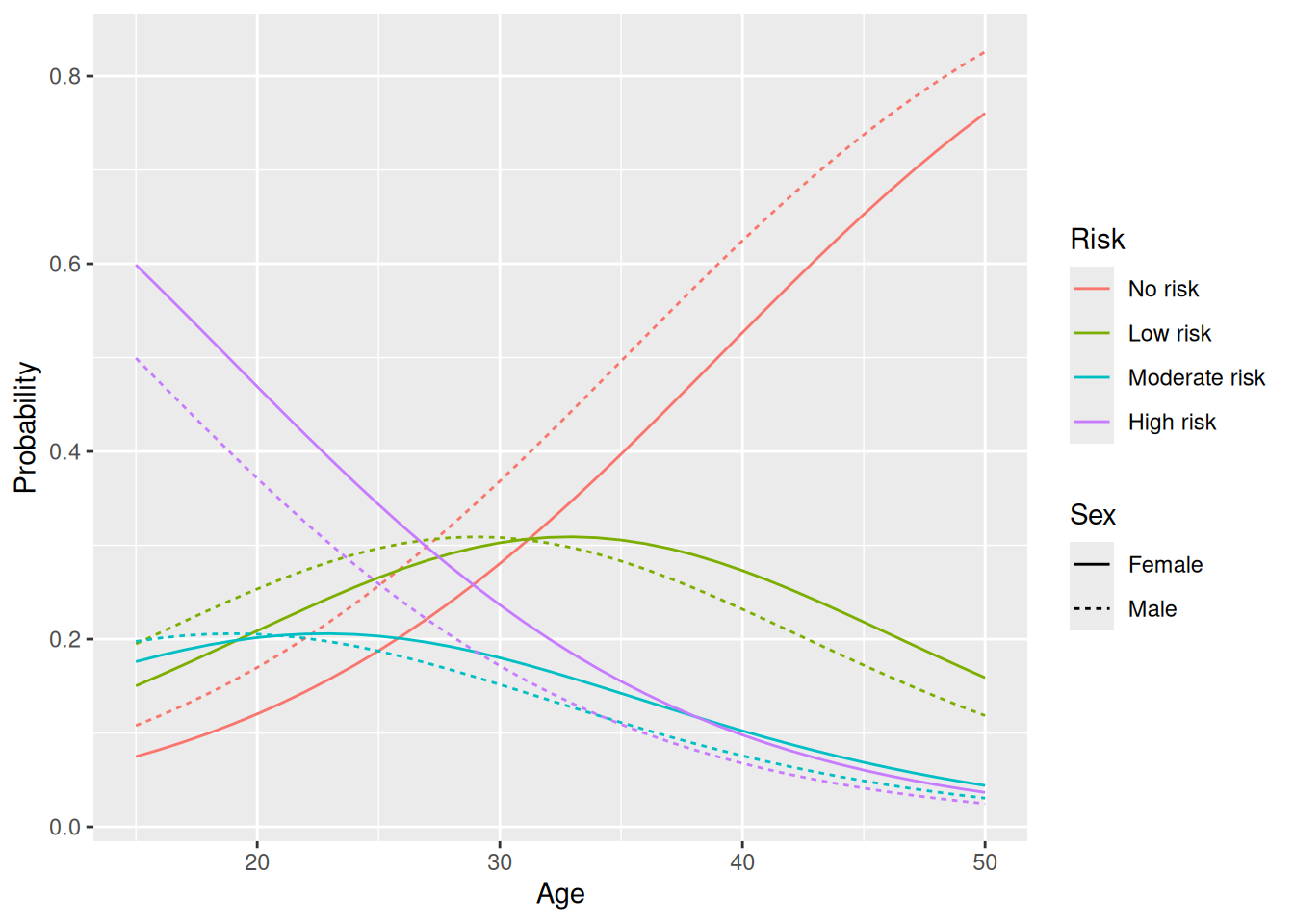
Figure 8.5: Model predictions for an ordinal logistic regression model.
8.4.2 Nominal response variables
Multinomial logistic regression, also known as softmax regression or MaxEnt regression, can be used when our response variable is a nominal categorical variable. It can also be used for ordinal response variables when the proportional odds assumption isn’t met.
A multinomial logistic regression model for a response variable with \(k\) categories is essentially a collection of \(k-1\) ordinary logistic regressions, one for each category except the reference category, which are combined into a single model. The multinom function in nnet can be used to fit such a model. We’ll have a look at an example using the same dataset as in the previous section:
The summary table shows the \(\beta\) coefficients for the \(k-1\) non-reference categories. In this case, No risk is the reference category, so all coefficients are relative to No risk and can be interpreted as in an ordinary logistic regression:
If we make predictions using this model, we get the probabilities of belonging to the different categories:
Finally, we can visualise the fitted model as follows:
library(tidyr)
library(ggplot2)
# Make predictions for males and females aged 15-50:
plotdata <- expand.grid(Age = 15:50,
Sex = c("Female", "Male"))
plotdata |>
bind_cols(predict(m, plotdata, type = "probs")) -> plotdata
# Reformat the predictions to be suitable for creating a ggplot:
plotdata |> pivot_longer(c("No risk", "Low risk", "Moderate risk", "High risk"),
names_to = "Risk") |>
rename(Probability = value) |>
mutate(Risk = factor(Risk, levels = levels(ordinalex$Risk))) -> plotdata
plotdata |>
ggplot(aes(Age, Probability, colour = Risk, linetype = Sex)) +
geom_line(linewidth = 2)The results are similar to what we got with an ordinal logistic regression, but there are some differences, for instance for the probability of moderate or high risk for 50 year olds.
8.5 Modelling count data
Logistic regression is but one of many types of GLMs used in practice. One important example is Cox regression, which is used for survival data. We’ll return to that model in Section 9.1. For now, we’ll consider count data instead.
8.5.1 Poisson and negative binomial regression
Let’s have a look at the shark attack data in sharks.csv, available on the book’s website. It contains data about shark attacks in South Africa, downloaded from The Global Shark Attack File (http://www.sharkattackfile.net/incidentlog.htm). To load it, we download the file and set file_path to the path of sharks.csv.
We then compute number of attacks per year, and filter the data to only keep observations from 1960 to 2019:
Without pipes:
# Compute number of attacks per year:
attacks <- aggregate(Type ~ Year, data = sharks, FUN = length)
names(attacks)[2] <- "n"
# Keep data for 1960-2019:
attacks <- subset(attacks, Year >= 1960)With pipes:
library(dplyr)
sharks |>
mutate(Year = as.numeric(Year)) |>
group_by(Year) |>
count() |>
filter(Year >= 1960) -> attacksThe number of attacks in a year is not binary but a count that, in principle, can take any non-negative integer as its value. Are there any trends over time for the number of reported attacks?
# Plot data from 1960-2019:
library(ggplot2)
ggplot(attacks, aes(Year, n)) +
geom_point() +
ylab("Number of attacks")No trend is evident. To confirm this, let’s fit a regression model with n (number of attacks) as the response variable and Year as an explanatory variable. For count data like this, a good first model to use is Poisson regression. Let \(\mu_i\) denote the expected value of the response variable given the explanatory variables. Given \(n\) observations of \(p\) explanatory variables, the Poisson regression model is:
\[\log(\mu_i)=\beta_0+\beta_1 x_{i1}+\beta_2 x_{i2}+\cdots+\beta_p x_{ip},\qquad i=1,\ldots,n\]
To fit it, we use glm as before, but this time with family = poisson:
We can add the curve corresponding to the fitted model to our scatterplot as follows (and as shown in Figure 8.6):
attacks_pred <- data.frame(Year = attacks$Year, at_pred =
predict(m, type = "response"))
ggplot(attacks, aes(Year, n)) +
geom_point() +
ylab("Number of attacks") +
geom_line(data = attacks_pred, aes(x = Year, y = at_pred),
colour = "red")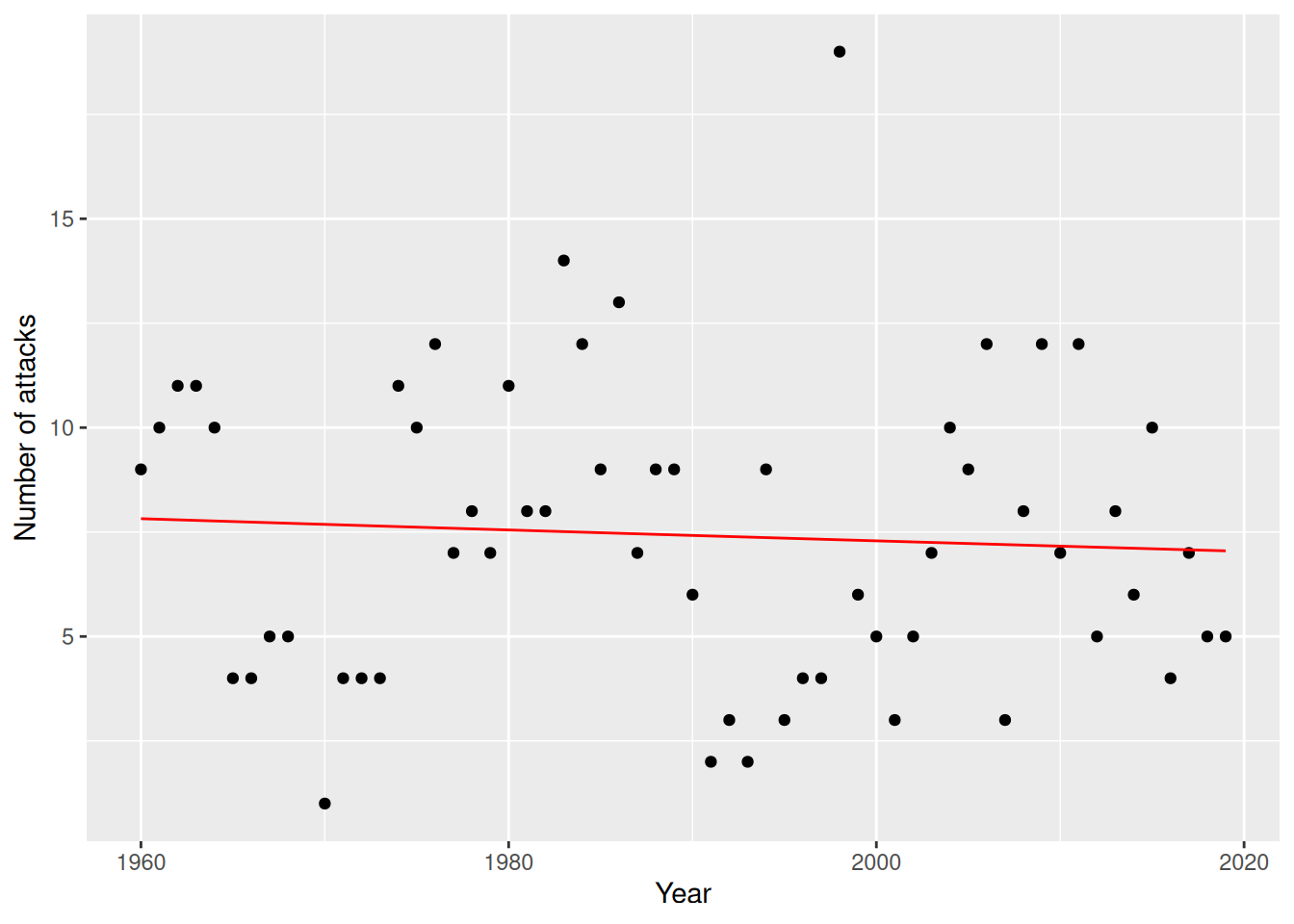
Figure 8.6: Poisson regression model for the sharks data.
The fitted model seems to confirm our view that there is no trend over time in the number of attacks.
For model diagnostics, we can use a binned residual plot and a plot of Cook’s distance to find influential points:
# Binned residual plot:
library(arm)
binnedplot(predict(m, type = "response"),
residuals(m, type = "response"))
# Plot index against the Cook's distance to find
# influential points:
res <- data.frame(Index = 1:nrow(m$data),
CooksDistance = cooks.distance(m))
ggplot(res, aes(Index, CooksDistance)) +
geom_point() +
geom_text(aes(label = ifelse(CooksDistance > 0.1,
rownames(res), "")),
hjust = 1.1)A common problem in Poisson regression models is excess zeroes, i.e., more observations with value 0 than what is predicted by the model. To check the distribution of counts in the data, we can draw a histogram:
If there are a lot of zeroes in the data, we should consider using another model, such as a hurdle model or a zero-inflated Poisson regression. Both of these are available in the pscl package.
Another common problem is overdispersion, which occurs when there is more variability in the data than what is predicted by the GLM. A formal test of overdispersion (Cameron & Trivedi, 1990) is provided by dispersiontest in the AER package. The null hypothesis is that there is no overdispersion, and the alternative is that there is overdispersion:
There are several alternative models that can be considered in the case of overdispersion. One of them is negative binomial regression, which uses the same link function as Poisson regression. We can fit it using the glm.nb function from MASS:
For the shark attack data, the predictions from the two models are virtually identical, meaning that both are equally applicable in this case:
attacks_pred <- data.frame(Year = attacks$Year, at_pred =
predict(m, type = "response"))
attacks_pred_nb <- data.frame(Year = attacks$Year, at_pred =
predict(m_nb, type = "response"))
ggplot(attacks, aes(Year, n)) +
geom_point() +
ylab("Number of attacks") +
geom_line(data = attacks_pred, aes(x = Year, y = at_pred),
colour = "red") +
geom_line(data = attacks_pred_nb, aes(x = Year, y = at_pred),
colour = "blue", linetype = "dashed")Finally, we can obtain bootstrap confidence intervals, e.g., using case resampling, using boot_summary:
\[\sim\]
Exercise 8.17 The quakes dataset, available in base R, contains information about seismic events off Fiji. Fit a Poisson regression model with stations as the response variable and mag as an explanatory variable. Are there signs of overdispersion? Does using a negative binomial model improve the model fit?
8.5.2 Modelling rates
Poisson regression models, and related models like negative binomial regression, can not only be used to model count data. They can also be used to model rate data, such as the number of cases per capita or the number of cases per unit area. In that case, we need to include an exposure variable \(N\) that describes, e.g., the population size or area corresponding to each observation. The model will be that:
\[\log(\mu_i/N_i)=\beta_0+\beta_1 x_{i1}+\beta_2 x_{i2}+\cdots+\beta_p x_{ip},\qquad i=1,\ldots,n.\] Because \(\log(\mu_i/N_i)=\log(\mu_i)-\log(N_i)\), this can be rewritten as:
\[\log(\mu_i)=\beta_0+\beta_1 x_{i1}+\beta_2 x_{i2}+\cdots+\beta_p x_{ip}+\log(N_i),\qquad i=1,\ldots,n.\]
In other words, we should include \(\log(N_i)\) on the right-hand side of our model, with a known coefficient equal to 1. In regression, such a term is known as an offset. We can add it to our model using the offset function.
As an example, we’ll consider the ships data from the MASS package. It describes the number of damage incidents for different ship types operating in the 1960s and 1970s, and it includes information about how many months each ship type was in service (i.e., each ship type’s exposure):
For our example, we’ll use ship type as the explanatory variable, incidents as the response variable, and service as the exposure variable. First, we remove observations with 0 exposure (by definition, these can’t be involved in incidents, and so there is no point in including them in the analysis).
Without pipes:
With pipes:
Then, we fit the model using glm and offset:
Model diagnostics can be performed as in the previous sections.
Rate models are usually interpreted in terms of the rate ratios \(e^{\beta_j}\), which describe the multiplicative increases of the intensity of rates when \(x_j\) is increased by one unit. To compute the rate ratios for our model, we use exp:
\[\sim\]
Exercise 8.18 Compute bootstrap confidence intervals for the rate ratios in the model for the ships data.
8.6 Bayesian estimation of generalised linear models
We can fit a Bayesian GLM with the rstanarm package, using stan_glm in the same way we did for linear models. Let’s look at an example with the wine data. First, we load and prepare the data:
# Import data about white and red wines:
white <- read.csv("https://tinyurl.com/winedata1",
sep = ";")
red <- read.csv("https://tinyurl.com/winedata2",
sep = ";")
white$type <- "white"
red$type <- "red"
wine <- rbind(white, red)
wine$type <- factor(wine$type)Now, we fit a Bayesian logistic regression model:
library(rstanarm)
m <- stan_glm(type ~ pH + alcohol, data = wine, family = binomial)
# Print the estimates:
coef(m)Next, we can plot the posterior distributions of the effects:
To get 95% credible intervals for the effects, we can use posterior_interval. We can also use plot to visualise them:
posterior_interval(m,
                   pars = names(coef(m)),
                   prob = 0.95)
plot(m, "intervals",
     pars = names(coef(m)),
     prob = 0.95)
Finally, we can use \(\hat{R}\) to check model convergence. It should be less than 1.1 if the fitting has converged:
8.7 Missing data and multiple imputation
A common problem is missing data, where some values in the dataset are missing. This can be handled by multiple imputation, where the missing values are artificially replaced with simulated values. These simulated values are usually predicted using other (non-missing) variables as explanatory variables. Because the impact of the simulated values on the model fit can be large, the process is repeated several times, with different imputed values in each iteration, and a model is fitted to each imputed dataset. These can then be combined to create a single model.
The mice package allows us to perform multiple imputation. Let’s install it:
8.7.1 Multiple imputation
For our examples, we’ll use the estates dataset. Download the estates.xlsx data from the book’s web page. It describes the selling prices (in thousands of Swedish kronor (SEK)) of houses in and near Uppsala, Sweden, along with a number of variables describing the location, size, and standard of the house. We set file_path to the path to estates.xlsx and then load the data:
As you can see, several values are missing. We are interested in creating a regression model where selling_price is the response variable, and living_area (size of house) and location (location of house) as explanatory variables, and would like to use multiple imputation.
Regression modelling using multiple imputation is carried out in five steps:
- Select the variables you want to use for imputation.
- Perform imputation \(m\) times.
- Fit models to each imputed sample.
- Pool the results: combine the estimates from the \(m\) fitted models to obtain a single set of estimates, standard errors, and p-values; see Rubin (1987) and Barnard & Rubin (1999) for details.
- Create a summary.
This is well suited to a pipeline, where each line corresponds to one of the steps above:
library(dplyr)
library(mice)

estates |>
    select(selling_price, living_area, location, plot_area,
           supplemental_area, tax_value) |>
    mice(m = 5, print = FALSE) |>
    with(lm(selling_price ~ living_area + location)) |>
    pool() |>
    summary()
By default, mice uses a method called predictive mean matching when imputing numerical variables, logistic regression when imputing binary variables, polytomous regression when imputing nominal categorical variables, and ordered logistic regression when imputing ordinal categorical variables. Many other methods are available; see ?mice for a list. We can for instance use random forest imputation instead (we’ll discuss random forest methods in Section 11.5.2), by using the method argument in mice:
estates |>
    select(selling_price, living_area, location, plot_area,
           supplemental_area, tax_value) |>
    mice(m = 5, print = FALSE, method = "rf") |>
    with(lm(selling_price ~ living_area + location)) |>
    pool() |>
    summary()
If we like, we can do imputation only for some of the variables. We then specify a formula for each such variable, showing what variables to use for imputation of that variable. The formula follows the syntax for regression formulas and can include interactions.
For example, if we only want to do imputation for living_area and plot_area:
# Create a list of formulas for the variables we want to do imputation for:
imp_formulas <- list(
    living_area = formula(living_area ~ .), # Use all other variables
    plot_area = formula(plot_area ~ location * living_area)) # Use location and
                                                             # living area, with
                                                             # an interaction

# Run the multiple imputation:
estates |>
    select(selling_price, living_area, location, plot_area,
           supplemental_area, tax_value) |>
    mice(m = 5, print = FALSE, formulas = imp_formulas) |>
    with(lm(selling_price ~ living_area + location + plot_area)) |>
    pool() |>
    summary()
8.7.2 The effect of missing data
First, let’s discuss what effect missing data has on a regression analysis. We’ll illustrate this using the penguins dataset from the palmerpenguins package. We fit a linear regression model with two explanatory variables:
library(palmerpenguins)
library(dplyr)

# Data set without missing values:
penguins |> select(flipper_length_mm, body_mass_g, species) |>
            na.omit() -> penguins

m <- lm(flipper_length_mm ~ body_mass_g + species, data = penguins)
summary(m)
To see how missing data affects the results, we run a simulation. We use the ampute functions from mice to randomly remove some observations from the dataset. We set the proportion of missing data to 25%. ampute converts the categorical species variable to numeric, so we also convert that back:
library(mice)
penguins_missing <- ampute(penguins, prop = 0.25)$amp
penguins_missing$species <- factor(penguins_missing$species)
We can now check the results to see if the fitted model differs from that using the complete dataset:
m2 <- lm(flipper_length_mm ~ body_mass_g + species,
        data = penguins_missing)
summary(m2)

# How large is the relative change of the coefficients?
coef(m2)/coef(m)

# How large is the absolute change of the p-values?
abs(summary(m2)$coef[,4]-summary(m)$coef[,4])
To see how large these effects can be, we can run this simulation 1,000 times, similar to the simulations we ran in Section 7.2:
B <- 1000
res <- data.frame(coef1 = vector("numeric", B),
                  coef2 = vector("numeric", B),
                  coef3 = vector("numeric", B),
                  coef4 = vector("numeric", B))

for(i in 1:B)
{
  penguins_missing <- ampute(penguins, prop = 0.25)$amp
  penguins_missing$species <- factor(penguins_missing$species)

  m2 <- lm(flipper_length_mm ~ body_mass_g + species,
          data = penguins_missing)

  # How large is the relative change of the coefficients?
  res[i,] <- coef(m2)/coef(m)
}

# How many % was the largest relative decrease?
(1-apply(res, 2, min))*100

# How many % was the largest relative increase?
(apply(res, 2, max)-1)*100
In my run, the estimated values for the third coefficient (the dummy variable for the Chinstrap species) ranged from 21% smaller to 19% larger than the estimate for the complete data. That’s substantial, so, it is clear that missing data can skew the results.
8.7.3 The effect of multiple imputation
So what happens if we use multiple imputation to estimate the coefficients instead of just using complete observations, as we did in our previous simulation?
We run the same simulation again, but this time using multiple imputation. It therefore takes a little longer to run.
B <- 1000
res <- data.frame(coef1 = vector("numeric", B),
                  coef2 = vector("numeric", B),
                  coef3 = vector("numeric", B),
                  coef4 = vector("numeric", B))

# Start progress bar:
pbar <- txtProgressBar(min = 0, max = B, style = 3)

for(i in 1:B)
{
  penguins_missing <- ampute(penguins, prop = 0.25)$amp
  penguins_missing$species <- factor(penguins_missing$species)

  penguins_missing |>
    mice(m = 5, print = FALSE) |>
    with(lm(flipper_length_mm ~ body_mass_g + species)) |>
    pool() |>
    summary() |>
    select(estimate) -> m2

  # How large is the relative change of the coefficients?
  res[i,] <- m2/coef(m)

  # Update progress bar
  setTxtProgressBar(pbar, i)
}

close(pbar)

# How many % was the largest relative decrease?
(1-apply(res, 2, min))*100

# How many % was the largest relative increase?
(apply(res, 2, max)-1)*100
The results are much better than before. In my run, the estimated values for the third coefficient (the dummy variable for the Chinstrap species) ranged from 2.2% smaller to 2.6% larger than the estimate for the complete data (which should be compared to the 21% and 19% I got when we didn’t use multiple imputation). The lesson here is that the multiple imputation lets us get estimates that are closer to what we would get if we had had complete data.
8.8 Mixed models
Mixed models are used in regression problems where measurements have been made on clusters of related units. As the first example of this, we’ll use a dataset from the lme4 package, which also happens to contain useful methods for mixed models. Let’s install it:
The sleepstudy dataset from lme4 contains data from a study on reaction times in a sleep deprivation study. The participants were restricted to 3 hours of sleep per night, and their average reaction time on a series of tests were measured each day during the 9 days that the study lasted:
Let’s start our analysis by making boxplots showing reaction times for each subject. We’ll also superimpose the observations for each participant on top of their boxplots:
library(ggplot2)
ggplot(sleepstudy, aes(Subject, Reaction)) +
      geom_boxplot() +
      geom_jitter(aes(colour = Subject),
                  position = position_jitter(0.1))
We are interested in finding out if the reaction times increase when the participants have been starved for sleep for a longer period. Let’s try plotting reaction times against days, adding a regression line:
ggplot(sleepstudy, aes(Days, Reaction, colour = Subject)) +
  geom_point() +
  geom_smooth(method = "lm", colour = "black", se = FALSE)
As we saw in the boxplots and can see in this plot too, some participants always have comparatively high reaction times, whereas others always have low values. There are clear differences between individuals, and the measurements for each individual will be correlated. This violates a fundamental assumption of the traditional linear model, namely that all observations are independent.
In addition to this, it also seems that the reaction times change in different ways for different participants, as can be seen if we facet the plot by test subject:
ggplot(sleepstudy, aes(Days, Reaction, colour = Subject)) +
  geom_point() +
  theme(legend.position = "none") +
  facet_wrap(~ Subject, nrow = 3) +
  geom_smooth(method = "lm", colour = "black", se = FALSE)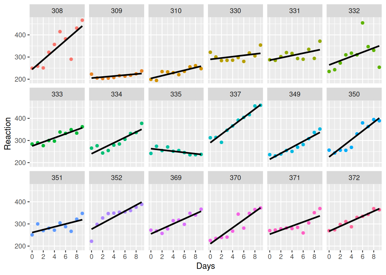
Figure 8.7: Comparison of the trends for the 18 sleep study test subjects.
The results are shown in Figure 8.7. Both the intercept and the slope of the average reaction time differs between individuals. Because of this, the fit given by the single model can be misleading. Moreover, the fact that the observations are correlated will cause problems for the traditional intervals and tests. We need to take this into account when we estimate the overall intercept and slope.
One approach could be to fit a single model for each subject. That doesn’t seem very useful though. We’re not really interested in these particular test subjects but in how sleep deprivation affects reaction times in an average person. It would be much better to have a single model that somehow incorporates the correlation between measurements made on the same individual. That is precisely what a linear mixed regression model does.
8.8.1 Fitting a linear mixed model
A linear mixed model (LMM) has two types of effects (explanatory variables):
- Fixed effects, which are non-random. These are usually the variables of primary interest in the data. In the
sleepstudyexample,Daysis a fixed effect. - Random effects, which represent nuisance variables that cause measurements to be correlated. These are usually not of interest in and of themselves, but are something that we need to include in the model to account for correlations between measurements. In the
sleepstudyexample,Subjectis a random effect.
Linear mixed models can be fitted using lmer from the lme4 package. The syntax is the same as for lm, with the addition of random effects. These can be included in different ways. Let’s have a look at them.
First, we can include a random intercept, which gives us a model where the intercept (but not the slope) varies between test subjects. In our example, the formula for this is:
Alternatively, we could include a random slope in the model, in which case the slope (but not the intercept) varies between test subjects. The formula would be:
Finally, we can include both a random intercept and random slope in the model. This can be done in two different ways, as we can model the intercept and slope as being correlated or uncorrelated:
# Correlated random intercept and slope:
m3 <- lmer(Reaction ~ Days + (1 + Days|Subject), data = sleepstudy)

# Uncorrelated random intercept and slope:
m4 <- lmer(Reaction ~ Days + (1|Subject) + (0 + Days|Subject),
           data = sleepstudy)
Which model should we choose? Are the intercepts and slopes correlated? It could of course be the case that individuals with a high intercept have a smaller slope – or a greater slope! To find out, we can fit different linear models to each subject and then make a scatterplot of their intercepts and slopes. To fit a model to each subject, we use split and map as in Section 8.2.5:
# Collect the coefficients from each linear model:
library(purrr)
sleepstudy |> split(sleepstudy$Subject) |>
              map(~ lm(Reaction ~ Days, data = .)) |>
              map(coef) -> coefficients

# Convert to a data frame:
coefficients <- data.frame(matrix(unlist(coefficients),
                  nrow = length(coefficients),
                  byrow = TRUE),
                  row.names = names(coefficients))
names(coefficients) <- c("Intercept", "Days")

# Plot the coefficients:
ggplot(coefficients, aes(Intercept, Days,
                         colour = row.names(coefficients))) +
      geom_point() +
      geom_smooth(method = "lm", colour = "black", se = FALSE) +
      labs(fill = "Subject")

# Test the correlation:
cor.test(coefficients$Intercept, coefficients$Days)
The correlation test is not significant, and judging from the plot, there is little indication that the intercept and slope are correlated. We saw earlier that both the intercept and the slope seem to differ between subjects, and so m4 seems like the best choice here. Let’s stick with that and look at a summary table for the model.
I like to add correlation = FALSE here, which suppresses some superfluous output from summary.
You’ll notice that unlike the summary table for linear models, there are no p-values! This is a deliberate design choice from the lme4 developers, who argue that the approximate tests available aren’t good enough for small sample sizes (Bates et al., 2015).
Summary tables, including bootstrap p-values, for the fixed effects are available through boot_summary:
Using the bootstrap is usually the best approach for mixed models. If you really want some quick p-values, you can load the lmerTest package, which adds p-values computed using the Satterthwaite approximation (Kuznetsova et al., 2017). This is better than the usual approximate test but still not as good as bootstrap p-values.
install.packages("lmerTest")

library(lmerTest)
m4 <- lmer(Reaction ~ Days + (1|Subject) + (0 + Days|Subject),
           data = sleepstudy)
summary(m4, correlation = FALSE)
If we need to extract the model coefficients, we can do so using fixef (for fixed effects) and ranef (for random effects):
If we want to extract the variance components from the model, we can use VarCorr:
Let’s add the lines from the fitted model to our facetted plot, to compare the results of our mixed model to the lines that were fitted separately for each individual:
mixed_mod <- coef(m4)$Subject
mixed_mod$Subject <- row.names(mixed_mod)

ggplot(sleepstudy, aes(Days, Reaction)) +
      geom_point() +
      theme(legend.position = "none") +
      facet_wrap(~ Subject, nrow = 3) +
      geom_smooth(method = "lm", colour = "cyan", se = FALSE,
                  size = 0.8) +
      geom_abline(aes(intercept = `(Intercept)`, slope = Days,
                      color = "magenta"),
                  data = mixed_mod, size = 0.8)
Notice that the lines differ. The intercept and slopes have been shrunk toward the global effects, i.e., toward the average of all lines.
\[\sim\]
Exercise 8.19 Consider the Oxboys data from the nlme package. Does a mixed model seem appropriate here? If so, are the intercept and slope correlated for different subjects? Fit a suitable model, with height as the response variable.
Save the code for your model, as you will return to it in the next few exercises.
(Click here to go to the solution.)
Exercise 8.20 The broom.mixed package allows you to get summaries of mixed models as data frames, just as broom does for linear and generalised linear models. Install it and use it to get the summary table for the model for the Oxboys data that you created in the previous exercise. How are fixed and random effects included in the table?
8.8.2 Model diagnostics
As for any linear model, residual plots are useful for diagnostics for linear mixed models. Of particular interest are signs of heteroscedasticity, as homoscedasticity is assumed in the mixed model. We’ll use fortify.merMod to turn the model into an object that can be used with ggplot2, and then create some residual plots:
library(ggplot2)
fm4 <- fortify.merMod(m4)

# Plot residuals:
ggplot(fm4, aes(.fitted, .resid)) +
  geom_point() +
  geom_hline(yintercept = 0) +
  xlab("Fitted values") + ylab("Residuals")

# Compare the residuals of different subjects:
ggplot(fm4, aes(Subject, .resid)) +
  geom_boxplot() +
  coord_flip() +
  ylab("Residuals")

# Observed values versus fitted values:
ggplot(fm4, aes(.fitted, Reaction)) +
  geom_point(colour = "blue") +
  facet_wrap(~ Subject, nrow = 3) +
  geom_abline(intercept = 0, slope = 1) +
  xlab("Fitted values") + ylab("Observed values")

## Q-Q plot of residuals:
ggplot(fm4, aes(sample = .resid)) +
  geom_qq() + geom_qq_line()

## Q-Q plot of random effects:
ggplot(ranef(m4)$Subject, aes(sample = `(Intercept)`)) +
  geom_qq() + geom_qq_line()
ggplot(ranef(m4)$Subject, aes(sample = `Days`)) +
  geom_qq() + geom_qq_line()
The normality assumption appears to be satisfied, but there are some signs of heteroscedasticity in the boxplots of the residuals for the different subjects.
\[\sim\]
Exercise 8.21 Return to your mixed model for the Oxboys data from Exercise 8.19. Make diagnostic plots for the model. Are there any signs of heteroscedasticity or non-normality?
8.8.3 Nested random effects and multilevel/hierarchical models
In many cases, a random factor is nested within another. To see an example of this, consider the Pastes data from lme4:
We are interested in the strength of a chemical product. There are 10 delivery batches (batch), and three casks within each delivery (cask). Because of variations in manufacturing, transportation, storage, and so on, it makes sense to include random effects for both batch and cask in a linear mixed model. However, each cask only appears within a single batch, which makes the cask effect nested within batch.
Models that use nested random factors are commonly known as multilevel models (because the random factors in the model exist at different “levels”), or hierarchical models (because there is a hierarchy between the random factors in the model). These aren’t really any different from other mixed models, but depending on how the data is structured, we may have to be a bit careful to get the nesting right when we fit the model with lmer.
If the two effects weren’t nested, we could fit a model using:
# Incorrect model:
m1 <- lmer(strength ~ (1|batch) + (1|cask),
           data = Pastes)
summary(m1, correlation = FALSE)
However, because the casks are labelled a, b, and c within each batch, we’ve now fitted a model where casks from different batches are treated as being equal! To clarify that the labels a, b, and c belong to different casks in different batches, we need to include the nesting in our formula. This is done as follows:
# Cask is nested within batch:
m2 <- lmer(strength ~ (1|batch/cask),
           data = Pastes)
summary(m2, correlation = FALSE)
Equivalently, we can also use:
8.8.4 ANOVA with random effects
The lmerTest package provides ANOVA tables that allow us to use random effects in ANOVA models. To use it, simply load lmerTest before fitting a model with lmer, and then run anova(m, type = "III") (or replace III with II or I if you want a type II or type I ANOVA table instead).
As an example, consider the TVbo data from lmerTest. Three types of TV sets were compared by eight assessors for four different pictures. To see if there is a difference in the mean score for the colour balance of the TV sets, we can fit a mixed model. We’ll include a random intercept for the assessor. This is a balanced design (in which case the results from all three types of tables coincide):
library(lmerTest)

# TV data:
?TVbo

# Fit model with both fixed and random effects:
m <- lmer(Colourbalance ~ TVset*Picture + (1|Assessor),
          data = TVbo)

# View fitted model:
m

# All three types of ANOVA table give the same results here:
anova(m, type = "III")
anova(m, type = "II")
anova(m, type = "I")
The interaction effect is significant at the 5% level. As for other ANOVA models, we can visualise this with an interaction plot:
\[\sim\]
Exercise 8.22 Fit a mixed effects ANOVA to the TVbo data, using Coloursaturation as the response variable, TVset and Picture as fixed effects, and Assessor as a random effect. Does there appear to be a need to include the interaction between Assessor and TVset as a random effect? If so, do it.
8.8.5 Generalised linear mixed models
Everything that we have just done for the linear mixed models carries over to generalised linear mixed models (GLMMs), which are GLMs with both fixed and random effects.
A common example is the item response model, which plays an important role in psychometrics. This model is frequently used in psychological tests containing multiple questions or sets of questions (“items”), where both the subject and the item are considered random effects. As an example, consider the VerbAgg data from lme4:
We’ll use the binary version of the response, r2, and fit a logistic mixed regression model to the data, to see if it can be used to explain the subjects’ responses. The formula syntax is the same as for linear mixed models, but now we’ll use glmer to fit a GLMM. We’ll include Anger and Gender as fixed effects (we are interested in seeing how these affect the response) and item and id as random effects with random slopes (we believe that answers to the same item and answers from the same individual may be correlated):
m <- glmer(r2 ~ Anger + Gender + (1|item) + (1|id),
           data = VerbAgg, family = binomial)
summary(m, correlation = FALSE)
We can plot the fitted random effects for item to verify that there appear to be differences between the different items:
mixed_mod <- coef(m)$item
mixed_mod$item <- row.names(mixed_mod)

ggplot(mixed_mod, aes(`(Intercept)`, item)) +
      geom_point() +
      xlab("Random intercept")
The situ variable, describing situation type, also appears interesting. Let’s include it as a fixed effect. Let’s also allow different situational (random) effects for different respondents. It seems reasonable that such responses are random rather than fixed (as in the solution to Exercise 8.22), and we do have repeated measurements of these responses. We’ll therefore also include situ as a random effect nested within id:
m <- glmer(r2 ~ Anger + Gender + situ + (1|item) + (1|id/situ),
           data = VerbAgg, family = binomial)
summary(m, correlation = FALSE)
Finally, we’d like to obtain bootstrap confidence intervals for fixed effects. Because this is a fairly large dataset (\(n=7,584\)), this can take a very long time to run; so, stretch your legs and grab a cup of coffee or two while you wait:
library(boot.pval)
boot_summary(m, type = "perc", R = 100)
# Ideally, R should be greater, but for the sake of
# this example, we'll use a low number.
\[\sim\]
Exercise 8.23 Consider the grouseticks data from the lme4 package (Elston et al., 2001). Fit a mixed Poisson regression model to the data, with TICKS as the response variable and YEAR and HEIGHT as fixed effects. What variables are suitable to use for random effects? Compute a bootstrap confidence interval for the effect of HEIGHT.
8.8.6 Bayesian estimation of mixed models
From a numerical point of view, using Bayesian modelling with rstanarm is preferable to frequentist modelling with lme4 if you have complex models with many random effects. Indeed, for some models, lme4 will return a warning message about a singular fit, basically meaning that the model is too complex, whereas rstanarm, powered by the use of a prior distribution, always will return a fitted model regardless of complexity.
After loading rstanarm, fitting a Bayesian linear mixed model with a weakly informative prior is as simple as substituting lmer with stan_lmer:
library(lme4)
library(rstanarm)
m4 <- stan_lmer(Reaction ~ Days + (1|Subject) + (0 + Days|Subject),
                data = sleepstudy)

# Print the results:
m4
To plot the posterior distributions for the coefficients of the fixed effects, we can use plot, specifying which effects we are interested in using pars:
To get 95% credible intervals for the fixed effects, we can use posterior_interval as follows:
We can also plot them using plot:
Finally, we’ll check that the model fitting has converged:
8.9 Creating matched samples
Matching is used to balance the distribution of explanatory variables in the groups that are being compared. This is often required in observational studies, where the treatment variable is not randomly assigned but determined by some external factor(s) that may be related to the treatment. For instance, if you wish to study the effect of smoking on mortality, you can recruit a group of smokers and non-smokers and follow them for a few years. But both mortality and smoking are related to confounding variables such as age and gender, meaning that imbalances in the age and gender distributions of smokers and non-smokers can bias the results. There are several methods for creating balanced or matched samples that seek to mitigate this bias, including propensity score matching, which we’ll use here. The MatchIt and optmatch packages contain the functions that we need for this.
To begin with, let’s install the two packages:
We will illustrate the use of the packages using the lalonde dataset that is shipped with the MatchIt package:
Note that the data has row names, which are useful, e.g., for identifying which individuals have been paired. We can access them using rownames(lalonde).
8.9.1 Propensity score matching
To perform automated propensity score matching, we will use the matchit function, which computes propensity scores and then matches participants from the treatment and control groups using these. Matches can be found in several ways. We’ll consider two of them here. As input, the matchit function takes a formula describing the treatment variable and potential confounders, what datasets to use, which method to use, and what ratio of control to treatment participants to use.
A common method is nearest neighbour matching, where each participant is matched to the participant in the other group with the most similar propensity score. By default, it starts by finding a match for the participant in the treatment group that has the largest propensity score, then it finds a match for the participant in the treatment groups with the second largest score, and so on. Two participants cannot be matched with the same participant in the control group. The nearest neighbour match is locally optimal in the sense that it finds the best (still) available match for each participant in the treatment group, ignoring if that match in fact would be even better for another participant in the treatment group.
To perform propensity score matching using nearest neighbour matching with one match each, evaluate the results, and then extract the matched samples, we can use matchit as follows:
matches <- matchit(treat ~ re74 + re75 + age + educ + married,
                   data = lalonde, method = "nearest", ratio = 1)

summary(matches)
plot(matches)
plot(matches, type = "hist")

matched_data <- match.data(matches)
summary(matched_data)
To view the matched pairs, you can use:
To view the values of the re78 variable of the matched pairs, use:
varName <- "re78"
resMatrix <- lalonde[row.names(matches$match.matrix), varName]
for(i in 1:ncol(matches$match.matrix))
{
  resMatrix <- cbind(resMatrix, lalonde[matches$match.matrix[,i],
                                        varName])
}
rownames(resMatrix) <- row.names(matches$match.matrix)
View(resMatrix)
As an alternative to nearest neighbour matching, optimal matching can be used. This is similar to nearest neighbour matching, but strives to obtain globally optimal matches rather than locally optimal. This means that each participant in the treatment group is paired with a participant in the control group, while also taking into account how similar the latter participant is to other participants in the treatment group.
To perform propensity score matching using optimal matching with two matches each:
matches <- matchit(treat ~ re74 + re75 + age + educ + married,
                   data = lalonde, method = "optimal", ratio = 2)

summary(matches)
plot(matches)
plot(matches, type = "hist")

matched_data <- match.data(matches)
summary(matched_data)
You may also want to find all controls that match participants in the treatment group exactly. This is called exact matching:
matches <- matchit(treat ~ re74 + re75 + age + educ + married,
                   data = lalonde, method = "exact")

summary(matches)
plot(matches)
plot(matches, type = "hist")

matched_data <- match.data(matches)
summary(matched_data)
Participants with no exact matches won’t be included in matched_data.
8.9.2 Stepwise matching
At times you will want to combine the above approaches. For instance, you may want to have an exact match for age, and then an approximate match using the propensity scores for other variables. This is also achievable but requires the matching to be done in several steps. To first match the participant exactly on age and then 1-to-2 via nearest neighbour propensity score matching on re74 and re75, we can use a loop:
# Match exactly on age:
matches <- matchit(treat ~ age, data = lalonde, method = "exact")
matched_data <- match.data(matches)

# Match the first subclass 1-to-2 via nearest neighbour propensity
# score matching:
matches2 <- matchit(treat ~ re74 + re75,
                    data = matched_data[matched_data$subclass == 1,],
                    method = "nearest", ratio = 2)
matched_data2 <- match.data(matches2, weights = "weights2",
                            subclass = "subclass2")
matchlist <- matches2$match.matrix

# Match the remaining subclasses in the same way:
for(i in 2:max(matched_data$subclass))
{
    matches2 <- matchit(treat ~ re74 + re75,
                 data = matched_data[matched_data$subclass == i,],
                 method = "nearest", ratio = 2)
    matched_data2 <- rbind(matched_data2, match.data(matches2,
                                          weights = "weights2",
                                          subclass = "subclass2"))
    matchlist <- rbind(matchlist, matches2$match.matrix)
}

# Check results:
View(matchlist)
View(matched_data2)
8.10 Ethical issues in regression modelling
The p-hacking problem, discussed in Section 3.11.2, is perhaps particularly prevalent in regression modelling. Regression analysis often involves a large number of explanatory variables, and practitioners often try out several different models (e.g., by performing stepwise variable selection; see Section 8.2.7). Because so many hypotheses are tested, often in many different but similar models, there is a large risk of false discoveries.
In any regression analysis, there is a risk of finding spurious relationships. These are dependencies between the response variable and an explanatory variable that either are non-causal or are purely coincidental. As an example of the former, consider the number of deaths by drowning, which is strongly correlated with ice cream sales. Not because ice cream causes people to drown, but because both are affected by the weather: we are more likely to go swimming or buy ice cream on hot days. Lurking variables, like the temperature in the ice cream drowning example, are commonly referred to as confounding factors. An effect may be statistically significant, but that does not necessarily mean that it is meaningful.
\[\sim\]
Exercise 8.24 Discuss the following. You are tasked with analysing a study on whether Vitamin D protects against the flu. One group of patients is given Vitamin D supplements, and one group is given a placebo. You plan on fitting a regression model to estimate the effect of the vitamin supplements, but note that some confounding factors that you have reason to believe are of importance, such as age and ethnicity, are missing from the data. You can therefore not include them as explanatory variables in the model. Should you still fit the model?
Exercise 8.25 Discuss the following. You are fitting a linear regression model to a dataset from a medical study on a new drug which potentially can have serious side effects. The test subjects take a risk by participating in the study. Each observation in the dataset corresponds to a test subject. Like all ordinary linear regression models, your model gives more weight to observations that deviate from the average (and have a high leverage or Cook’s distance). Given the risks involved for the test subjects, is it fair to give different weight to data from different individuals? Is it OK to remove outliers because they influence the results too much, meaning that the risk that the subject took was for nought?
If the variables aren’t centred, the intercept is the expected value of the response variable when all explanatory variables are 0. This isn’t always realistic or meaningful.↩︎